Generate a Wireframe Contour Chart with AI
Create custom Wireframe Contour Charts with Sourcetable AI. Generate data from scratch or upload your own to get started.
Introduction
Creating a Wireframe Contour Chart helps visualize complex data sets to understand terrain and other three-dimensional surfaces. Traditional methods using spreadsheet programs like Excel or Google Sheets require manual input and adjustments. However, these methods can be time-consuming and less accurate without expert guidance.
Sourcetable introduces a simpler, more intuitive way to generate these charts with the help of an AI spreadsheet assistant. This AI-powered assistant aids in swiftly creating charts and graphs, including Wireframe Contour Charts. Sourcetable is ideal for users at any skill level aiming to enhance their spreadsheet capabilities.
Whether you are looking to harness AI for creating detailed charts or just need to know the basics of traditional spreadsheet tools, continue reading for more insights. Alternatively, you can sign up for Sourcetable to generate your first Wireframe Contour Chart with ease.
See how easy it is to generate Wireframe Contour Chart with Sourcetable

What is a Wireframe Contour Chart?
Definition
A Wireframe Contour Chart is a type of Surface chart viewed from above. It shows only the lines without the color bands that are typically seen in Surface charts. This chart type is used to display a 2-D top view of a 3-D Surface chart using lines alone.
Characteristics
Wireframe Contour Charts are characterized by having both the categories and the series as numeric data. Due to the absence of color bands, these charts are often not easy to read. They highlight the structural lines of the data, which can be beneficial for specific analytical purposes.
Usage and Considerations
Wireframe Contour Charts are used to analyze data from a 2-D perspective. However, they are less commonly preferred compared to Contour charts, as the latter provides more detail through the use of colors. It is recommended to use Contour charts instead for better readability and detail presentation.
Creating a Wireframe Contour Chart
To create a Wireframe Contour Chart in Excel, use the same data as for a Contour Chart. Select the data, click the Insert tab, choose All Charts under the Recommended Graph section, select Surface, and choose the last chart option. Click OK, add a title, and customize the color of the wires if desired.
When to Use a Wireframe Contour Chart
Overview of Wireframe Contour Charts
Wireframe Contour Charts are ideal for visualizing three-dimensional surface data. They provide a clear method to view and analyze variables across a 3D space.
Pros of Wireframe Contour Charts
These charts are excellent for identifying patterns and relationships in 3D data. They enable easy examination of changes and gradients across the data set. Wireframe Contour Charts are efficient at handling complex datasets and represent information succinctly.
Cons of Wireframe Contour Charts
Wireframe Contour Charts can become cluttered, making them difficult to read. They are not suitable for all data types as simpler graphs may convey the information more clearly. Interpretation may require more expertise compared to other charts.
Comparisons with Other Charts
Line Graphs vs. Wireframe Contour Charts: Line graphs are simpler and ideal for 2D data but cannot effectively represent 3D relationships. Wireframe Contour Charts excel in 3D environments where line graphs fall short.
Heatmaps vs. Wireframe Contour Charts: Heatmaps are superb for visualizing density and distribution in 2D spaces. While heatmaps provide a quick view of data intensity, they lack the depth and dimensional representation offered by Wireframe Contour Charts.
Scatter Plots vs. Wireframe Contour Charts: Scatter plots work well for showcasing relationships between two variables but fail to represent three-dimensional relationships. Wireframe Contour Charts bring a third dimension into play, offering a more detailed analysis.
Choosing between these chart types depends on the specific data and what insights you are trying to gain. Consider the complexity of the data and the clarity needed for presentation.
Generate a Wireframe Contour Chart with Sourcetable
- Creating a Wireframe Contour Chart with Sourcetable, an AI spreadsheet, is straightforward and effective. Use Sourcetable AI for the easiest method. Here's how:
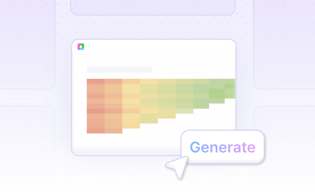
- First, create sample data using Sourcetable's AI assistant or upload a CSV file. Select the range of data you want to visualize. Then, ask the AI assistant to generate the Wireframe Contour Chart. Finally, refine or iterate on the chart by specifying changes to formatting, labels, and other elements through the AI assistant.
- Generation of Wireframe Contour Charts is similar across platforms like Excel or Google Sheets. In Sourcetable, however, the process is streamlined and simplified with AI guidance. In the next section, we will show you how to manually create a Wireframe Contour Chart.
How to Generate a Wireframe Contour Chart in Excel or Google Sheets
Generating a Wireframe Contour Chart in Excel
To create a Wireframe Contour Chart in Excel, start with the data you want to use. Select the data, then click the Insert tab. Click on All Charts under Recommended Graph. Select Surface and choose the last contour chart option. Click OK. You can add a title and change the chart’s color if desired.
Generating a Wireframe Contour Chart in Google Sheets
To create a Surface Chart in Google Sheets, start by selecting the data to be displayed on the chart. Click the Insert Tab, then click the Insert Waterfall, Funnel, Stock, Surface or Radar Chart symbol in the Charts Group. Choose Surface or Bar Chart from the menu. The chart will appear on the worksheet. Surface charts can include elements like axes, axis titles, chart titles, and gridlines, which can be formatted to suit your needs.
Benefits of Using Wireframe Contour Charts
Wireframe Contour Charts are useful for comparing multiple data sets directly. These charts display data sets on vertical surfaces, making visual analysis more effective. Whether in Excel or Google Sheets, creating these charts helps in efficient data visualization and can streamline your data analysis processes.
Use Cases for Visualizing Data with a Wireframe Contour Chart
Identifying Trends |
Wireframe contour charts effectively highlight data trends over time or across different variables. By visualizing these trends, analysts can quickly identify patterns that might otherwise be obscured in raw data. This identification supports proactive decision-making and strategic planning. |
Analyzing Multivariate Data |
Visualizing complex multivariate data is one of the strengths of wireframe contour charts. They can display relationships between three or more variables clearly, making it easier to discern correlations, variances, and anomalies within a dataset. This capability is crucial for fields such as finance, healthcare, and scientific research. |
Monitoring Performance |
Organizations can use wireframe contour charts to monitor performance metrics over time. Visual representations of performance data enable quicker identification of positive or negative trends. This monitoring is essential for maintaining operational efficiency and achieving business goals. |
Forecasting and Predictive Analysis |
Wireframe contour charts are instrumental in forecasting and predictive analysis. They can visualize historical data to predict future trends, helping businesses anticipate changes and prepare accordingly. This predictive capability is vital for informed decision-making and long-term planning. |
Optimizing Resource Allocation |
By visualizing data with wireframe contour charts, organizations can optimize resource allocation. The clear depiction of data highlights areas where resources are under or over-utilized. This optimization ensures that resources are used efficiently, maximizing productivity and reducing waste. |
Enhancing Presentation of Results |
Wireframe contour charts enhance the presentation of analytical results. Their visual format makes complex data more accessible, facilitating better communication of findings to stakeholders. This enhancement is important for gaining buy-in and ensuring that data-driven insights are effectively conveyed. |
Improving Process Control |
In manufacturing and production environments, wireframe contour charts can improve process control. By visualizing process variables, managers can identify deviations and implement corrective actions swiftly. This control is crucial for maintaining product quality and operational efficiency. |
Supporting Data-Driven Decisions |
Overall, wireframe contour charts support data-driven decision-making across various domains. By providing a clear and comprehensive view of data, they empower stakeholders to make informed choices. This support is essential for fostering a culture of data-driven excellence within organizations. |
Frequently Asked Questions
What is a Wireframe Contour Chart?
A Wireframe Contour Chart is a type of Surface chart viewed from above that shows only the lines without the color bands on the surface.
How do you create a Wireframe Contour Chart?
To create a Wireframe Contour Chart, you start by selecting the data you want to visualize, then choose the Wireframe Contour Chart option from the Surface charts menu in your charting software.
What are the key benefits of using a Wireframe Contour Chart?
Using a Wireframe Contour Chart can efficiently communicate the structure of a possible solution, showing the 2-D top view of a 3-D Surface chart using only lines.
What are the challenges of interpreting a Wireframe Contour Chart?
Interpreting a Wireframe Contour Chart can be difficult because it shows only the lines and lacks the color bands, which makes it less detailed and harder to read compared to other types of contour charts.
How can you add more contour lines to a Wireframe Contour Chart in Excel?
In Excel, you can add more contour lines to a Wireframe Contour Chart by setting the axis-z gridlines to the desired number of lines.
Generating a Wireframe Contour Chart
This guide provided an overview of what a Wireframe Contour Chart is and detailed the methods for creating one. We explored using AI with Sourcetable, which simplifies and enhances the process through its AI spreadsheet assistant, and compared this with traditional methods using Excel or Google Sheets.
Sourcetable elevates your data visualization capabilities by offering an intuitive AI-driven environment to craft charts and graphs efficiently. Whether you're a beginner or an experienced spreadsheet user, Sourcetable's tools can streamline the creation of complex data visualizations like the Wireframe Contour Chart.
To experience the ease and power of creating Wireframe Contour Charts with AI assistance, consider signing up for Sourcetable. Begin your journey towards expert-level spreadsheet management by following this link: Sign up for Sourcetable.
Recommended Guides
Connect your most-used data sources and tools to Sourcetable for seamless analysis.
Frequently Asked Questions
If your question is not covered here, you can contact our team.
Contact Us


