Chart Generator
Turn your data into stunning visualizations in seconds
Sourcetable's AI Chart Generator analyzes your spreadsheet data and automatically creates the perfect charts and graphs. Go from raw numbers to professional visuals and customize charts to highlight key insights, and impress stakeholders with data-driven stories - no data skills required.
Try for Free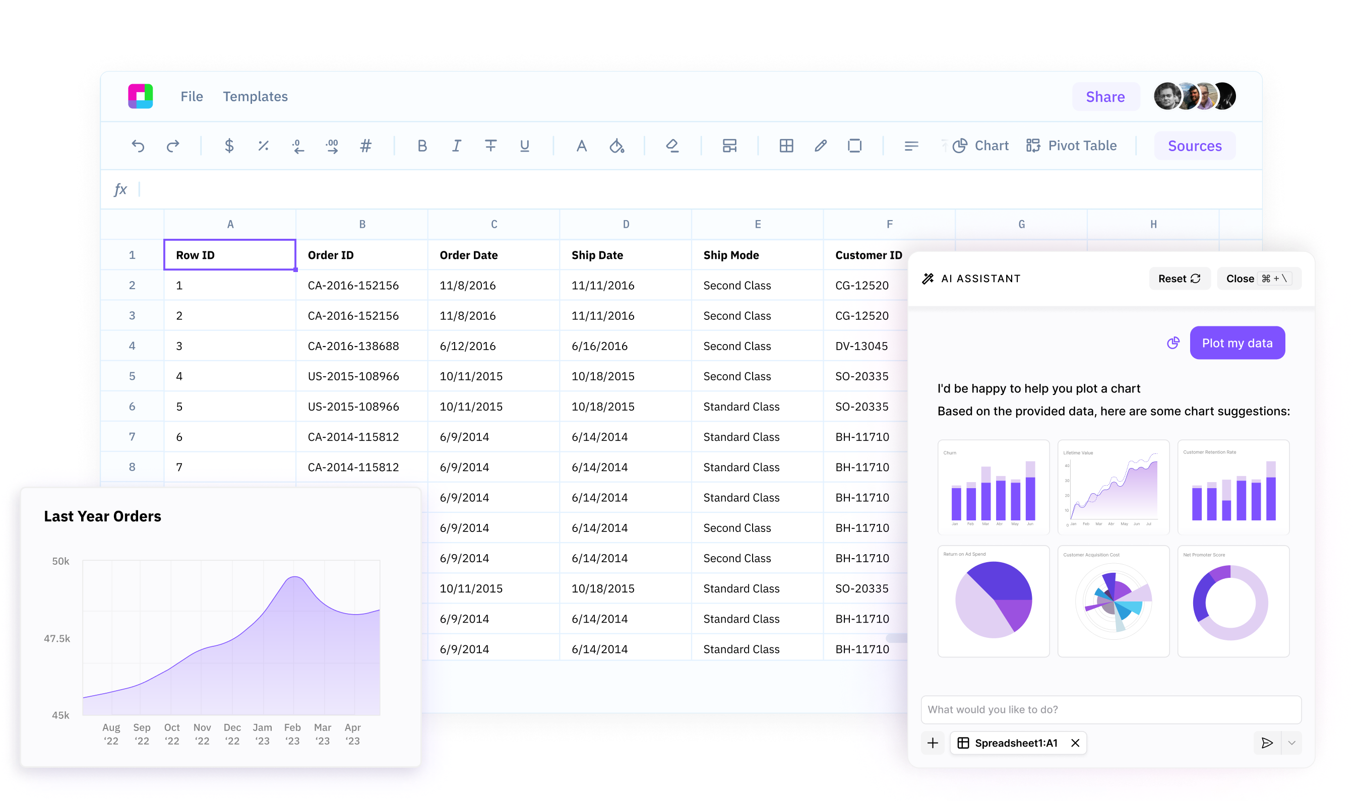
Uncover hidden insights in your data
Sourcetable’s AI Chart Generator intelligently analyzes your spreadsheet data to surface the most important trends, patterns, and relationships, so you can quickly discover actionable insights.
Create professional charts in seconds
Go from raw data to polished, presentation-ready charts with just a few clicks. No manual formatting or chart building required - our AI does the heavy lifting for you.
Customize charts to tell your data story
Polish your AI-generated charts to highlight the insights that matter most. Adjust colors, labels, formatting and more to create charts that effectively communicate your message and impress your audience.
Your AI-Powered Chart Generator
Sourcetable's AI Chart Generator analyzes your spreadsheet data and automatically creates the perfect charts and graphs.
Transform your data into stunning visual stories with AI
Intelligent Data Analysis
Sourcetable uses AI generated spreadsheet formulas to quickly analyze your data. It identifies the most significant variables, trends, and outliers to recommend the best charts for uncovering valuable insights.
Try for free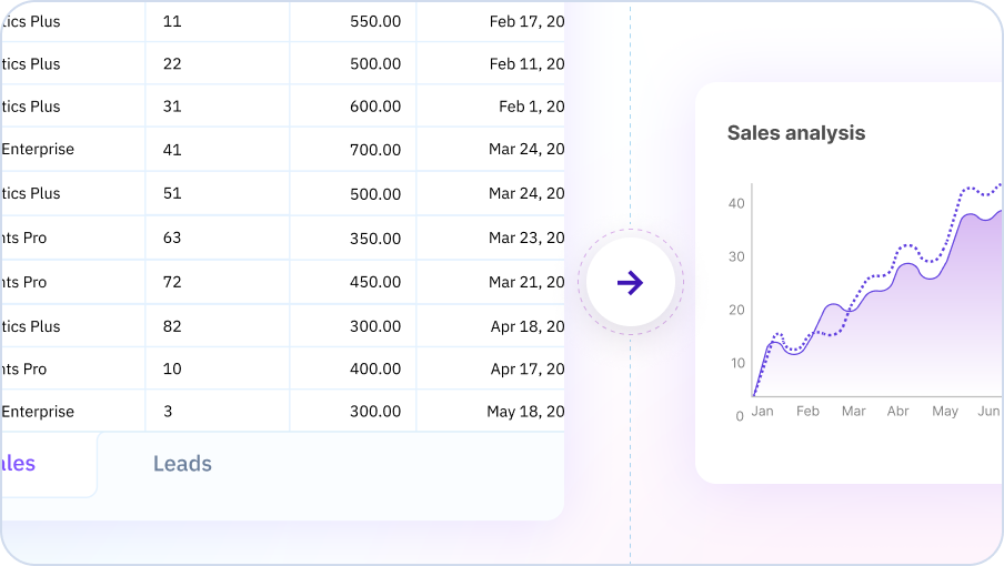
One-Click Chart Creation
Creating a professional chart is as easy as selecting your data and clicking 'Generate Chart'. Sourcetable's AI handles all the complex design decisions - chart type selection, layout, colors, labels, and more. You get stunning, ready-to-use charts in seconds.
Try for free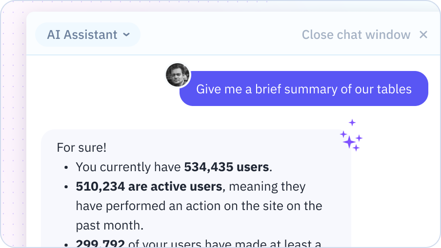
Intuitive Chart Customization
While our AI generates great charts autonomously, you have full control to customize them. Use intuitive options to adjust titles, axes, legends, styles, and more. Tailor charts to your exact needs and brand guidelines with ease.
Try for free
Learn how to get started charting with Sourcetable
Sourcetable's AI Chart Generator analyzes your spreadsheet data and automatically creates the perfect charts and graphs. Go from raw numbers to professional visuals, customize charts to highlight key insights, and impress stakeholders with data-driven stories - no data skills required.

Why use Sourcetable's AI Chart Generator?
Discover insights faster
Let our AI do the heavy lifting of data analysis. It quickly identifies the most important insights in your data, so you can make data-driven decisions faster.
Create charts with ease
Say goodbye to the frustration and wasted time of manual chart creation. Our AI generates professional, customized charts for you in seconds.
Communicate data effectively
Impress your audience with clear, compelling data visualizations. Our AI-powered customization options make it easy to create charts that tell your data story perfectly.
Integrate seamlessly with your workflow
Access the power of AI charting right where you work - in your spreadsheets. No need to learn a new tool or disrupt your workflow.
Team Purple
See what people say about Sourcetable

Chris Aubuchon
@ChrisAubuchon
Spreadsheets are still the best interface for so many real world projects, it's time for @SourcetableApp to give them a reboot

Micah Alpern
@malpern
Love seeing innovation in this space after so many decades with very little.


Frequently Asked Questions
What types of charts can Sourcetable's AI generate?
Sourcetable's AI can generate a wide variety of chart types including bar charts, line charts, pie charts, scatter plots, area charts, histograms, heatmaps, box plots, radar charts, funnel charts, and more. Simply describe the visualization you want in plain English, and Sourcetable's AI will create the appropriate chart based on your data.
Can I customize the charts after the AI generates them?
Yes, all AI-generated charts are fully customizable. You can modify colors, labels, axes, legends, chart types, and styling through an intuitive interface. Sourcetable's AI can also help you adjust charts by describing the changes you want to make in natural language.
Do I need to know which chart type to use for my data?
No, Sourcetable's AI automatically recommends the best chart type based on your data structure and what you're trying to communicate. If you're unsure whether to use a bar chart or line chart, just describe your goal (e.g., 'show sales trends over time') and Sourcetable's AI will choose the most effective visualization.
Can I generate multiple charts at once?
Yes, you can ask Sourcetable's AI to create multiple charts from the same dataset simultaneously. For example, you can request 'create a bar chart of sales by region and a line chart of monthly trends' in a single command.
How do I export charts created by the AI?
Charts can be exported as images (PNG, JPG), PDFs, or as interactive embeds for websites and dashboards. You can also download the entire spreadsheet with charts included in Excel or Google Sheets format.
Can the AI create charts from multiple data sources?
Yes, Sourcetable can combine data from multiple sources (CSV files, databases, APIs) and create unified visualizations. Sourcetable's AI handles the data merging and creates charts that span across your connected data sources.