Generate a Surface Chart with AI
Create custom Surface Charts with Sourcetable AI. Generate data from scratch or upload your own to get started.
Introduction
Creating a Surface Chart can be a powerful way to visualize complex data. Whether you choose AI-enhanced tools like Sourcetable or traditional spreadsheet programs like Excel or Google Sheets, the process can be straightforward. Sourcetable simplifies this task with its AI spreadsheet assistant, enabling users to easily generate charts and graphs.
Sourcetable’s AI assistant aids in quickly transforming data into insightful Surface Charts, without requiring deep technical knowledge. For those opting for traditional methods, Excel and Google Sheets provide the necessary tools, though they might require a steeper learning curve and more manual effort.
To experience the ease of creating Surface Charts with AI, sign up for Sourcetable and generate your first Surface Chart today or keep reading for more detailed instructions and alternatives.
See how easy it is to generate Surface Chart with Sourcetable

What is a Surface Chart?
A Surface Chart, also known as a 3D Surface Plot, displays three-dimensional data as a mesh surface. It is particularly useful for determining the optimal combinations of two sets of data.
Surface Charts plot a functional relationship between a dependent variable and two independent variables. The use of colors and patterns indicates regions where values fall within the same range, much like a topographic map.
These charts are invaluable in visualizing complicated datasets, allowing users to find optimum data sets and identify patterns and relationships within the data.
When to Use a Surface Chart
Understanding Surface Charts
A Surface Chart allows you to find the optimum combinations between two sets of data. They are ideal for data analysis that involves three variables. The chart represents three-dimensional data in a two-dimensional format, making it easier to identify relationships and trends.
Pros of Surface Charts
Surface Charts excel in visualizing complex relationships. They can show detailed multivariate data, making it easy to understand patterns. Surface Charts represent three variables, providing depth and perspective in visual data analysis.
Cons of Surface Charts
One limitation is the complexity involved in interpreting the data. Users may find it hard to understand without a solid grasp of the data involved. Surface Charts also require precise data preparation to avoid misinterpretation.
Comparison with Other Charts
Unlike Line Charts, which display two-dimensional data, Surface Charts provide a three-dimensional view. Bar Charts, while excellent for categorical data, lack the capability to represent complex relationships among three variables. Heat Maps also visualize data relationships but don't offer the depth of a Surface Chart.
Use Cases for Surface Charts
Surface Charts are best for showing performance over a range of conditions or for financial modeling. They are excellent tools when you need to visualize topographical data or any situation where you want to find the optimum combinations of data points.
Generate a Surface Chart with Sourcetable
- Sourcetable is an AI-powered spreadsheet that simplifies data visualization. Creating a Surface Chart using Sourcetable is quick and efficient, especially with the AI assistant.
- First, generate sample data with Sourcetable's AI assistant or upload a CSV. Accurate and well-structured data is essential for meaningful visualizations. The AI assistant can help create or format the data for you.
- Next, select the range of data you want to turn into a Surface Chart. Precise selection helps the AI assistant generate accurate charts. Ensure all relevant data points are included in the selection.
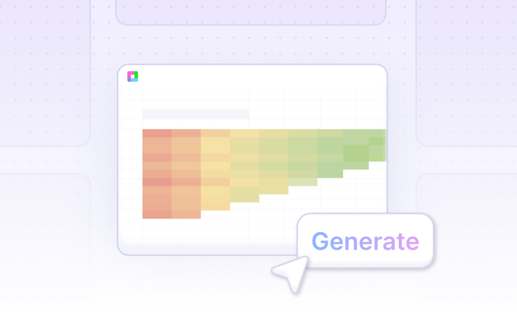
- Then, ask the AI assistant to generate the Surface Chart. The AI streamlines the process, reducing the need for manual adjustments. This step leverages Sourcetable's advanced technology for seamless chart creation.
- Finally, use the AI assistant to refine the Surface Chart. You can specify changes to formatting, labels, and other elements. This ensures the final chart meets your specific needs and preferences.
How to Generate a Surface Chart in Excel and Google Sheets
Creating a Surface Chart in Excel
To create a Surface Chart in Excel, begin by opening the Excel spreadsheet containing your data. Copy the data to one of the worksheets. Next, select the data range you wish to visualize. Navigate to the ribbon tab and choose the "INSERT" option.
Within the "Chart" section, select "Stock," "Surface," or "Radar Chart in Excel." From the available options, choose the "3-D Surface" chart. Finally, customize the chart as needed to fit your analysis.
Creating Charts in Google Sheets
Google Sheets currently does not support Surface Charts or any 3D charts. While the platform offers basic charting options sufficient for common visualization needs, advanced chart types like Surface Charts are not available. However, Google Charts may introduce this feature in the future.
Excel vs Google Sheets for Surface Charts
Microsoft Excel provides a wider variety of charts and graphs, including advanced options like Surface Charts. Excel's charting features allow for comprehensive customization, making it ideal for more complex data visualizations.
In contrast, Google Sheets focuses on basic charting options that cater to most common needs, but it lacks advanced chart types like Surface Charts. For users needing robust and sophisticated charting capabilities, Excel is the superior choice.
Use Cases Unlocked by Visualizing Data Using a Surface Chart
Identifying Trends Over Time |
Use Surface Charts to effortlessly identify trends over time. This is especially useful in financial data analysis where visualizing data across multiple time frames can reveal market patterns, providing a competitive advantage in decision-making. |
Comparing Variables Across Multiple Dimensions |
Surface Charts help compare variables across multiple dimensions, making it easy to analyze complex data sets. For instance, in manufacturing, you can compare the effect of temperature and pressure on product quality, facilitating better process controls. |
Optimizing Resource Allocation |
Visualizing data with Surface Charts can optimize resource allocation in project management. By evaluating factors like time spent and resource utilization, managers can allocate resources more efficiently, leading to improved project outcomes. |
Detecting Anomalies |
Surface Charts are instrumental in detecting data anomalies. Businesses can identify outliers in sales performance or production metrics, allowing for timely interventions to rectify issues and maintain operational stability. |
Enhancing Forecast Accuracy |
Surface Charts enhance the accuracy of forecasts by providing a clear visualization of historical data trends. Businesses can leverage this to make more informed predictions about future performance, leading to better strategic planning. |
Improving Customer Segmentation |
Utilize Surface Charts to improve customer segmentation. By visualizing demographic and behavioral data, marketers can identify distinct customer segments, enabling targeted marketing strategies that boost engagement and conversion rates. |
Monitoring Environmental Conditions |
Surface Charts are vital for monitoring environmental conditions. Scientists and researchers can visualize data such as temperature, humidity, and pollution levels across different regions and time periods, enhancing environmental studies and policy-making. |
Streamlining Supply Chain Operations |
Streamline supply chain operations by visualizing data on a Surface Chart. It aids in analyzing factors like delivery times, inventory levels, and supplier performance, fostering a more efficient and responsive supply chain. |
Frequently Asked Questions
What is a surface chart, and how is it useful for data visualization?
A surface chart displays trends and patterns in data and helps identify the optimal combinations of data sets. It is useful for showing the highs and lows across different variables and allows for multi-dimensional analysis.
What are the best practices for creating an effective surface chart?
Best practices include choosing the right dataset, simplifying data for clarity, highlighting key data points, narrating the data story with annotations, and customizing the surface chart for better understanding.
How can you make a surface chart easier to understand?
Simplify the data to make it less complex, highlight key data points, and use annotations to narrate the data story. Customizing the chart by adjusting colors, labels, and legends can enhance clarity.
When should you use a surface chart?
Use a surface chart when you need to show trends and patterns in multi-dimensional data or when identifying optimal combinations of data sets.
What are the key components to focus on when analyzing a surface chart?
Focus on the highs and lows across different variables, trends and patterns in the data, and any key data points that have been highlighted for significance.
Generating a Surface Chart: AI vs. Traditional Methods
In this guide, we explored the definition and utility of Surface Charts, illustrating the process of creating them using both traditional spreadsheet programs like Excel and Google Sheets, and AI-enhanced tools such as Sourcetable. Traditional methods demand manual setup and calibration, whereas Sourcetable simplifies and accelerates this process with its AI capabilities.
Sourcetable leverages an AI spreadsheet assistant that empowers users to efficiently create charts, including Surface Charts, without the steep learning curve associated with conventional spreadsheets. This makes Sourcetable an ideal choice for those seeking to harness the power of AI for enhanced data visualization.
To experience the simplicity and efficiency of generating your first Surface Chart with AI, sign up for Sourcetable today.
Recommended Guides
Connect your most-used data sources and tools to Sourcetable for seamless analysis.
Frequently Asked Questions
If your question is not covered here, you can contact our team.
Contact Us


