Generate a 3-D Surface Chart with AI
Create custom 3-D Surface Charts with Sourcetable AI. Generate data from scratch or upload your own to get started.
Introduction
Creating a 3-D Surface Chart can significantly enhance data visualization, revealing hidden patterns and details within complex datasets. While traditional spreadsheet programs like Excel or Google Sheets provide basic tools to construct these charts, they often require a step-by-step approach that can be time-consuming and sometimes complex.
Sourcetable changes this dynamic by integrating AI capabilities into its spreadsheet environment. It enables users, regardless of their proficiency level, to quickly generate advanced charts, including 3-D Surface Charts. The AI assistant in Sourcetable streamlines the creation process, assisting users from setup to final visualization.
To experience enhanced ease and efficiency in creating detailed 3-D Surface Charts, consider using Sourcetable. Sign up to generate your first 3-D Surface Chart or continue reading for more detailed instructions.
See how easy it is to generate 3-D Surface Chart with Sourcetable

What is a 3-D Surface Chart?
A 3-D Surface Chart, also known as a Surface Chart or 3D Surface Plot, displays three-dimensional data as a mesh surface. It visualizes relationships across three variables: X and Y as independent variables on the horizontal axes, and Z as a dependent variable on the vertical axis.
Purpose and Functionality
Surface Charts are essential tools for finding optimum combinations between two sets of data. They demonstrate the functional relationship between a dependent variable and two independent variables. The colors and patterns on the chart indicate where data ranges are similar, much like a topographic map.
Applications
3-D Surface Charts are used extensively in multivariate analysis to identify clusters and relationships within the dataset. They are valuable for visualizing data in three dimensions, which helps in better understanding complex datasets and revealing hidden patterns.
Creation and Formatting
Creating a 3-D Surface Chart in Excel requires three-dimensional data. This chart can be found under the "Charts" section of the "Insert" tab. Colors represent value ranges on the chart and formatting can be done through the "Format Chart Area" option.
When to Use a 3-D Surface Chart
Understanding 3-D Surface Charts
A 3-D Surface Chart is ideal for visualizing data across three dimensions. It displays the relationships between large data sets that involve multiple variables. These charts help in finding the optimum combinations between the two sets of data.
Pros of 3-D Surface Charts
3-D Surface Charts provide a comprehensive view of the data's topography. They are effective for identifying peaks, valleys, and trends within data. These charts also facilitate the recognition of correlations and patterns that may not be visible in 2-D plots.
Cons of 3-D Surface Charts
One downside is their complexity, which can make them difficult to read for some audiences. They can also be misleading if not properly scaled or if the data is presented inaccurately. Rendering issues may arise when dealing with very dense data sets.
3-D Surface Charts vs. Other Comparable Charts
Compared to 2-D line graphs, 3-D Surface Charts offer a more detailed representation of complex data sets. However, 2-D line graphs are easier to read and interpret. Scatter plots can also display three-dimensional data using color and size variations, but they may not offer the same depth of analysis as 3-D Surface Charts.
When to Choose a 3-D Surface Chart
Opt for a 3-D Surface Chart when you need to illustrate the relationships between three variables clearly, especially in scientific and engineering data analysis. Avoid using them for simple data sets or presentations where clarity is paramount. Choose simpler options like 2-D line graphs or scatter plots in those cases.
How to Generate a 3-D Surface Chart with Sourcetable
- Generating a 3-D Surface Chart with Sourcetable's AI is the easiest method. First, create sample data using Sourcetable's AI assistant or upload a CSV. This quick setup ensures you have the necessary data for your chart.
- Next, select the range of data you want to visualize as a 3-D Surface Chart. Precision in data selection enhances the clarity and accuracy of your chart.
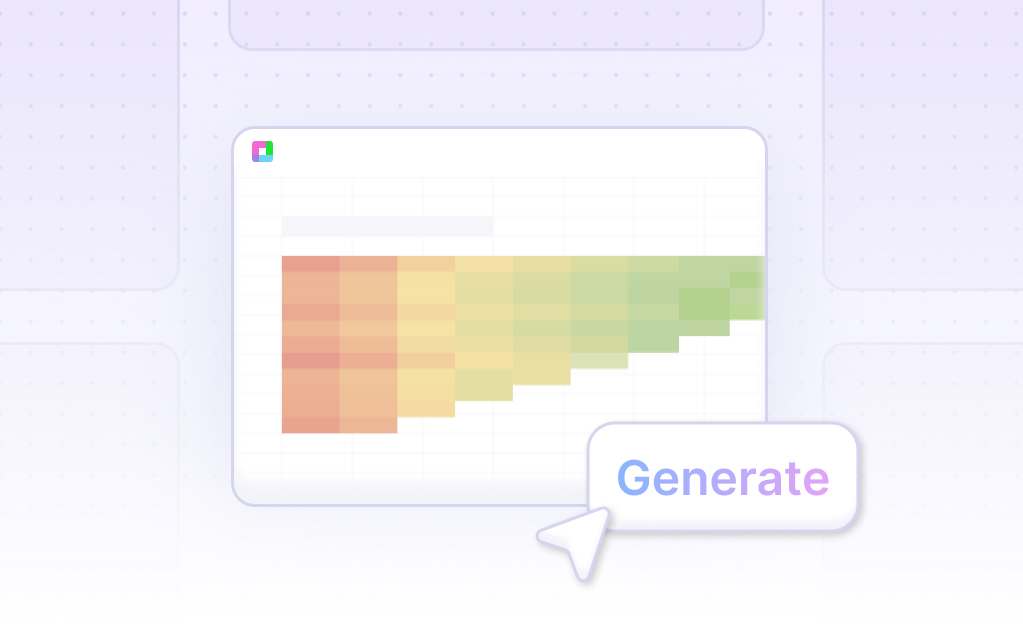
- Then, ask the AI assistant to generate the 3-D Surface Chart. With a simple command, Sourcetable’s AI transforms your selected data into a dynamic chart.
- Finally, refine or iterate on the 3-D Surface Chart. Use the AI assistant to specify changes to formatting, labels, and other elements. This customization ensures your chart effectively communicates your data insights.
How to Generate a 3-D Surface Chart in Excel or Google Sheets
Creating a 3-D Surface Chart in Excel
To create a 3-D Surface Chart in Excel, start by preparing your data in a table format. Arrange the data in columns or rows on the worksheet. Then, select the range of data to be included in the chart.
Next, go to the Insert tab. In the Charts group, click the Stock, Surface or Radar Chart icon on the Ribbon. Hover over each icon to preview the chart types. Finally, double-click the 3D Surface Chart icon to generate the chart.
Creating a 3-D Surface Chart in Google Sheets
To create a 3-D Surface Chart in Google Sheets, first select the data you wish to include. Click the Insert tab, and then click the Insert Waterfall, Funnel, Stock, Surface or Radar Chart button from the Charts section on the ribbon.
From the Insert Surface window, click the Surface button. The 3-D Surface Chart will then appear in your worksheet.
Alternative Method with Chart Studio
For a more styled 3-D Surface Chart, consider using Chart Studio. First, go to Chart Studio and add your data. Select '3D Surface' under the '3D' chart type. Fill in the 'X', 'Y', and 'Z' values from their respective dropdown menus. Style the chart as needed, then save and share it.
By following these steps, you can effectively create a visually engaging 3-D Surface Chart in either Excel or Google Sheets.
Use Cases for 3-D Surface Charts
1. Analyzing Complex Data Sets |
3-D Surface Charts allow users to visualize complex data sets by providing a three-dimensional perspective. This visualization helps in identifying patterns, trends, and outliers that might be missed in two-dimensional charts. Businesses benefit from better decision-making capabilities. |
2. Financial Modeling |
Financial analysts use 3-D Surface Charts to model financial scenarios involving multiple variables. This helps in comprehensively understanding risk, returns, and market behavior, aiding in investment strategies and portfolio management. |
3. Scientific Research |
Researchers leverage 3-D Surface Charts to visualize data from experiments and simulations. This is particularly useful in fields such as physics, chemistry, and biology where multidimensional data representation enhances understanding and interpretation. |
4. Geographic Data Visualization |
Geographers and urban planners employ 3-D Surface Charts to represent topographical data. These visualizations assist in urban development planning, environmental monitoring, and disaster management by providing clear and detailed terrain views. |
5. Engineering Design |
Engineers use 3-D Surface Charts to visualize stress, strain, and other performance metrics on materials and structures. This supports the design process by enabling clearer insights into material behavior under different conditions. |
6. Market Analysis |
Marketing professionals utilize 3-D Surface Charts to analyze consumer behavior and market trends. This helps in segmenting markets, identifying target demographics, and optimizing marketing strategies based on multidimensional consumer data. |
7. Manufacturing Process Optimization |
Manufacturers implement 3-D Surface Charts to visualize and improve production processes. Identifying inefficiencies and potential improvements in the workflow leads to enhanced productivity and cost savings. |
8. Climate Data Analysis |
Climatologists and environmental scientists use 3-D Surface Charts for analyzing climate data, including temperature, humidity, and precipitation patterns. This visualization is crucial for climate modeling, forecasting, and developing mitigation strategies. |
Frequently Asked Questions
What can you change in a 3-D chart to customize its appearance?
You can change the rotation, scale, depth, spacing, order of data series, and use transparency.
How does a 3-D Surface Chart display data?
A 3-D Surface Chart shows how a response variable relates to two predictor variables. The predictor variables are plotted on the x- and y-axes, and the response variable is plotted on the z-axis. Peaks and valleys represent local maxima and minima.
What are the benefits of using a 3-D Surface Chart in data analysis?
3-D Surface Charts reveal relationships between three variables, are useful for multivariate analysis, and display the coordinates of 3D objects.
What are best practices when creating 3-D Surface Charts?
Ensure that the same insight couldn't be achieved with 2D visualizations, and use interactive features to rotate the visualization. Surface plotting is particularly effective.
Why use 3D visualizations for data analysis?
3D visualizations add an additional dimension, making them useful for showing relationships across three variables and for surface plotting.
Conclusion
In this guide, we've explored the essentials of creating a 3-D Surface Chart, detailing both AI-driven methods using Sourcetable and traditional approaches using Excel or Google Sheets. While spreadsheet programs offer basic tools for chart creation, Sourcetable's AI capabilities simplify the process, providing you with an integrated assistant to enhance your data visualization effortlessly.
Whether you are a novice or looking to streamline your data analysis tasks, Sourcetable empowers you to generate professional 3-D Surface Charts with ease. Leverage the intelligence of AI and make your data speak volumes.
Ready to transform your data into stunning charts? Sign up for Sourcetable today and create your first 3-D Surface Chart seamlessly.
Recommended Guides
Connect your most-used data sources and tools to Sourcetable for seamless analysis.
Frequently Asked Questions
If your question is not covered here, you can contact our team.
Contact Us


