Generate a Wireframe 3-D Surface Chart with AI
Create custom Wireframe 3-D Surface Charts with Sourcetable AI. Generate data from scratch or upload your own to get started.
Introduction
Creating a Wireframe 3-D Surface Chart can be a challenging task, especially for those who are not familiar with advanced data visualization techniques. This guide will provide clear instructions on how to generate such charts, whether you are using an AI-enhanced tool like Sourcetable or traditional spreadsheet programs such as Excel and Google Sheets.
Sourcetable simplifies the creation of complex visualizations with its AI spreadsheet capabilities, enabling anyone to quickly become proficient with its tools. The AI assistant in Sourcetable can help users build everything from simple templates to intricate charts and graphs, significantly reducing the learning curve typically associated with spreadsheet software.
To start generating your first Wireframe 3-D Surface Chart with the aid of artificial intelligence or to learn more about creating charts with traditional spreadsheet software, visit sign up for Sourcetable.
See how easy it is to generate Wireframe 3-D Surface Chart with Sourcetable

What is a Wireframe 3-D Surface Chart?
A Wireframe 3-D Surface Chart is a type of Surface chart that displays data in three dimensions without color, presenting only the wireframe of the surface. This chart type is useful for showing trends in values across two dimensions in a continuous curve.
Unlike regular 3-D Surface Charts, Wireframe 3-D Surface Charts plot large data sets faster. However, they are not easy to read due to their lack of surface color. These charts are particularly effective when both the categories and the series in the dataset are numeric values.
One of the key benefits of a Wireframe 3-D Surface Chart is its ability to show the effect of two variables on a third variable. This makes it a valuable tool for data analysis where understanding multi-variable relationships is crucial.
When to Use a Wireframe 3-D Surface Chart
Overview
A Wireframe 3-D Surface Chart visualizes data across a three-dimensional plain, useful for identifying peaks, valleys, and trends within complex datasets. This type of chart excels in scenarios involving multiple variables and intricate data relationships, such as in mathematical functions or engineering simulations.
Advantages of Wireframe 3-D Surface Charts
Wireframe 3-D Surface Charts provide a clear view of data interactions and gradients, making them ideal for visualizing topography or performance landscapes. They enable users to perceive depth and variable correlations effectively. This type of chart is beneficial for displaying the structure of data where hidden trends need to be highlighted.
Disadvantages of Wireframe 3-D Surface Charts
One major drawback is their potential complexity; novices may find them challenging to interpret. Additionally, inter-grid lines might cause visual clutter, leading to difficulties in data discrimination. Compared to other types of charts, Wireframe 3-D Surface Charts may require more computational power for rendering, making them less suitable for real-time data analysis.
Comparison with Other Charts
Unlike 2-D line or bar charts, Wireframe 3-D Surface Charts illustrate the relationship between three variables, which provides a more dimensional understanding of the data. However, 2-D charts often offer easier interpretation and quicker insights due to their simplicity. Compared to heat maps, which also show data intensities, Wireframe 3-D Surface Charts add a layer of depth information, though sometimes at the expense of clarity.
Conclusion
Wireframe 3-D Surface Charts are ideal for sophisticated data analysis involving three variables and complex interactions. While they offer depth and a detailed view into data trends, they can be challenging to interpret and may require greater computational resources. Choose this chart type when the emphasis is on visualizing multi-variable relationships and interactions in detail.
How to Generate a Wireframe 3-D Surface Chart with Sourcetable
- Generating a Wireframe 3-D Surface Chart is straightforward with Sourcetable, an AI spreadsheet. Using Sourcetable AI is the most efficient method. To start, create sample data using Sourcetable's AI assistant or upload a CSV file.
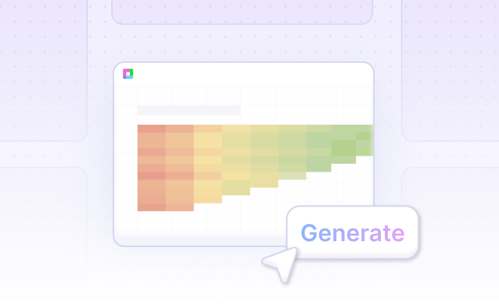
- Next, select the range of data you want to turn into a Wireframe 3-D Surface Chart. Ask the AI assistant to generate the Wireframe 3-D Surface Chart. This avoids the manual process needed in Excel or Google Sheets.
- Finally, refine or iterate on the Wireframe 3-D Surface Chart. Use the AI assistant to specify changes to formatting, labels, and other details. This ensures your chart meets your exact needs quickly and easily.
How to Generate a Wireframe 3D Surface Chart in Excel and Google Sheets
Generating a Wireframe 3D Surface Chart in Excel
To create a Wireframe 3D Surface Chart in Excel, start by selecting the data you intend to plot. Open the Excel spreadsheet and copy the data to one of the worksheets. Choose the data range and navigate to the "INSERT" tab in the ribbon. Under the "Charts" section, select "Stock," "Surface," or "Radar" Chart options. From the dropdown, choose the "3-D Surface" chart. Excel supports only surface, contour, and wireframe contour charts, making it ideal for displaying changes in a variable according to two other variables.
Generating a Wireframe 3D Surface Chart in Google Sheets
In Google Sheets, the process is slightly different. Select the data you want to display on the Surface chart. Click the "Insert" tab, then click the "Insert Waterfall, Funnel, Stock, Surface, or Radar Chart" button in the Charts group. From the "Insert Surface or Bar Chart" window that appears, select "Surface." The chart will automatically appear in the worksheet, creating an effective visual representation of your data. This method offers a streamlined approach for Google Sheets users, ensuring quick and efficient chart creation.
Both Excel and Google Sheets provide robust options for generating Wireframe 3D Surface Charts. These charts are particularly useful for visualizing how one variable changes concerning two other variables. However, it is important to note that surface charts have limitations. They are not true X-Y-Z charts and require regularly defined, evenly spaced categories for the X and Y axes, with exactly one Z value for each X-Y pair. Despite these limitations, they effectively illustrate complex data sets, making them an invaluable tool for data analysis and presentation.
Use Cases for Visualizing Data with a Wireframe 3-D Surface Chart
Identifying Trends Over Time |
Using Wireframe 3-D Surface Charts, analysts can visualize trends across different time periods. This allows for a clear and comprehensive understanding of how variables evolve, assisting in predictive analysis and strategic planning. |
Comparing Multiple Data Sets |
Wireframe 3-D Surface Charts enable the comparison of multiple data sets within a single visualization. This helps in identifying correlations or discrepancies among variables, providing a clearer picture for data-driven decision-making. |
Visualizing Complex Relationships |
These charts are crucial for displaying complex relationships in data that might be missed with 2-D charts. By adding a third dimension, one can uncover hidden patterns and insights that enhance analytic capability. |
Enhancing Presentation of Data |
For presentations, Wireframe 3-D Surface Charts offer a visually appealing and intuitive way to present complex data. This aids in effectively communicating insights and findings to stakeholders or team members. |
Detecting Performance Peaks and Valleys |
With a Wireframe 3-D Surface Chart, it's easy to detect performance peaks and valleys across different dimensions. This is invaluable for performance analysis and optimization in fields like finance or operations. |
Optimizing Resource Allocation |
Businesses can use these charts to visualize resource allocation efficiency across various projects or departments. This helps in identifying areas that require more or fewer resources, leading to better resource management. |
Improving Forecasting Accuracy |
By visualizing historical data trends in a 3-D surface chart, forecasters can improve the accuracy of their predictions. This visualization aids in recognizing patterns and anomalies that impact forecast reliability. |
Frequently Asked Questions
What is a Wireframe 3-D Surface Chart?
A Wireframe 3-D Surface Chart is a type of chart that shows a 3-D surface without color on the surface, making it useful for emphasizing structure rather than color-coded data values.
When should I use a Wireframe 3-D Surface Chart?
Use a Wireframe 3-D Surface Chart when you need to plot large data sets quickly, show trends in values across two dimensions in a continuous curve, or when both the categories and the series are numeric.
What are the benefits of using a Wireframe 3-D Surface Chart?
Wireframe 3-D Surface Charts are beneficial for visualizing the relationship between a response variable and two predictor variables. They also allow you to view a three-dimensional surface of the predicted response.
Are Wireframe 3-D Surface Charts easy to read?
No, Wireframe 3-D Surface Charts are not easy to read due to their lack of surface color and the way data curves behind itself.
Can the display of a Wireframe 3-D Surface Chart be adjusted?
Yes, the display can be adjusted by changing the 3-D format, rotation, and scaling of the chart to make it easier to read.
Conclusion
Throughout this guide, we've explored what a Wireframe 3-D Surface Chart is, showcasing its utility in visualizing complex data sets in three dimensions. We've demonstrated how to effortlessly create this chart using AI-driven tools like Sourcetable, as well as how to construct it using traditional spreadsheet software such as Excel and Google Sheets. The advantages of using AI in Sourcetable include powerful automation features that simplify the process significantly.
For those keen on advancing their spreadsheet skills and embracing next-generation charting capabilities, Sourcetable offers an invaluable resource. Its AI spreadsheet assistant ensures a seamless creation of dynamic charts, including the Wireframe 3-D Surface Chart, with minimal manual input.
To experience the simplicity and power of AI-driven data visualization, we invite you to sign up for Sourcetable and generate your first Wireframe 3-D Surface Chart today.
Recommended Guides
Connect your most-used data sources and tools to Sourcetable for seamless analysis.
Frequently Asked Questions
If your question is not covered here, you can contact our team.
Contact Us


