Generate a 3-D Area Chart with AI
Create custom 3-D Area Charts with Sourcetable AI. Generate data from scratch or upload your own to get started.
Introduction
Creating visual data representations like 3-D Area Charts can be challenging, whether you use traditional tools like Excel and Google Sheets or innovative AI-powered platforms. Sourcetable, an AI spreadsheet platform, simplifies this process by integrating an AI spreadsheet assistant that guides users in crafting detailed charts and graphs effortlessly.
Sourcetable stands out by enabling both novice and seasoned spreadsheet users to enhance their productivity and visualization capabilities. The AI assistant helps in laying out data effectively, making the generation of complex charts straightforward and swift.
To explore the potential of AI in crafting compelling 3-D Area Charts or to utilize traditional methods effectively, consider reading further. Alternatively, sign up for Sourcetable to generate your first 3-D Area Chart now.
See how easy it is to generate 3-D Area Chart with Sourcetable

What is a 3-D Area Chart?
A 3-D Area Chart is a graphical representation that displays data segments in three dimensions. It employs the x, y, and z axes to illustrate these segments, providing a more visually engaging way to compare multiple variables.
Excel is a popular tool for constructing 3-D Area Charts. The creation process involves similar steps as those for regular Area Charts, making it accessible for users familiar with basic chart-building techniques.
Applications of 3-D Area Charts
3-D Area Charts are beneficial for multivariate analysis, helping to visualize how clusters form among data points. They are especially useful in surface plotting to display the coordinates of complex 3D objects.
When to Use a 3-D Area Chart
Benefits of 3-D Area Charts
3-D Area Charts are ideal for visualizing data trends over time across multiple categories. They allow for the comparison of values and illustrate the cumulative effects of different data sets. This type of chart can handle large volumes of data, making it suitable for complex datasets.
Drawbacks of 3-D Area Charts
Despite their advantages, 3-D Area Charts can be misleading. The three-dimensional aspect may distort the data, making it harder to interpret. Overlapping areas can obscure information, complicating data comparison and analysis.
Comparing to 2-D Area Charts
While 3-D Area Charts provide a more layered visual appeal, 2-D Area Charts offer clearer readability. The flat design of 2-D charts avoids the distortion seen in 3-D versions, making data interpretation more straightforward.
Comparing to Line Charts
Line Charts excel in displaying precise data trends over time without the confusion of filled areas. They are ideal for simple datasets where clarity is paramount. However, they lack the cumulative effect visualization that 3-D Area Charts provide.
Comparing to Bar Charts
Bar Charts are effective for categorical data and comparing discrete values. They provide a clear and straightforward representation but do not effectively show trends over time like 3-D Area Charts can, making them less suitable for time series analysis.
How to Generate a 3-D Area Chart with Sourcetable
- Creating a 3-D Area Chart in Sourcetable, an AI spreadsheet, is simple and straightforward. This guide outlines the process using Sourcetable's AI assistant, the easiest method available.
- First, create sample data using Sourcetable's AI assistant or upload a CSV file. This provides the data foundation for your chart. Ensure your data is accurate and well-organized.
- Next, select the range of data you wish to visualize as a 3-D Area Chart. Highlight the relevant cells to ensure all necessary data points are included in the chart generation process.
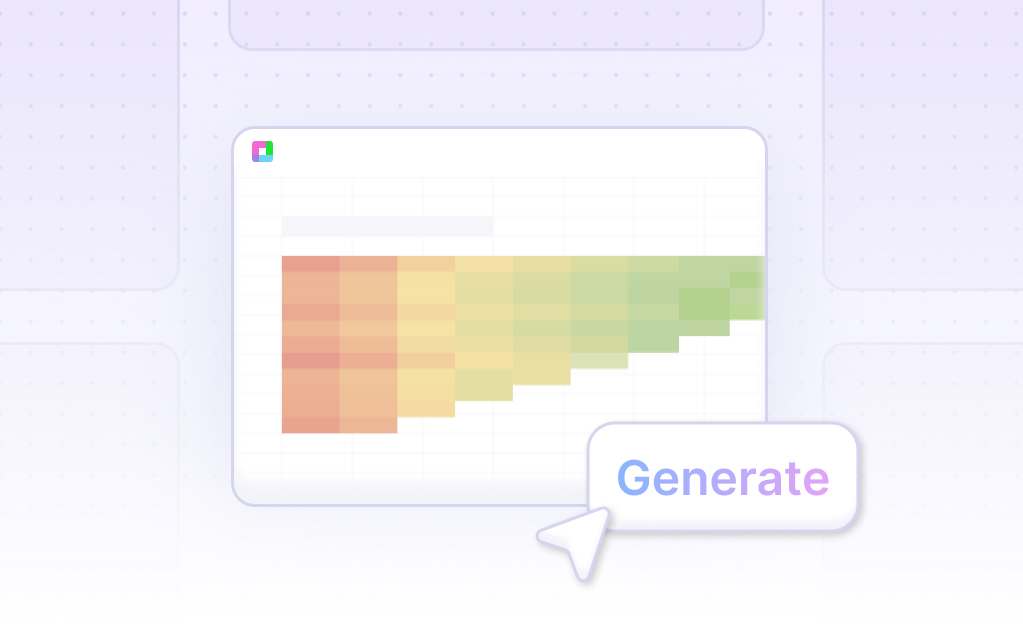
- Then, ask the AI assistant to generate the 3-D Area Chart. This automated step simplifies the process, producing a chart based on the selected data.
- Finally, refine or iterate on the 3-D Area Chart using the AI assistant. Specify changes to formatting, labels, and other elements to enhance clarity and presentation. This ensures your chart meets your specific needs.
- For a manual guide, refer to the next section on creating 3-D Area Charts in Excel or Google Sheets.
How to Generate a 3-D Area Chart in Excel and Google Sheets
Creating a 3-D Area Chart in Excel
To generate a 3-D Area Chart in Excel, follow these steps:
Select the cells with the data to use for the chart. On the Insert tab, click Charts. From the category shown, pick the chart type. Choose a 3-D Area Chart type from the chart types available.
Creating a 3-D Area Chart in Google Sheets
To create a 3-D Area Chart in Google Sheets, open a spreadsheet in Google Sheets. Format the data like an area chart, ensuring you have at least 2 data series. Select the data to include in the chart. Select Chart and customize the chart as desired.
Features of 3-D Area Charts
3-D Area Charts track one or more data series graphically. They are useful for seeing changes in value between categories of data. This makes them effective for visualizing trends and comparing data sets over time or categories.
For advanced usage, Excel’s 3D formulas can be useful for creating summary calculations from data across multiple sheets. This allows for efficient referencing and summarizing of data, enhancing data management and analysis.
Use Cases for 3-D Area Charts
Trend Analysis |
3-D Area Charts offer an effective method to analyze trends over time. By visualizing multiple data series, these charts help identify patterns and changes in data, providing valuable insights for decision-making. |
Comparative Analysis |
Using 3-D Area Charts facilitates comparing different data sets simultaneously. This visualization method allows for immediate recognition of similarities and differences, aiding in performance comparisons. |
Resource Allocation |
Organizations can leverage 3-D Area Charts to optimize resource allocation. By displaying data across different categories and periods, these charts help in understanding resource distribution and making informed adjustments. |
Market Research |
3-D Area Charts are invaluable for market research. They enable detailed analysis of market trends and consumer behavior over time, supporting strategic planning and competitive analysis. |
Financial Forecasting |
In financial forecasting, 3-D Area Charts present a clear view of financial projections and historical data. This visualization helps in anticipating future performance and making sound investment decisions. |
Sales Performance |
3-D Area Charts provide a comprehensive view of sales data. By visualizing sales performance across different regions and time periods, businesses can identify growth opportunities and areas needing improvement. |
Operational Efficiency |
Visualizing operational metrics through 3-D Area Charts aids in identifying inefficiencies. This helps organizations streamline processes, improve productivity, and achieve operational excellence. |
Customer Segmentation |
3-D Area Charts assist in analyzing customer segments. By displaying customer data over multiple dimensions, businesses can tailor marketing strategies to target specific groups more effectively. |
Frequently Asked Questions
What is a 3-D area chart and what is it used for?
A 3-D area chart, also known as a 3D surface plot, is a tool to visualize how a response variable relates to two predictor variables. It is useful for finding desirable response values and operating conditions, with predictors on the x and y axes and response values on the z axis.
How do you create a 3-D chart?
You can create a 3-D chart by selecting the cells with data and clicking on the chart icon. Available 3-D charts include 3-D column, 3-D line, and 3-D surface charts.
What are the benefits and limitations of using 3-D area charts?
The benefits of 3-D area charts include their usefulness for multivariate analysis and displaying the coordinates of a 3-D object. Limitations include problems with conveying information due to depth of field effects, which cause confusion and make it difficult to compare values or identify patterns and trends.
How can you improve the readability of a 3-D area chart?
The readability of a 3-D area chart can be improved by changing the 3-D format, rotation, and scaling. Additionally, reversing the order of data series and using transparency can enhance visibility and ensure smaller data markers are not hidden behind larger ones.
What do the peaks and valleys represent in a 3-D area chart?
In a 3-D area chart, the peaks and valleys of the surface represent the local maxima and minima of the x and y combinations, indicating where the highest and lowest response values are located.
Creating a 3-D Area Chart: AI vs. Traditional Methods
In this guide, we've explored the intricacies of the 3-D Area Chart, demonstrating both innovative and traditional methods to create these visual tools. We discussed utilizing AI technology in Sourcetable, which simplifies the process significantly through its AI spreadsheet assistant, enabling even novice users to efficiently craft complex charts. On the other hand, we also covered how to generate a 3-D Area Chart using conventional spreadsheet programs like Excel and Google Sheets, suitable for those accustomed to traditional data handling.
Whether you're leaning toward the cutting-edge capabilities of AI or prefer the familiar environment of traditional spreadsheets, the knowledge to create effective 3-D Area Charts is now at your fingertips. Remember, the choice between AI-enhanced and standard spreadsheet tools depends on your specific needs and comfort with evolving technology.
Ready to dive into making your first 3-D Area Chart with the ease of AI? Sign up for Sourcetable today and access a powerful tool that transforms your data visualization tasks into a seamless, efficient process. Sign up here.
Recommended Guides
Connect your most-used data sources and tools to Sourcetable for seamless analysis.
Frequently Asked Questions
If your question is not covered here, you can contact our team.
Contact Us


