Generate a 3-D Stacked Area Chart with AI
Create custom 3-D Stacked Area Charts with Sourcetable AI. Generate data from scratch or upload your own to get started.
Introduction
Creating a 3-D Stacked Area Chart can enhance data visualization by showing the relationships between multiple datasets over time. While traditional spreadsheet programs like Excel and Google Sheets enable users to generate such charts manually, Sourcetable offers a more streamlined, AI-powered approach.
Sourcetable is an AI spreadsheet that simplifies complex tasks, transforming any user into a spreadsheet power user. Its AI assistant aids in crafting anything from templates to detailed charts and graphs, including 3-D Stacked Area Charts.
Whether you're a novice or seasoned professional, the capabilities of Sourcetable can significantly elevate your data presentation. Sign up for Sourcetable to generate your first 3-D Stacked Area Chart or continue reading for more detailed guidance on both AI-assisted and traditional methods.
See how easy it is to generate 3-D Stacked Area Chart with Sourcetable

What is a 3-D Stacked Area Chart?
A 3-D Stacked Area Chart is a type of data visualization that shows how a measure changes over time across multiple categories. Each category is represented as an area, and these areas are stacked on top of each other, showcasing cumulative totals.
Visualization of Contributions
In a 3-D Stacked Area Chart, the contributions from different category values are visualized along with the total. The curve traced by each category series serves as the baseline for the series stacked above it. This helps in highlighting part-to-whole contributions and tracking cumulative totals more effectively than individual values.
Enhanced Visual Appeal
3-D Stacked Area Charts add a visual enhancement by introducing a z-axis, which can represent another variable such as different days of the week. This additional dimension helps mitigate the issues of overlap seen in traditional 2-D stacked area charts, making the visualization clearer and more impactful.
Applications and Benefits
3-D Stacked Area Charts are particularly useful for visualizing changes over time, highlighting contributions from different categories, and showing radical changes in these contributions. They provide a rough idea of numerical values, making them ideal for analyses aimed at illustrating trends rather than precise data points.
When to Use a 3-D Stacked Area Chart
A 3-D Stacked Area Chart is ideal for displaying the cumulative contribution of multiple components over time. It is especially useful when you want to show how each part contributes to a whole across different periods.
Pros of 3-D Stacked Area Charts
3-D Stacked Area Charts offer a visually engaging way to present data. They allow for easy comparison between the parts and the whole, making trends and patterns more apparent. The added 3-D effect can also enhance visual appeal.
Cons of 3-D Stacked Area Charts
Despite their visual appeal, 3-D Stacked Area Charts can sometimes distort data, making it difficult to accurately interpret values. The 3-D perspective may obscure smaller data segments, leading to potential misinterpretation.
Comparison with Other Chart Types
Compared to 2-D Stacked Area Charts, 3-D versions add depth but may sacrifice clarity for aesthetics. 2-D charts offer better accuracy in data reading. Bar charts and line charts provide clearer distinctions between individual data points but lack the cumulative visualization offered by stacked area charts.
Pie charts can show parts of a whole but do not display changes over time, making them less suitable for trend analysis. Line charts excel in highlighting individual trends but do not emphasize the cumulative aspect as effectively.
Generating a 3-D Stacked Area Chart with Sourcetable
- Sourcetable, an AI-powered spreadsheet, simplifies creating 3-D Stacked Area Charts. Follow these straightforward steps for optimal results.
- First, create sample data using Sourcetable's AI assistant or upload a CSV file. This ensures your data is ready for visualization.
- Next, select the range of data you want to include in your 3-D Stacked Area Chart. Accurate data selection is crucial for meaningful charts.
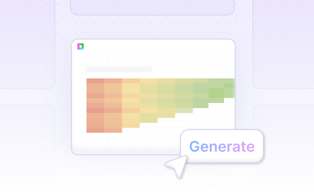
- Then, ask the AI assistant to generate the 3-D Stacked Area Chart. Sourcetable’s AI efficiently creates the chart based on your selected data range.
- Lastly, use the AI assistant to refine your chart. Specify changes to formatting, labels, and other elements to perfect your 3-D Stacked Area Chart.
- Generating a 3-D Stacked Area Chart with Sourcetable is efficient and user-friendly, ensuring high-quality visualizations for your data.
How to Generate a 3-D Stacked Area Chart
In Excel
To create a 3-D stacked area chart in Excel, start by selecting the cells with the data you want to visualize. Then, navigate to the Insert tab and click on Charts to choose a specific chart type. Select the 3-D chart type from the options displayed.
Once the chart appears, you can customize it further. Change the 3-D format of the chart elements, adjust the depth and spacing, and modify the rotation. These options allow you to fine-tune the chart for better data presentation and clarity.
In Google Sheets
Google Sheets also supports the creation of 3-D stacked area charts to show part-to-whole relationships and trends over time. To begin, format your row and column data similar to an area chart and ensure you have at least two data series. Select this data to use in the chart.
Next, use the chart creation tools in Google Sheets. Choose a stacked area chart to display how various components contribute to a whole. This type of chart is particularly useful in visualizing contributions over periods while highlighting trends and comparisons.
Benefits and Use Cases
Both Excel and Google Sheets offer powerful tools for creating area charts, which are essential for data visualization in business analytics, financial charts, and other data-driven projects. These charts not only depict trends over time but also compare multiple data sets effectively by filling the area under the lines with color.
Stacked area charts layer multiple data sets to illustrate how different components cumulatively contribute to the whole over time. They are invaluable for presenting complex data in a comprehensible visual format, enabling better decision-making and insights.
Use Cases for 3-D Stacked Area Charts
1. Trend Analysis Over Time |
3-D Stacked Area Charts are ideal for visualizing data trends over time. By displaying multiple data sets simultaneously, users can analyze how different variables interact and change in relation to each other across different time periods. This facilitates a deeper understanding of temporal patterns and correlations. |
2. Comparative Data Insights |
Utilize 3-D Stacked Area Charts to compare various categories within a dataset. The three-dimensional aspect adds a layer of depth, making it easier to distinguish between different data points. This is particularly useful for identifying which categories contribute most significantly to the overall trend. |
3. Resource Allocation Visualization |
In resource management, 3-D Stacked Area Charts can visually represent the allocation of resources over time. By stacking the data, users can see how resources are distributed among different departments, projects, or activities, aiding in more efficient planning and allocation. |
4. Financial Performance Tracking |
Businesses can use 3-D Stacked Area Charts to track financial performance across different segments. The chart's capability to display multiple financial metrics over time helps in understanding profit, expenses, and revenues in a cohesive manner, facilitating more informed financial decisions. |
5. Marketing Campaign Effectiveness |
Marketing teams can leverage 3-D Stacked Area Charts to measure the effectiveness of campaigns across various channels. By stacking data for each channel, it becomes easier to identify which channels are performing well and which need optimization, improving overall marketing strategy. |
6. Demographic Data Representation |
3-D Stacked Area Charts are effective in representing demographic data. For instance, population distribution across age groups, genders, or regions can be visualized more clearly, assisting in public policy planning and market analysis. |
7. Customer Segmentation Analysis |
For businesses focusing on customer segmentation, 3-D Stacked Area Charts can illustrate the proportions of different customer segments. This visualization aids in tailoring marketing strategies to specific segments and improving customer satisfaction efforts. |
8. Sales Performance Breakdown |
Sales teams can use 3-D Stacked Area Charts to break down sales performance by product lines or geographical regions. The chart makes it easier to identify trends and patterns, enabling better forecasting and strategic planning to boost sales. |
Frequently Asked Questions
What are stacked area charts used for?
Stacked area charts are used for visualizing how a measure changes over time through multiple category values.
How do stacked area charts visualize data?
Stacked area charts plot each category as an area and stack the areas on top of each other to visualize contributions from different category values and their total.
What kind of contributions do stacked area charts highlight?
Stacked area charts highlight part-to-whole contributions and are useful for showing radical changes to contributions over time.
When should you avoid using stacked area charts?
Avoid using stacked area charts to accurately show fluctuations in each category, when the focus is on one category overtaking another, when data is not available in a continuous time series, and when accurate reading of values is important.
What is a primary benefit of using stacked area charts?
A primary benefit of using stacked area charts is that they provide a rough idea of the numbers involved in an analysis and are best used to show a quick glance of totals and contributions.
Conclusion
This guide explored the 3-D Stacked Area Chart, covering both innovative AI-driven methods using Sourcetable and traditional approaches with spreadsheet programs like Excel and Google Sheets. Sourcetable simplifies the process through its AI spreadsheet assistant, enabling anyone to effortlessly become a spreadsheet expert and visualize data dynamically.
Whether you are familiar with traditional methods or seeking new AI-powered tools, the techniques outlined here provide valuable insights into creating effective 3-D Stacked Area Charts. Enhance your data presentation skills by utilizing these methods.
To experience the power of AI-driven data visualization, sign up for Sourcetable and generate your first 3-D Stacked Area Chart today. Sign up here.
Recommended Guides
Connect your most-used data sources and tools to Sourcetable for seamless analysis.
Frequently Asked Questions
If your question is not covered here, you can contact our team.
Contact Us


