Generate a Pyramid 3-D Column Chart with AI
Create custom Pyramid 3-D Column Charts with Sourcetable AI. Generate data from scratch or upload your own to get started.
Introduction
Creating a Pyramid 3-D Column Chart can significantly enhance your data presentations, highlighting relationships in your data visually. With advancements in technology, users have options like using AI-powered tools such as Sourcetable or traditional methods through spreadsheet programs like Excel and Google Sheets. These tools cater to various proficiency levels and need specific steps for execution.
Sourcetable simplifies the process of chart creation by integrating an AI spreadsheet assistant to guide users through building templates to charts and graphs. This feature makes it particularly user-friendly for those new to data analysis or those seeking to enhance their productivity with smarter tools. Traditional spreadsheet applications require manual setup but offer flexibility and control over the detailed aspects of chart design.
To begin creating your Pyramid 3-D Column Chart with ease, sign up for Sourcetable or continue reading for a step-by-step guide on using traditional spreadsheet tools.
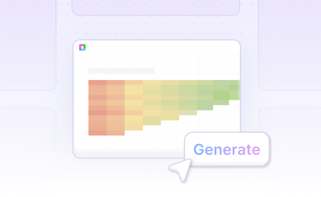
See how easy it is to generate Pyramid 3-D Column Chart with Sourcetable

What is a Pyramid 3-D Column Chart?
Pyramid 3-D Column Charts are specialized column or bar charts that utilize pyramid-shaped items to represent data. These charts do not add additional data but offer an enhanced visual appearance through their pyramid structure.
Visual Advantages of Pyramid 3-D Column Charts
The use of a pyramid shape provides a more appealing visualization of data compared to traditional column or bar charts. This design choice can help make data presentation more engaging and easier to understand.
Applications of Pyramid 3-D Column Charts
The 3D pyramid shape is versatile and can be employed in numerous visualization applications across various domains. It is particularly effective for presenting business strategies, vision/mission statements, goals, strategies, hierarchical structures, and assorted data sets.
Creating a Pyramid 3-D Column Chart
Excel is a popular tool for creating 3D Filled Pyramids Charts. These charts can be used to display KPI metrics such as Sales Conversion and Service Level across multiple categories on the horizontal axis. Incorporating a gradient fill can make the chart more visually attractive.
Examples of Pyramid 3-D Column Charts
Examples of Pyramid 3-D Column Charts include: a 3D Filled Pyramids Chart in Excel, a chart with multiple categories on the horizontal axis, and charts with gradient fill for each zone, all enhancing the visual appeal of the data displayed.
When to Use a Pyramid 3-D Column Chart
Overview
A Pyramid 3-D Column Chart is ideal for visualizing hierarchical data. It effectively displays proportional relationships, making it easier to compare multiple categories at different levels. Use it when you need to convey the differences in size or quantity between hierarchical groups.
Advantages
Pyramid 3-D Column Charts provide a visually appealing way to present data. The 3-D aspect enhances the perception of depth and volume. This type of chart facilitates quick comparisons and highlights changes across categories, making it useful for presentations and reports requiring visual impact.
Disadvantages
Despite their visual appeal, Pyramid 3-D Column Charts can sometimes distort data perception. The 3-D effect may introduce unnecessary complexity and make accurate interpretation difficult. These charts may not be suitable for precise data analysis or when exact values are critical.
Comparison with Other Charts
Compared to traditional bar or column charts, Pyramid 3-D Column Charts are more visually engaging but less precise. Standard bar charts offer clearer value representation and are easier to interpret. Line charts, on the other hand, are better for showing trends over time but do not depict hierarchical data effectively.
Usage Recommendations
Use Pyramid 3-D Column Charts for hierarchical data where visual appeal is important. Avoid them for precise data analysis or when clarity and accuracy are paramount. Consider traditional bar charts for clearer and more precise data representation.
How to Generate a Pyramid 3-D Column Chart with Sourcetable
- Generating a Pyramid 3-D Column Chart with Sourcetable is straightforward and efficient. Sourcetable, an AI spreadsheet, offers the simplest method for this task.
- To start, create sample data using Sourcetable's AI assistant or upload a CSV file. This ensures you have a dataset ready for visualization.
- Next, select the range of data you want to transform into a Pyramid 3-D Column Chart. This selection is crucial for accurate chart generation.
- Then, ask the AI assistant to generate the Pyramid 3-D Column Chart. This step utilizes AI to quickly convert your data into the desired chart format.
- Finally, use the AI assistant to refine or iterate on the Pyramid 3-D Column Chart. You can specify changes to formatting, labels, and other chart elements to ensure clarity and accuracy.
- By following these steps, you can create a Pyramid 3-D Column Chart manually like you would in Excel or Google Sheets, which we will detail in the next section.
Generating a Pyramid 3-D Column Chart in Excel or Google Sheets
Creating a 3-D Pyramid Column Chart in Excel
To create a 3-D Pyramid Column Chart in Excel, start by entering and selecting your data in a spreadsheet. Navigate to the Insert tab, click on Charts, and choose a 3-D chart type.
To customize the 3-D format, click on any chart element you wish to modify. Use the Format tab to adjust the 3-D format including applying different shape styles or effects like Bevel or Glow.
For additional formatting options, select Chart Layout or Chart Styles on the Chart Design tab. You can also apply a theme by selecting Themes on the Page Layout tab. To format specific chart components, use the Chart Elements dropdown on the Format tab and select Format Selection.
Creating a Pyramid Chart in Google Sheets
Although Google Sheets does not support Pyramid charts directly, you can modify a stacked bar chart to resemble a pyramid chart. This is a practical workaround given the limitations of the Google Visualization API.
Create a stacked bar chart with your data. Adjust the bar colors and positioning to visually simulate a pyramid effect. This approach allows you to achieve a pyramid-like display despite the absence of native support.
Use Cases for Visualizing Data with Pyramid 3-D Column Chart
Revenue Comparison |
Visualizing revenue data with a Pyramid 3-D Column Chart allows companies to easily compare financial performance across multiple periods. This method highlights growth trends and reveals seasonal patterns, enabling more informed financial planning and strategy development. |
Market Share Analysis |
Using a Pyramid 3-D Column Chart to display market share data helps businesses discern market positioning relative to competitors. This visualization can pinpoint leading players and reveal opportunities to capture a greater market share through targeted initiatives. |
Product Performance |
A Pyramid 3-D Column Chart for product performance data showcases which products are driving sales and which ones are underperforming. This insight aids in making promotional, development, and inventory management decisions to maximize profitability. |
Budget Allocation |
Visualizing budget allocation with a Pyramid 3-D Column Chart offers a clear overview of how resources are distributed across different departments or projects. This ensures stakeholders can easily identify overspending or underfunding, facilitating financial rebalancing and optimized resource use. |
Sales Distribution |
Displaying sales distribution data with a Pyramid 3-D Column Chart provides a clear picture of regional, demographic, or channel-specific sales performance. This helps businesses optimize their sales strategies by focusing on high-performing areas and improving low-performing ones. |
Performance Metrics |
A Pyramid 3-D Column Chart is effective for visualizing key performance metrics such as KPIs, conversion rates, or customer satisfaction scores. This allows teams to quickly assess performance against targets and identify areas requiring improvement. |
User Engagement |
Visualizing user engagement metrics, such as website visits, app downloads, or user activity, with a Pyramid 3-D Column Chart helps in tracking the effectiveness of digital marketing campaigns. This leads to better strategies for enhancing user interaction and retention. |
Frequently Asked Questions
How can I create a pyramid column chart using overlapping triangles?
To create a pyramid column chart using overlapping triangles, visualize each segment as a separate triangle that overlaps with others to form the full pyramid. Each layer represents a different data group.
What are the benefits of using Pyramid 3-D Column Charts in data visualization?
Pyramid 3-D Column Charts are beneficial for visualizing hierarchical data, large datasets by breaking them into smaller groups, and datasets focused on a single topic. They can be used to represent population demographics, historical trends, and income disparities.
What are the best practices for using Pyramid 3-D Column Charts?
Use pyramid shapes to present business strategies and plans, lay out problems and solutions, present hierarchy, and display data in a structured format.
How do Pyramid 3-D Column Charts help interpret data?
Pyramid 3-D Column Charts help interpret data by showing hierarchical structures, relative positions in data flows, categorizing items based on hierarchy, and representing sizes and quantities.
In what scenarios should Pyramid 3-D Column Charts be used?
Pyramid 3-D Column Charts should be used in business and education settings to visualize datasets on single topics, such as family tree data, and in cases where hierarchical structures need clear representation.
Conclusion
Throughout our guide, we've explored the Pyramid 3-D Column Chart, a visually impactful tool for data presentation. We covered how to efficiently generate these charts using AI-powered tools like Sourcetable, as well as the conventional methods available in spreadsheet programs like Excel and Google Sheets.
Sourcetable simplifies the process with its AI spreadsheet assistant, which assists users in creating a variety of charts and graphs, including the Pyramid 3-D Column Chart. For those preferring traditional methods, we detailed step-by-step instructions on creating these charts manually.
Ready to leverage AI for enhanced data visualization? Sign up for Sourcetable to generate your first Pyramid 3-D Column Chart effortlessly.
Recommended Guides
Connect your most-used data sources and tools to Sourcetable for seamless analysis.
Frequently Asked Questions
If your question is not covered here, you can contact our team.
Contact Us


