Generate a Pyramid Clustered Column Chart with AI
Create custom Pyramid Clustered Column Charts with Sourcetable AI. Generate data from scratch or upload your own to get started.
Introduction
Creating a Pyramid Clustered Column Chart can simplify complex data, making insights easier to discern. This visualization is feasible with AI-enhanced tools like Sourcetable or traditional spreadsheet applications such as Excel and Google Sheets. The choice of tool depends on your preference for automation and features.
Sourcetable leverages AI to streamline the chart creation process. It offers an AI spreadsheet assistant that not only assists in building charts but also enhances overall spreadsheet functionalities, making it a powerful tool for both beginners and seasoned users.
To start using this advanced AI-assisted feature or to learn more about creating Pyramid Clustered Column Charts with traditional methods, sign up for Sourcetable or continue reading for further details.
See how easy it is to generate Pyramid Clustered Column Chart with Sourcetable

What is a Pyramid Clustered Column Chart?
A Pyramid Clustered Column Chart is a type of chart used to represent data in an easy-to-understand format. Unlike regular charts, this chart type is shaped like a pyramid, making it visually distinctive.
Structure and Uses
Pyramid Clustered Column Charts are effective for comparing multiple series of data. They can be stacked on top of each other, facilitating the display of values rather than categories. This chart type is particularly useful for showing how a specific product is selling or representing data in a hierarchical structure.
Design and Implementation
To create a Pyramid Clustered Column Chart, start with a clustered bar chart and amend the layout to form a pyramid. Use two data series, making one series negative to achieve the pyramid shape. Ensure the series overlap is set to 100% and the gap width is slightly reduced so the bars are close together.
Benefits
Pyramid Clustered Column Charts are beneficial for visualizing large datasets by categorizing them into smaller groups. They effectively convey information about size and quantity in a clear, engaging manner.
Examples
An example of this is the "Total" series option with the Full Pyramid option, which creates a Clustered Column Chart with a Full Pyramid shape, illustrating the data in a compelling and structured way.
When to Use a Pyramid Clustered Column Chart
Overview
A Pyramid Clustered Column Chart is ideal for visualizing parts of a whole, especially when showcasing hierarchical or pyramid-like structures. Examples include organizational charts, population pyramids, or sales distribution across different levels.
Advantages
Compared to traditional column charts, a Pyramid Clustered Column Chart emphasizes the comparative size and hierarchy within data. This chart type provides an intuitive visual representation that highlights the relative proportion of categories and subcategories.
Disadvantages
While useful for hierarchical data, Pyramid Clustered Column Charts can become cluttered with too many categories. They are less effective for time series data or when fine detail comparison between many groups is required. In such cases, line charts or traditional column charts may be more suitable.
Comparison
In contrast to pie charts, Pyramid Clustered Column Charts offer a clear view of hierarchical relationships, but may be less effective in showing small differences between categories. Bar charts provide a straightforward view for comparing quantities but lack the hierarchical emphasis of pyramid charts.
Overall, selecting the appropriate chart depends on the specific data characteristics and the visualization objectives. For hierarchical representation, use Pyramid Clustered Column Charts judiciously to avoid overloading the viewer with information.
How to Generate a Pyramid Clustered Column Chart with Sourcetable
- Generating a Pyramid Clustered Column Chart with Sourcetable is straightforward. Sourcetable, an AI spreadsheet, simplifies the process significantly. While you can manually create charts as done in Excel or Google Sheets, using Sourcetable AI is the quickest and easiest method.
- First, create sample data using Sourcetable’s AI assistant or by uploading a CSV file. This initial data setup is crucial for chart generation. Ensure your data is properly formatted and contains the necessary values for accurate visualization.
- Next, select the range of data you wish to visualize. Highlight the dataset to specify which information will be included in the Pyramid Clustered Column Chart. Proper data selection ensures the chart accurately represents your information.
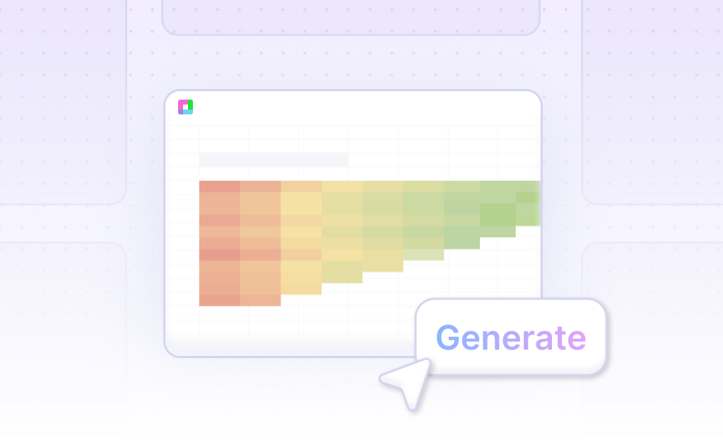
- Then, ask the AI assistant to generate the Pyramid Clustered Column Chart. This step leverages Sourcetable's AI capabilities, transforming your selected data into a visual chart efficiently. The AI handles the heavy lifting, creating a precise and clear chart.
- Lastly, refine or iterate on the chart using the AI assistant. Specify changes to formatting, labels, and other elements to tailor the chart to your needs. This customization step allows for adjustments that enhance clarity and presentation.
How to Generate a Pyramid Clustered Column Chart in Excel or Google Sheets
Creating a Pyramid Clustered Column Chart in Excel
To create a Full Pyramid Clustered Column Chart in Excel, start by creating a 3-D Clustered Column Chart. Click anywhere in the data, then go to the Insert tab and select the Column and Bar Chart drop-down. Choose the 3-D Clustered Column Chart option. In the Chart Format tab, use the Current Selection group to select Format Selection, or right-click the chart area and choose Format Chart Area.
In the Format Chart Area pane, navigate to the Chart Options drop-down. Select Series "Total" and then choose Series options. Check the Full Pyramid option to finalize the chart.
Creating a Pyramid Clustered Column Chart in Google Sheets
To make a Pyramid Clustered Column Chart in Google Sheets, begin by selecting the data to display. Click Insert and then Chart from the submenu. In the Chart Editor, change the chart type to Column Chart. Clustered column charts group vertical columns together because each data set shares the same axis labels, making it easy to directly compare data sets.
The Chart Editor in Google Sheets allows for extensive customization, including modifying the chart style, background color, and font to enhance the chart's visual appeal and readability.
Steps for Overlapping Data Series in PowerPoint
To create a Pyramid Clustered Column Chart in PowerPoint, start with a standard clustered bar chart. Set one of the data series to be negative to create the pyramid effect. Adjust the series to overlap, and display data in the negative bar as positive using custom number formatting for visual clarity.
Using these steps, you can efficiently generate Pyramid Clustered Column Charts in Excel, Google Sheets, or PowerPoint to compare data sets effectively and enhance your data presentation.
Use Cases for Visualizing Data with a Pyramid Clustered Column Chart
Compare Sales Performance Across Multiple Regions |
Using a Pyramid Clustered Column Chart allows businesses to compare sales performance across different regions efficiently. The visualization highlights regional strengths and weaknesses, enabling data-driven decisions to improve overall sales strategy. |
Analyze Market Segment Contributions |
A Pyramid Clustered Column Chart effectively displays the contributions of distinct market segments to the total sales. This helps businesses identify which segments are underperforming or overperforming, guiding marketing and resource allocation efforts. |
Monitor Year-over-Year Growth |
The visual layout of a Pyramid Clustered Column Chart is ideal for monitoring year-over-year growth. This visualization helps stakeholders quickly assess growth trends, allowing timely adjustments to business strategies and operations. |
Track Changes in Consumer Behavior |
Visualizing changes in consumer behavior over time with a Pyramid Clustered Column Chart provides insights into evolving customer preferences. Businesses can use this information to adapt product offerings and marketing approaches to better meet consumer needs. |
Evaluate the Effectiveness of Marketing Campaigns |
A Pyramid Clustered Column Chart can help measure the impact of various marketing campaigns. By comparing pre- and post-campaign data, businesses can determine the effectiveness of their marketing strategies and optimize future campaigns. |
Assess Budget Allocation Efficiency |
This chart type also assists in evaluating how efficiently budget allocations have been utilized. By visualizing expenditure across different departments or projects, businesses can identify areas for financial optimization and improved resource management. |
Product Performance Comparison |
Visualizing individual product performance using a Pyramid Clustered Column Chart allows businesses to compare the success of different products. This helps in making informed decisions about product development, inventory management, and marketing focus. |
Frequently Asked Questions
What are the benefits of using a Pyramid Clustered Column Chart?
Pyramids are a useful alternative to clustered bars when comparing two data series. They also help visualize data on a single topic, societal groups, historical trends, and income disparities.
What are common issues with Pyramid Clustered Column Charts?
Pyramid charts are difficult to read, inefficient at displaying data, and take up too much space relative to the amount of data they display. The thickness of the layers is not an effective way to convey data.
When should I use Pyramid Clustered Column Charts for data visualization?
Pyramid charts should be your go-to choice if you have a small amount of data focused on one specific topic or if you need to categorize large datasets into smaller groups. They are also good for visualizing hierarchical data.
How do stacked pyramid charts differ from standard pyramid charts?
A stacked pyramid chart has values stacked on top of each other, typically by level of hierarchy. They are good for showing values and trends rather than categories, similar to bar and column charts.
What are better alternatives to Pyramid Clustered Column Charts?
Column or line charts are better alternatives as they clearly show how each bar changes over time and are more effective at clarifying data.
Conclusion
In this guide, we explored the Pyramid Clustered Column Chart, detailing what it is and how it can visually enhance your data representation. We discussed the use of AI in Sourcetable to streamline the creation process, as well as methods for generating this type of chart using traditional spreadsheet tools like Excel and Google Sheets.
Sourcetable simplifies complex data tasks with its AI-powered spreadsheet assistant, allowing both novices and experienced users to efficiently produce diverse charts and graphs. By comparing AI-driven and traditional approaches, we highlighted how Sourcetable's AI assistant markedly reduces the effort and increases the precision in making a Pyramid Clustered Column Chart.
Ready to transform your data visualization techniques? Sign up for Sourcetable and create your first Pyramid Clustered Column Chart with ease.
Recommended Guides
Connect your most-used data sources and tools to Sourcetable for seamless analysis.
Frequently Asked Questions
If your question is not covered here, you can contact our team.
Contact Us


