Generate a Clustered Column Chart with AI
Create custom Clustered Column Charts with Sourcetable AI. Generate data from scratch or upload your own to get started.
Introduction
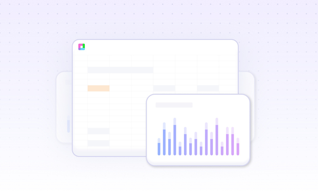
Creating a Clustered Column Chart can substantially enhance data visualization, whether you opt for an AI-driven tool like Sourcetable or traditional spreadsheet programs such as Excel and Google Sheets. Sourcetable simplifies complex data tasks with its AI spreadsheet capabilities, enabling users to quickly generate charts, including detailed Clustered Column Charts. This AI assistant not only facilitates the creation of templates and graphs but also guides users through each step, making the process intuitive and user-friendly.
For those familiar with traditional spreadsheet tools, the process of chart generation remains straightforward but manual. Users of Excel or Google Sheets need to input data, set up the correct chart type, and adjust various settings to achieve a similar output as Sourcetable's AI-enhanced method.
Whether you are a beginner eager to dive into the world of data or an experienced user seeking to leverage AI for more sophisticated chart-making, Sourcetable offers a compelling solution. Sign up for Sourcetable to generate your first Clustered Column Chart or keep reading to find more detailed information on both methods.
See how easy it is to generate Clustered Column Chart with Sourcetable

What is a Clustered Column Chart?
Definition
A clustered column chart is a type of vertical bar chart that includes a group of bars for every primary category. It allows subcategories to be charted, enabling multiple dimensions of data to be visualized. This chart type is ideal for comparing multiple series of data, offering deeper comparative analysis than regular bar charts.
Key Features
Clustered column charts are effective for comparative analysis. They visualize large, complex datasets with ease, providing more details than standard bar graphs. These charts group vertical columns together, as each data set shares the same axis labels, making them suitable for directly comparing data sets.
Uses in Data Visualization
Clustered column charts are versatile visualization tools, effective for measuring data over time and comparing performance before, during, and after particular events or processes. They can highlight peaks and valleys in performance and track growth over time. When basic chart types do not provide enough detail, clustered column charts offer a detailed alternative.
Benefits
Clustered column charts provide more value and insight to visual analysis by allowing comparisons across many related categories. They help in understanding complex datasets, comparing competitor strategies, and determining the best and worst items in a dataset. This chart type allows for deep comparative analysis, making it a superb choice for data visualization.
When to Use a Clustered Column Chart
Overview
A Clustered Column Chart is ideal for comparing multiple data series grouped by category. It is particularly useful in highlighting variations in data over discrete intervals of time. This type of chart visually segments data categories, making it easier to analyze differences and trends.
Pros of Clustered Column Charts
Clustered Column Charts effectively display multiple data series, allowing for straightforward comparison. They are intuitive and easy to interpret, making them a popular choice for presentations. The clear visualization of data categories helps in quick comprehension and decision-making.
Cons of Clustered Column Charts
These charts can become cluttered with too many data series, reducing readability. They may not effectively convey patterns in large datasets. Additionally, the visual impact may be lessened when dealing with small variations in data values.
Comparison with Other Charts
Compared to Line Graphs, Clustered Column Charts are better for categorical data but less effective at showing trends over continuous intervals. Unlike Pie Charts, they can display more than one data series, but Pie Charts are better for representing parts of a whole. Bar Charts are similar but usually better for horizontal data comparisons, while Clustered Column Charts provide a vertical perspective.
Conclusion
Use Clustered Column Charts for comparing multiple data series across categories. They are a strong choice for presenting clear, categorical data but can be less effective with large datasets or small data variations.
How to Generate a Clustered Column Chart with Sourcetable
- Generating a Clustered Column Chart with Sourcetable is straightforward and efficient. Sourcetable, an AI-powered spreadsheet, offers the easiest method to create these charts. Start by creating sample data using Sourcetable's AI assistant or upload a CSV file containing your data.
- Next, select the range of data you want to turn into a Clustered Column Chart. With your data selected, you can ask the AI assistant to generate the chart for you. This process is quick and eliminates the need for manual chart creation as seen in Excel or Google Sheets.
- Finally, refine and iterate on your Clustered Column Chart using the AI assistant. You can specify changes to formatting, labels, and other chart elements to ensure the final visualization meets your requirements. Sourcetable's AI makes this process seamless and user-friendly.
How to Generate a Clustered Column Chart
In Excel
To create a Clustered Column Chart in Excel, start by organizing your data. Select the data you wish to visualize. Go to the ribbon and choose Create > Form Design. Click Insert Chart > Column > Clustered Columns. Click a spot on the Form Design grid to place your chart. In the Chart Settings pane, pick your query and set the Axis (Category) to "Quarter". Set the Values (Y Axis) to "East Asia Sales 2017 (Sum)" and "East Asia Sales 2018 (Sum)".
Once your chart is inserted, add a title and legends. Customize your chart as needed for clarity and visual appeal. Analyzing the chart will then provide insights into your data trends and variances.
In Google Sheets
To generate a Clustered Column Chart in Google Sheets, begin by entering and selecting your data. Click on Insert in the main menu, then choose Insert > Chart. The Chart Editor panel will appear on the right. Change the chart type to Column Chart. Your new chart will appear in the worksheet.
Customize the chart labels, add a title, and move the legend to the bottom if desired. Further adjust chart elements and formatting to enhance readability and presentation effectiveness. This visual tool will help convey data insights efficiently.
Use Cases of Visualizing Data with a Clustered Column Chart
Comparing Sales Performance Across Regions |
Clustered Column Charts allow businesses to effectively compare sales performance across multiple regions. By representing sales data as vertical bars grouped by region, stakeholders can easily identify which areas are performing well and which need improvement. |
Tracking Monthly Revenue Streams |
Organizations can track monthly revenue streams using Clustered Column Charts. By displaying revenue data month by month, businesses can observe trends over time and make informed decisions about future financial strategies. |
Analyzing Product Category Popularity |
Clustered Column Charts help businesses analyze the popularity of different product categories. By visualizing sales data for each category side by side, companies can identify top-performing products and adjust inventory or marketing efforts accordingly. |
Comparing Yearly Performance Metrics |
Clustered Column Charts enable the comparison of yearly performance metrics such as sales, profits, or customer growth. This visualization aids in recognizing yearly patterns and acting on areas that require attention. |
Evaluating Marketing Campaign Effectiveness |
By visualizing the outcomes of different marketing campaigns, businesses can evaluate which strategies generated the highest returns. Clustered Column Charts highlight the comparative success of each campaign efficiently. |
Monitoring Departmental Expenses |
Clustered Column Charts allow businesses to monitor departmental expenses. By tracking spending across departments, financial managers can identify areas of overspending and allocate resources more effectively. |
Comparing Employee Performance |
Using Clustered Column Charts to compare employee performance metrics helps managers identify high achievers and those who may need additional support or training. This visualization supports objective performance evaluations. |
Frequently Asked Questions
How can I group the clusters of a clustered column chart to show the same months of different years?
To group the clusters for the same months of different years, adjust your data series so that each cluster represents a specific month across years.
How can I compare months of different years using a clustered column chart?
You can compare months of different years by ensuring your data is organized such that each column represents a month, and the clustered columns signify different years for that month.
Can I use a clustered column chart to compare data from two different queries?
Yes, you can use a clustered column chart to compare data from two different queries by plotting each query as a separate data series within your chart.
What are the best practices for using a clustered column chart?
Best practices include maintaining a zero-baseline, ordering bars from largest to smallest, ignoring divisions of other categorical variables when making size judgments, and choosing effective colors.
Why should I use a clustered column chart for data visualization?
Clustered column charts are excellent for comparative analysis, visualizing large datasets, measuring data over time, and presenting complex data in an accessible and understandable manner.
Conclusion
In this guide, we explored the essentials of creating a Clustered Column Chart. We covered both the traditional methods using spreadsheet programs like Excel and Google Sheets, and the modern AI-driven approach with Sourcetable. The latter simplifies the process significantly through its AI assistant, which helps even novices quickly master spreadsheet functionalities.
The ease of generating Clustered Column Charts with Sourcetable’s AI-driven features underscores its value for any data analysis task. Combining AI capabilities with user-friendly controls, it empowers users to efficiently transform data into actionable insights. This approach not only saves time but enhances accuracy and creativity in data presentation.
To begin leveraging the full potential of your data with seamless chart creation, sign up for Sourcetable and generate your first Clustered Column Chart today. Visit Sourcetable Sign Up.
Recommended Guides
Connect your most-used data sources and tools to Sourcetable for seamless analysis.
Frequently Asked Questions
If your question is not covered here, you can contact our team.
Contact Us


