Generate a Cylinder Clustered Column Chart with AI
Create custom Cylinder Clustered Column Charts with Sourcetable AI. Generate data from scratch or upload your own to get started.
Introduction
Visual data representation enhances comprehension and communication in many fields. A Cylinder Clustered Column Chart serves as an effective tool for displaying data variations across multiple categories. This type of chart is invaluable for comparative analysis.
Creating such charts has traditionally involved manual work in spreadsheet programs like Excel or Google Sheets. However, with the advent of AI-driven platforms like Sourcetable, the process has become more accessible and user-friendly. Sourcetable's AI capabilities, including an AI spreadsheet assistant, empower users, facilitating the creation of complex charts and graphs effortlessly.
Whether you're a novice or a seasoned spreadsheet user, Sourcetable caters to all skill levels. Sign up for Sourcetable to generate your first Cylinder Clustered Column Chart here or continue reading for more detailed instructions on using both AI and traditional methods.
See how easy it is to generate Cylinder Clustered Column Chart with Sourcetable

What is a Cylinder Clustered Column Chart?
A Cylinder Clustered Column Chart, also known as a Cylinder Chart, is a type of column chart used to represent data. It uses cylindrical shapes instead of the traditional rectangular bars to offer a different visual aesthetic.
This chart type is particularly effective for comparative analysis, as it provides insight by allowing the comparison of data across multiple series. Its design adds more dimensions to the data, facilitating a deeper analysis and a more detailed understanding of large datasets.
Besides being visually appealing, Cylinder Clustered Column Charts can also be stacked, further enhancing their utility in representing complex datasets. They are suitable for comparing data across many related categories, making them a versatile tool for various analytical needs.
When to Use a Cylinder Clustered Column Chart
Ideal Use Cases
Use a Cylinder Clustered Column Chart when you need to compare data across categories with a visual emphasis on volume. This type of chart is effective for showing differences in magnitudes without requiring precise numerical values.
Pros and Cons
Advantages
The 3D effect of Cylinder Clustered Column Charts can make data more visually appealing and easier to understand for lay audiences. They effectively highlight contrasts between groups, making them suitable for presentations and reports where impact is essential.
Disadvantages
However, Cylinder Clustered Column Charts can sometimes distort data perception due to their 3D nature. They can be less precise in displaying exact values compared to traditional column charts, potentially leading to misinterpretation.
Comparison with Other Charts
While traditional column charts offer clearer data interpretation, they may lack the visual appeal of cylindrical columns. Bar charts are more effective for horizontal data comparison but lack the volume representation of cylindrical columns. Line charts show trends over time better but do not emphasize individual category comparisons like Cylinder Clustered Column Charts.
How to Generate a Cylinder Clustered Column Chart with Sourcetable
- Generating a Cylinder Clustered Column Chart with Sourcetable is simple and efficient. Sourcetable, an AI spreadsheet, offers the easiest method to create these charts.
- First, create sample data using Sourcetable's AI assistant or upload a CSV. This ensures you have the necessary data for your chart. Next, select the range of data you want to turn into a Cylinder Clustered Column Chart. Precise data selection is crucial for accurate chart representation.
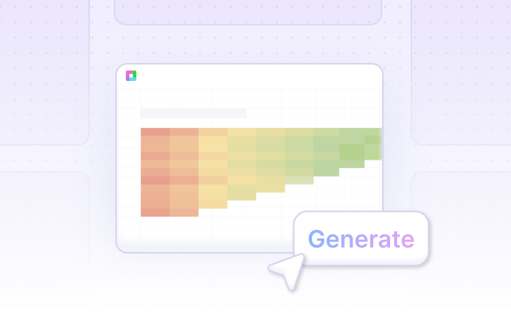
- Then, ask the AI assistant in Sourcetable to generate the Cylinder Clustered Column Chart. This step leverages Sourcetable's AI capabilities to quickly create the desired chart format. Finally, use the AI assistant to refine or iterate on the Cylinder Clustered Column Chart by specifying changes to formatting, labels, and other details.
- The ability to create and customize charts using Sourcetable's AI streamlines the process, making it faster and more intuitive compared to manual methods in Excel or Google Sheets, which we discuss in the next section.
How to Generate a Cylinder Clustered Column Chart in Excel and Google Sheets
Creating a Cylinder Clustered Column Chart in Excel
To create a Cylinder Clustered Column Chart in Excel 2013, begin by inserting a 3D rectangle chart. While Excel 2013 removed the option to directly insert a 3D cone, pyramid, or cylinder chart, you can still achieve the desired visual.
First, create a clustered bar chart. Double-click the bars in the chart. In the panel on the right, select the Series menu. Choose the Cylinder option to transform your bars into cylinders.
Creating a Cylinder Clustered Column Chart in Google Sheets
In Google Sheets, select the data you want to display in the chart. Click on the Insert option in the main menu, then select the Chart option from the submenu. The Chart Editor panel will appear on the right side of the worksheet, and Google Sheets will default to a recommended chart type.
Change the chart type to a Column Chart. This will arrange your data into vertical clustered columns. Customize the chart further by adding chart elements and formatting within the Chart Editor panel.
Steps to Create a Column Chart in Google Sheets
Select the data to display in the column chart. Click on the Insert menu and then on Chart. Once the Chart Editor panel appears, change the chart type to Column Chart. The new clustered column chart will appear on your worksheet.
Use this visual to compare data sets effectively, as it allows each data set to share the same axis labels, thus facilitating direct comparison.
Use Cases Unlocked by Visualizing Data with a Cylinder Clustered Column Chart
Comparing Sales Performance Across Different Regions |
A Cylinder Clustered Column Chart enables businesses to compare sales performance across multiple regions effectively. By visualizing the data, companies can quickly identify which regions are outperforming others, leading to strategic decisions for resource allocation and market focus. |
Evaluating Yearly Trends in Customer Growth |
Organizations can use a Cylinder Clustered Column Chart to evaluate trends in customer growth over several years. This visualization helps in understanding growth patterns, forecasting future growth, and developing targeted strategies to enhance customer acquisition and retention. |
Monitoring Monthly Revenue Streams |
Businesses can monitor their monthly revenue streams efficiently using a Cylinder Clustered Column Chart. This chart type allows stakeholders to compare month-over-month revenue figures, making it easier to detect seasonal trends, anomalies, and overall financial health. |
Analyzing Product Category Performance |
By utilizing a Cylinder Clustered Column Chart, companies can analyze the performance of different product categories. This aids in identifying high-performing products and those that may need discontinuation or promotion, thereby optimizing the product portfolio |
Visualizing Project Timelines and Progress |
Project managers can leverage Cylinder Clustered Column Charts to visualize project timelines and progress. This application helps in tracking the completion status of various project phases and tasks, ensuring project milestones are met and deadlines adhered to. |
Frequently Asked Questions
Is it possible to add a line displaying the average value on a Clustered Cylinder Graph?
Yes, to add a line displaying the average value, add a new series using the =AVERAGE($B$1:$B$7) function and select 'line' as the chart type for the new series.
Can you mix 3D (cylinder) and 2D (line) series on the same chart?
No, you cannot mix 3D (cylinder) and 2D (line) series directly. Bars can be used instead of cylinders to combine the two.
What can be used instead of cylinders to combine 3D (cylinder) and 2D (line) series on the same chart?
Bars can be used instead of cylinders to combine the two.
What are the visualization strengths of cylinder charts?
The best visualization of cylinder charts is in 3D mode. Cylinder charts can be stacked and clustered by the Z axis.
Why use clustered column charts for data visualization?
Clustered column charts provide more insight by allowing you to compare data across multiple series. They are perfect for comparative analysis, versatile, and excellent for tracking comparisons over time.
Conclusion
Throughout this guide, we explained the Cylinder Clustered Column Chart and its significance in data visualizations. We explored two methods for generating this type of chart: utilizing the AI capabilities of Sourcetable and employing traditional spreadsheet programs like Excel and Google Sheets. Both approaches offer flexibility depending on the user's preference and technological comfort.
Utilizing Sourcetable's AI spreadsheet assistant simplifies complex data manipulation into a straightforward process, enabling any user to quickly become proficient in creating detailed and visually appealing charts. On the other hand, traditional spreadsheets also provide robust tools, but they may require more manual input and a stronger grasp of data functions.
To experience the ease of generating a Cylinder Clustered Column Chart and explore more spreadsheet possibilities, sign up for Sourcetable today.
Recommended Guides
Connect your most-used data sources and tools to Sourcetable for seamless analysis.
Frequently Asked Questions
If your question is not covered here, you can contact our team.
Contact Us


