Generate a 3-D Clustered Column Chart with AI
Create custom 3-D Clustered Column Charts with Sourcetable AI. Generate data from scratch or upload your own to get started.
Introduction
Creating a 3-D Clustered Column Chart helps visualize complex data effectively, whether you use AI tools like Sourcetable or traditional spreadsheet programs such as Excel and Google Sheets. Sourcetable enhances this process by integrating AI, making it accessible for users at any skill level to create powerful data visualizations.
Sourcetable's AI spreadsheet assistant can aid in quickly generating templates, charts, and graphs with minimal effort. This feature simplifies the creation of 3-D Clustered Column Charts by automating data arrangement and visualization tasks that typically require extensive manual input in conventional spreadsheet software.
To experience this blend of simplicity and power, sign up for Sourcetable to generate your first 3-D Clustered Column Chart or continue reading for more detailed information on traditional and AI-enhanced data visualization methods. Sign up here.
See how easy it is to generate 3-D Clustered Column Chart with Sourcetable

What is a 3-D Clustered Column Chart?
A 3D clustered column chart is a type of chart that visualizes the values of multiple numeric variables by using 3-D bars. These bars are clustered by a categorical variable, allowing for effective comparison across multiple data series.
Key Features
3-D clustered column charts display data using a 3-D perspective, distinguishing them from standard column charts which show data in 2-D. Although these charts use a 3-D visualization, they do not incorporate a depth axis.
Use Cases
These charts are particularly effective for visualizing large datasets, measuring data over time, and comparing data across multiple series. They are also beneficial when assessing performance before, during, and after events.
Applications
In practical applications, 3-D clustered column charts can be used to compare sales data, track changes over time, and visualize complex datasets in a clear and insightful manner. They excel in providing more insights than standard bar charts, making them a valuable tool for various analytical tasks.
When to Use a 3-D Clustered Column Chart
Overview of 3-D Clustered Column Charts
A 3-D Clustered Column Chart is ideal for visualizing data across different categories and comparing values side-by-side. This chart highlights individual data points while maintaining clarity for detailed comparison.
Pros of 3-D Clustered Column Charts
This chart type offers clear visual differentiation between data sets, making it easier to compare multiple values. The 3-D effect adds a visual appeal that can enhance presentations and reports.
Cons of 3-D Clustered Column Charts
However, the 3-D aspect can sometimes distort data interpretation. When angles or perspectives are altered, it may become challenging to determine exact values.
Comparison with Other Charts
Compared to 2-D column charts, 3-D Clustered Column Charts are visually more engaging but can be harder to read accurately. Line charts, which show trends over time, might be better for temporal data, while pie charts are preferable for showing parts of a whole.
Conclusion
Use 3-D Clustered Column Charts for visually appealing presentations where exact precision is not critical. For precise data analysis or when accuracy is crucial, opt for simpler chart types like 2-D column or line charts.
How to Generate a 3-D Clustered Column Chart with Sourcetable
- Using Sourcetable's AI spreadsheet, generating a 3-D Clustered Column Chart is simple and efficient. Sourcetable AI provides the most straightforward method.
- First, create sample data using Sourcetable's AI assistant or upload a CSV file. This step ensures you have the data you need in place.
- Next, select the specific range of data you want to convert into a 3-D Clustered Column Chart. Accurate selection is crucial for a precise and meaningful chart.
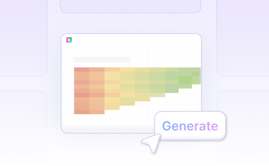
- Then, ask the AI assistant to generate the 3-D Clustered Column Chart. The AI will promptly create the chart based on your selected data range.
- Finally, use the AI assistant to refine the chart. Specify changes to formatting, labels, and other aspects to enhance the chart's clarity and appearance.
- This method is efficient, SEO-optimized, and ideal for creating detailed 3-D Clustered Column Charts effortlessly.
How to Generate a 3-D Clustered Column Chart in Excel or Google Sheets
Creating a 3-D Clustered Column Chart in Excel
To generate a 3-D Clustered Column Chart in Excel, start by selecting the cells that contain your chart data. Next, open the Insert tab and click on Charts. From the options available, choose a 3-D chart type to visualize your data.
Another method involves selecting your data range, navigating to Insert and clicking the Column Chart Icon. Then, select the 3-D Clustered Column option from the 3D Column header. Excel will automatically plot your data in a 3-D clustered column format.
For a more step-by-step approach, open Excel and select your data. Click the Insert tab and then Charts. Choose a 3-D chart from the category offering both 2-D and 3-D options.
Creating a 3-D Clustered Column Chart in Google Sheets
To create a 3-D Clustered Column Chart in Google Sheets, start by formatting your data correctly. Place labels in the first column, which will appear on the horizontal axis. The first row is optional but can contain category names that will be shown in the legend.
Enter numeric data in the subsequent columns and ensure each row represents a different bar in the chart. Use a column chart to compare categories of data or to track changes over time, such as comparing monthly revenue and expenses.
Clustered columns in Google Sheets help compare data sets directly, utilizing the same axis labels for each data set. This method is detailed in tutorials that also guide users in editing the chart post-creation.
Following these guides ensures a seamless process for creating 3-D Clustered Column Charts in both Excel and Google Sheets, allowing for effective data visualization and analysis.
Use Cases Unlocked by Visualizing Data Using a 3-D Clustered Column Chart
Comparing Multiple Data Sets |
Visualizing data using a 3-D Clustered Column Chart enables the simultaneous comparison of multiple data sets. This is crucial for identifying trends and patterns across different categories, providing a clear visual representation of variances and relationships. |
Enhancing Data Presentation |
3-D Clustered Column Charts enhance data presentation by making complex data more accessible and understandable. The three-dimensional aspect adds depth and perspective, allowing stakeholders to grasp key insights quickly and effectively during presentations. |
Identifying Outliers |
Using 3-D Clustered Column Charts helps in easily identifying outliers and anomalies in the data. This visualization method makes unusual data points stand out, prompting further investigation and facilitating more accurate data analysis and decision-making. |
Facilitating Financial Analysis |
Financial analysts benefit from 3-D Clustered Column Charts by examining revenue, expenses, and profits across different time periods or business segments. These charts provide clear visual comparisons, aiding in understanding financial performance and trends over time. |
Supporting Market Research |
Market researchers use 3-D Clustered Column Charts to analyze consumer behavior, sales performance, and market share. This data visualization helps in comparing various demographic groups and product categories, providing insights for strategic planning. |
Improving Project Management |
Project managers leverage 3-D Clustered Column Charts to track project timelines, resource allocation, and task completion rates. This visualization tool helps in maintaining clarity on project progress, ensuring efficient workflow and timely delivery. |
Enhancing Educational Tools |
Educators and trainers use 3-D Clustered Column Charts to illustrate complex concepts in an engaging manner. This visualization technique aids in simplifying and explaining multifaceted information, making it easier for students to comprehend and retain knowledge. |
Frequently Asked Questions
What is a 3D clustered column chart?
A 3D clustered column chart visualizes multiple numeric variables using 3D bars and clusters them by a categorical variable.
How do you create a 3D clustered column chart in Excel?
To create a 3D clustered column chart in Excel, select your data, go to the 'Insert' tab, choose 'Column or Bar Chart,' and then select '3-D Clustered Column.'
How do you customize a 3D clustered column chart?
You can customize a 3D clustered column chart by changing the 3-D format, rotation, and scaling of the chart. Additionally, using transparency can improve the visibility of smaller data markers hidden behind larger ones.
How do you interpret a 3D clustered column chart?
In a 3D clustered column chart, the y-axis typically shows numeric values like sales, while the x-axis shows categorical variables such as different regions. The 3D bars represent multiple numeric variables clustered by the categorical variable.
Conclusion
Throughout this guide, we've explored the essentials of creating a 3-D Clustered Column Chart, highlighting the processes involved when using AI-enhanced tools like Sourcetable, as well as traditional spreadsheet applications such as Excel and Google Sheets. We've detailed the advantages of leveraging Sourcetable's AI features, which simplify the creation of complex charts by assisting users in crafting visually impactful data presentations without the need for extensive spreadsheet skills.
Whether you are a novice looking to delve into the realm of data visualization or a seasoned professional seeking to streamline your workflow, the guidance provided here should equip you with the knowledge needed to effectively generate 3-D Clustered Column Charts. For an even more intuitive and efficient experience, consider using Sourcetable’s AI capabilities to enhance your data handling and visualization strategies.
Ready to transform your data into stunning visualizations with ease? Sign up for Sourcetable and create your first 3-D Clustered Column Chart today by visiting https://app.sourcetable.com/signup.
Recommended Guides
Connect your most-used data sources and tools to Sourcetable for seamless analysis.
Frequently Asked Questions
If your question is not covered here, you can contact our team.
Contact Us


