Generate a Clustered Bar Chart with AI
Create custom Clustered Bar Charts with Sourcetable AI. Generate data from scratch or upload your own to get started.
Introduction
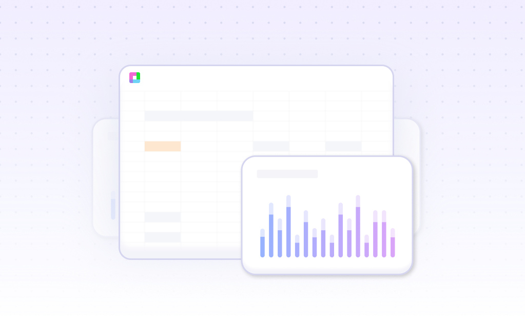
Creating a Clustered Bar Chart can be complex, whether using AI tools or traditional spreadsheet programs. A Clustered Bar Chart visually displays data, making it easier to compare sets of quantitative information across categories. Tools like Sourcetable, an AI spreadsheet program, streamline this process.
Sourcetable simplifies the creation of complex data visualizations by integrating AI assistance directly within its spreadsheet interface. This AI assistant can help users generate any spreadsheet feature, including templates, charts, and graphs. For those who are less familiar with spreadsheet mechanics, Sourcetable is particularly valuable.
To experience the benefits of an AI-driven approach in spreadsheet management, consider signing up for Sourcetable to create your first Clustered Bar Chart. For more traditional methods using Excel or Google Sheets, continue reading. Sign up here.
See how easy it is to generate Clustered Bar Chart with Sourcetable

What is a Clustered Bar Chart?
A Clustered Bar Chart is a type of bar chart used to visualize data and compare multiple independent variables. It allows for meaningful comparisons within and across categories, presenting multiple data series using grouped bars.
Features of a Clustered Bar Chart
In a Clustered Bar Chart, each cluster of bars represents a top-level category. The smaller subcategories within each cluster are the same across each grouping, allowing for comprehensive comparisons.
Advantages of a Clustered Bar Chart
Clustered Bar Charts are ideal for cross-comparing results across multiple categories. They provide more dimensions and detail than regular bar graphs, making them effective for visualizing large, complex datasets and tracking data over time.
Comparative Analysis with Clustered Bar Charts
These charts are particularly useful for comparative analysis, showing how data fluctuates over different periods and the impact of controllable and uncontrollable factors on performance. They allow for deeper and more flexible comparative analysis.
Use Cases and Examples
Clustered Bar Charts are versatile and can be used in various scenarios, such as tracking sales for different products over time or comparing survey responses across departments. Examples include quarterly sales data across product lines and tracking performance trends over time.
When to Use a Clustered Bar Chart
Overview
A clustered bar chart, also known as a grouped bar chart, is used to compare multiple categories of data across different subgroups. It is ideal for visualizing the distribution and relationships among discrete or categorical data points.
Pros of Clustered Bar Charts
Clustered bar charts allow for easy comparison between different groups. Multiple datasets can be displayed in a single graph, making it clear to see how subgroups compare within categories. They are effective for showing part-to-whole relationships and making data patterns evident.
Cons of Clustered Bar Charts
Clustered bar charts can become cluttered and hard to read if too many categories or groups are included. They may also lead to visual confusion when comparing numerous subgroups, making it difficult to discern specific trends or differences.
Comparison with Other Graphs
Compared to stacked bar charts, clustered bar charts provide a clearer comparison between individual subcategories, though they may be less effective at showing overall totals. Line charts are better suited for continuous data and trends over time, while clustered bar charts are optimal for discrete comparisons. Pie charts summarize part-to-whole relationships for a single category, but lack the depth of comparison across multiple groups that clustered bar charts offer.
How to Generate a Clustered Bar Chart with Sourcetable
- Generating a Clustered Bar Chart with Sourcetable, an advanced AI spreadsheet, is quick and easy. Sourcetable offers two methods: using the AI assistant or creating it manually, akin to Excel or Google Sheets. This section covers the AI-assisted method for its simplicity and efficiency.
- First, create sample data using Sourcetable's AI assistant or upload a CSV file. Ensure your data is well-organized for best results. Next, select the range of data you wish to visualize. Accurate selection is crucial for generating a meaningful chart.
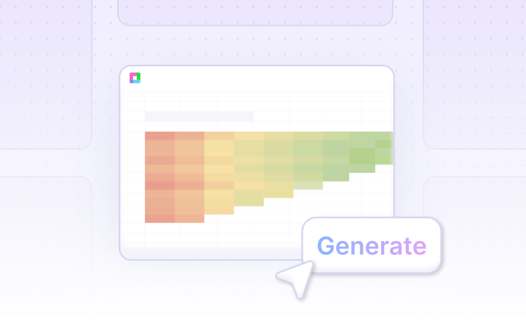
- After selecting your data, ask the AI assistant to generate the Clustered Bar Chart. This step is straightforward and user-friendly, eliminating the need for extensive formatting knowledge. The AI swiftly creates the chart based on your data.
- Finally, refine or iterate on your Clustered Bar Chart by specifying changes to formatting, labels, and other elements using the AI assistant. Tailor your chart to meet specific requirements and enhance clarity.
- Utilize Sourcetable’s AI capabilities to streamline the creation of Clustered Bar Charts, making data visualization both simple and effective.
How to Generate a Clustered Bar Chart in Excel and Google Sheets
Creating a Clustered Bar Chart in Excel
To create a clustered bar chart in Excel, begin by selecting the data you want to display in the chart. Click the "Insert" tab on the ribbon. Next, click the "Column" symbol in the Charts group. Within the Charts section, click the "Insert Column or Bar Chart" button. From the window that appears, select the "Clustered Column" button.
For further customization, click on the chart and use the "Chart Settings" pane. In this pane, you can choose the query for your chart under the "Queries" section. Adjust the axis options in the Axis (Category) and Values (Y Axis) sections. If necessary, edit the Display Name to trim text on the chart. Finally, set the "Has Title" option to "No" to remove the chart title.
Creating a Clustered Bar Chart in Google Sheets
To create a clustered bar chart in Google Sheets, start by selecting the data you wish to include. Click the "Insert" option from the main menu and then choose "Chart" from the submenu. In the Chart Editor that appears, go to the Setup Tab and change the Chart type to "Bar Chart." The chart type initially defaults to the type recommended by Google Sheets for the selected data.
You can further fine-tune the chart by adding chart elements and formatting the chart to meet your needs. Clustered bar charts are ideal for comparing multiple data sets displayed in horizontal bars.
Benefits of Using Clustered Bar Charts
Clustered bar charts, whether created in Excel or Google Sheets, provide a clear visualization of data by displaying multiple series in horizontal bars. They are particularly useful for direct comparisons between different data sets.
Use Cases Unlocked by Visualizing Data Using a Clustered Bar Chart
Sales Comparisons Across Different Regions |
A clustered bar chart is ideal for comparing sales data across multiple regions. By grouping bars by region and using different colors for each item or category, businesses can quickly identify which regions are performing well and which need attention. |
Performance Analysis Over Time |
Visualizing data using a clustered bar chart enables businesses to compare performance metrics over time. By displaying clustered bars for different time periods, such as months or quarters, trends can be easily spotted and analyzed for patterns or seasonality. |
Market Share Distribution |
Clustered bar charts can effectively display the market share distribution between different competitors. By clustering bars representing each competitor's share side-by-side, it becomes straightforward to see market dominance and competition dynamics. |
Budget Allocation Insights |
A clustered bar chart can be used to visualize how budget allocations differ across departments or projects. Grouping bars by department or project and highlighting categories of expenses provides a clear view of spending trends and potential areas for cost optimization. |
Product Performance Comparison |
Businesses can use clustered bar charts to compare the performance of different products. By visualizing sales, growth, or customer feedback for each product side-by-side, companies can determine which products are succeeding and which may need improvement. |
Employee Performance Evaluation |
Human resources can utilize clustered bar charts to evaluate employee performance across different teams or departments. By comparing metrics such as productivity, efficiency, and attendance, it becomes easier to recognize high-performing employees and areas needing development. |
Frequently Asked Questions
What is a clustered bar chart?
A clustered bar chart, also known as a grouped bar chart or multi-series bar chart, is a type of bar chart that extends the bar chart by plotting numeric values for levels of two categorical variables instead of one. This allows for deeper analysis and comparison within groups and between groups.
What are the benefits of using a clustered bar chart?
Clustered bar charts allow for within-group comparisons by systematically plotting bars within each group. They also facilitate between-group comparisons by using consistent colors and orders for each secondary variable level. Clustered bar charts are flexible and can accommodate growing data, making them ideal for comparative analysis.
How can I create a clustered bar chart in Excel?
To create a clustered bar chart in Excel, it is recommended to use a clustered bar graph maker add-in such as ChartExpo. ChartExpo is an easy and fast way to make professional charts and is available for both Excel and Google Sheets. It allows you to create a clustered bar chart in just a few clicks.
What are some best practices for using clustered bar charts effectively?
Best practices for using clustered bar charts effectively include using a zero-baseline, ordering categories from largest to smallest, using consistent ordering of bars across groups, ordering bars within groups if appropriate, and choosing effective colors.
Are clustered bar charts suitable for comparing totals across levels of individual categorical variables?
No, clustered bar charts are not well suited for comparing totals across levels of individual categorical variables. Instead, using a standard bar chart or a stacked bar chart is better for this purpose. Clustered bar charts are more appropriate for showing distributions of data points or making comparisons across different categories of data.
Conclusion
In this guide, we explored the fundamentals and construction of Clustered Bar Charts. We covered methods to create these charts using AI-driven tools like Sourcetable and traditional spreadsheet programs such as Excel and Google Sheets. While traditional programs require manual data manipulation and chart customization, Sourcetable simplifies and accelerates this process with its AI assistant.
For those looking to leverage the power of artificial intelligence for efficient and compelling data visualization, Sourcetable offers a robust solution. Sign up today and explore how its AI spreadsheet assistant can enhance your data presentation capabilities.
Take your data visualization to the next level: sign up for Sourcetable and generate your first Clustered Bar Chart effortlessly.
Recommended Guides
Connect your most-used data sources and tools to Sourcetable for seamless analysis.
Frequently Asked Questions
If your question is not covered here, you can contact our team.
Contact Us


