Generate a Pyramid Stacked Column Chart with AI
Create custom Pyramid Stacked Column Charts with Sourcetable AI. Generate data from scratch or upload your own to get started.
Introduction
Creating a Pyramid Stacked Column Chart effectively communicates hierarchical relationships and size proportions between different data categories. This type of chart can be generated using AI-driven tools like Sourcetable or traditional spreadsheet programs such as Excel or Google Sheets. Sourcetable simplifies the process with its AI spreadsheet, empowering users to quickly create detailed charts.
Sourcetable offers an AI spreadsheet assistant that guides users in creating templates, charts, and graphs with ease, tailoring tools to their specific needs. This functionality is especially useful for those new to data visualization or those looking to streamline their workflow. In comparison, traditional spreadsheet programs require more manual input but are widely used and familiar to most users.
To easily create your own Pyramid Stacked Column Chart, sign up for Sourcetable at https://app.sourcetable.com/signup or continue reading for further insights into using traditional spreadsheet methods.
See how easy it is to generate Pyramid Stacked Column Chart with Sourcetable

What is a Pyramid Stacked Column Chart?
The Pyramid Stacked Column Chart is a type of data visualization chart that displays series values using absolute totals. By representing one member hierarchy on the x-axis and a second member hierarchy to drive the color, it clearly shows the distribution and comparison of parts to a whole within each category.
Key Features
The chart is distinguished by accumulated series values, which are shown as segments of different heights within the columns. The value zone measure drives these segment heights, making it easier to compare the absolute totals across categories.
Benefits
Pyramid Stacked Column Charts are effective for visualizing multiple measures within each column. This display method highlights the accumulated values, providing an intuitive way to analyze and compare data sets that compose an overall total.
Uses in Data Visualization
These charts are particularly useful for visualizing accumulated series values based on absolute totals. They are frequently used to display demographic data, such as age distribution and gender composition, making them ideal for showing the age and male/female composition of a country.
How to Create a Pyramid Stacked Column Chart
To create this chart, add the hierarchy to the x-axis in the Categories zone. Next, add the required measure to the Values zone. Then, select the Stacked Column Chart from the Column Chart fly-out menu. Finally, add a second member hierarchy to the Color zone for differentiation.
When to Use a Pyramid Stacked Column Chart
Pyramid Stacked Column Charts are ideal for illustrating hierarchical structures or distributions. They effectively highlight the progression or regression through different stages, making them particularly useful in business reporting and demographic studies.
Pros of Pyramid Stacked Column Charts
These charts provide a clear visualization of multiple data series in a single cohesive graphic. They help in comparing proportions within and across categories, illustrating changes over time. The pyramid shape emphasizes the relative sizes of each component, ensuring ease of data interpretation.
Cons of Pyramid Stacked Column Charts
Pyramid Stacked Column Charts can become cluttered with too many data series, reducing readability. They are less effective for showing exact numerical values and can confuse if not designed carefully. Simplicity is key to avoid overwhelming the audience.
Comparison with Other Charts
Compared to line charts, Pyramid Stacked Column Charts better showcase the distribution and hierarchical relationships but may lack precision in illustrating exact trends. Bar charts offer clearer comparisons between individual categories but do not convey a sense of hierarchy as effectively.
Pie charts are excellent for showing proportions but are limited in displaying multiple series over time. In contrast, Pyramid Stacked Column Charts excel in multi-series comparison across a hierarchical structure, giving them a distinct advantage in certain contexts.
Choosing the right chart depends on your specific data visualization needs. If hierarchy and distribution are pivotal, Pyramid Stacked Column Charts are an excellent choice. For precise trend analysis or simpler categorical comparisons, consider alternatives like line or bar charts.
Generate a Pyramid Stacked Column Chart with Sourcetable
- Sourcetable, an AI spreadsheet, simplifies creating Pyramid Stacked Column Charts. To start, create sample data with Sourcetable's AI assistant or upload a CSV file.
- Next, select the data range to convert into a Pyramid Stacked Column Chart. This selection process is similar to what you might do in Excel or Google Sheets.
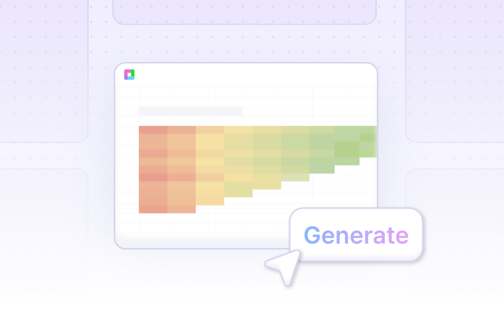
- Then, instruct the AI assistant to generate the Pyramid Stacked Column Chart from your selected data. The AI will instantly create the chart based on your input.
- Finally, refine or iterate on your Pyramid Stacked Column Chart. Use the AI assistant to make changes to formatting, labels, and other chart elements. This step ensures your chart meets your requirements.
How to Generate a Pyramid Stacked Column Chart in Excel and Google Sheets
Creating a Pyramid Stacked Column Chart in Excel
There are two main methods to create a pyramid chart in Excel. The first involves using SmartArt Graphics. Open Excel, insert your values, and select SmartArt Graphics from the Insert tab. Choose the Pyramid option from the available templates to complete your chart.
The second method is using a built-in chart tool. Create the pyramid chart manually using a template. This approach allows for more customization and precise control over the chart’s appearance.
Creating a Pyramid Stacked Column Chart in Google Sheets
In Google Sheets, you can create a pyramid-shaped chart by tweaking a stacked bar chart. Begin by using the stacked bar chart feature. Adjust the bar widths to reflect the percentages of each data point. This method allows the creation of layered structures, similar to a food pyramid.
Advanced Techniques and Considerations
In Excel, pyramid charts can also be designed using tornado charts. Use PbiVizEdit to create these charts, though the readability might be challenging. Purchase the full version of PbiVizEdit for complete functionality. Remember to use multiple value columns to distinguish the left and right sides of the pyramid.
For a horizontally stacked pyramid chart in Excel, use small multiples to align y-axis labels, even if data is missing. However, this method is complex and not ideal, prompting users to seek better solutions.
Use Cases Unlocked by Visualizing Data Using a Pyramid Stacked Column Chart
Assessing Sales Performance Across Products |
A Pyramid Stacked Column Chart provides a clear visualization of sales figures, highlighting the contribution of each product category. This enables businesses to quickly identify top-performing products and underperformers, optimizing inventory and marketing strategies. |
Comparing Market Share within Segments |
Visualizing market share within different segments using this chart type allows companies to better understand their competitive position. This insight is crucial for making informed decisions on where to focus resources for maximum market penetration. |
Tracking Financial Metrics Over Time |
Pyramid Stacked Column Charts are effective for tracking financial metrics such as revenue, expenses, and profit over multiple periods. This aids in identifying trends, seasonal patterns, and areas requiring financial adjustments to improve profitability. |
Analyzing Employee Performance by Department |
By visualizing employee performance data across different departments, Pyramid Stacked Column Charts help managers pinpoint which departments are excelling and which are lagging. This information is vital for workforce planning and performance improvement initiatives. |
Visualizing Customer Satisfaction Scores |
Customer satisfaction scores broken down by various service categories can be effectively visualized using Pyramid Stacked Column Charts. This allows businesses to identify areas excelling in customer satisfaction and others needing improvement. |
Monitoring Project Progress: |
In project management, these charts assist in tracking the progress of various project components. By visualizing task completion rates, resource allocation, and milestone achievements, project managers can ensure projects stay on track and within scope. |
Understanding Demographic Data Distribution |
When analyzing demographic data, Pyramid Stacked Column Charts provide a clear visualization of population distribution across different age groups, genders, or income levels, facilitating targeted demographic research and policy making. |
Frequently Asked Questions
What is a Stacked Column Chart?
A Stacked Column Chart is a type of chart that displays accumulated series values based on absolute totals.
What does a Stacked Column Chart show?
A Stacked Column Chart shows accumulated series values, typically representing different categories and sub-categories within each column.
How does a Stacked Column Chart display series values?
A Stacked Column Chart displays series values by stacking them on top of each other in a single column, with the height of each segment driven by the measure in the Values zone.
What is represented on the x-axis of a Stacked Column Chart?
The x-axis of a Stacked Column Chart represents one member hierarchy that categorizes the data.
What drives the color of the Stacked Column Chart?
The color of the Stacked Column Chart is driven by a second member hierarchy that adds another level of categorization to the data.
Conclusion
This guide has thoroughly explored the Pyramid Stacked Column Chart, demonstrating both AI-driven methods using Sourcetable and traditional approaches with spreadsheet programs like Excel and Google Sheets. Understanding these methods allows you to visually represent and analyze data effectively. Sourcetable simplifies the process with its AI spreadsheet assistant, enabling users to efficiently create charts and graphs.
Ready to leverage the power of AI for your data visualization needs? Sign up for Sourcetable and generate your first Pyramid Stacked Column Chart effortlessly.
Recommended Guides
Connect your most-used data sources and tools to Sourcetable for seamless analysis.
Frequently Asked Questions
If your question is not covered here, you can contact our team.
Contact Us


