Generate a Pyramid 100% Stacked Bar Chart with AI
Create custom Pyramid 100% Stacked Bar Charts with Sourcetable AI. Generate data from scratch or upload your own to get started.
Introduction
Creating a Pyramid 100% Stacked Bar Chart can streamline data presentation, highlighting proportions among categories stacked upon each other to form a pyramid shape. While traditional tools like Excel or Google Sheets require manual setup and configuration, newer AI-assisted platforms simplify and enhance this process. Sourcetable, an AI spreadsheet tool, offers a powerful AI assistant that enables users to efficiently generate these charts, among other complex data visualizations.
Sourcetable stands out by allowing even those with minimal spreadsheet experience to become power users quickly. The platform's AI assistant supports the creation of charts, graphs, and customized spreadsheet templates, making it a versatile choice for various data handling needs. Users can swiftly create a Pyramid 100% Stacked Bar Chart, bypassing the steep learning curve typically associated with advanced chart making.
Ready to transform your data visualization techniques? Sign up for Sourcetable to generate your first Pyramid 100% Stacked Bar Chart or continue reading for more information on how to utilize this powerful tool. Sign up here.
See how easy it is to generate Pyramid 100% Stacked Bar Chart with Sourcetable

What is a Pyramid 100% Stacked Bar Chart?
A Pyramid 100% Stacked Bar Chart displays the accumulated series values relative to 100% totals. This chart type is ideal for visualizing part-to-whole relationships, as each column measures from 0 to 100%, with each segment representing a proportion of the column total.
Structure and Requirements
The chart requires two member hierarchies: The first is on the x-axis, and the second drives the chart color. The height of each segment in the columns is determined by the measure in the Values zone. This facilitates easy comprehension of how individual parts contribute to the whole.
Uses and Comparisons
Similar to the stacked column chart, the 100% stacked bar chart is particularly useful for comparing percentages of responses to Likert scales or when the chart consists of only two segments (e.g., male and female). It effectively highlights part-to-whole relationships across multiple categories.
Creating a Pyramid 100% Stacked Bar Chart
To create this chart, select "Stacked 100 Column Chart" at Step 2 of the chart-building process. The steps required to build this chart are similar to those used for a stacked column chart.
Advantages
The 100% stacked bar chart is advantageous for visually indicating parts-of-a-whole immediately. It is more intuitive and easier to comprehend compared to line graphs, as it explicitly shows the part-to-whole relationship without needing additional explanation. This chart type is also effective for comparing individual segments across different bars and for trend comparisons within hierarchical data.
When to Use a Pyramid 100% Stacked Bar Chart
Ideal Scenarios
Use a Pyramid 100% Stacked Bar Chart to compare the composition of different groups. This chart is ideal for displaying the proportional differences between categories within each group. It is particularly effective for visualizing survey results, market share distribution, and demographic data.
Pros
A Pyramid 100% Stacked Bar Chart clearly shows the part-to-whole relationships. It emphasizes comparative differences while maintaining an overall view of total proportions. This makes it easier to identify trends and patterns within the data. The visual appeal and straightforward structure enhance readability and engagement.
Cons
Although useful, Pyramid 100% Stacked Bar Charts can become cluttered with too many categories or groups. The complexity increases with additional data, making it harder to interpret. It is less effective for absolute values since it focuses on percentages, potentially obscuring the actual magnitudes.
Comparison with Other Charts
Compared to a regular Stacked Bar Chart, the 100% variant is better for highlighting proportions rather than absolute values. Line charts might outperform Pyramid 100% Stacked Bar Charts in tracking changes over time, while Pie charts can offer a simpler view for a single group's composition but lack the comparative depth between groups.
Choose wisely based on your specific analytic needs and the nature of your data. Each chart type offers unique advantages and limitations, impacting the clarity and effectiveness of your data visualization.
Generate a Pyramid 100% Stacked Bar Chart with Sourcetable
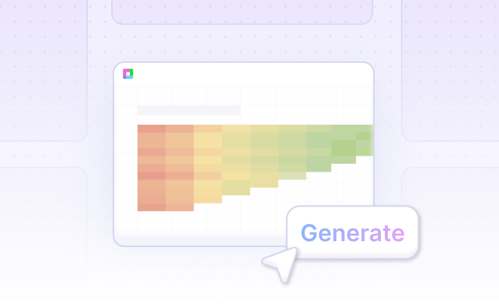
- Generating a Pyramid 100% Stacked Bar Chart with Sourcetable is straightforward and efficient. Sourcetable, an AI-powered spreadsheet, offers the simplest way to create this chart type. You can either create sample data using Sourcetable's AI assistant or upload a CSV file.
- To begin, select the desired data range for your chart. Next, ask the AI assistant to generate the Pyramid 100% Stacked Bar Chart. This process is much easier compared to manual methods used in Excel or Google Sheets.
- Once the initial chart is created, you can further refine and customize it. Use Sourcetable's AI assistant to specify changes to the formatting, labels, and other elements of the Pyramid 100% Stacked Bar Chart. This ensures that your chart meets all your presentation needs effectively.
How to Generate a Pyramid 100% Stacked Bar Chart in Excel and Google Sheets
Creating a Pyramid 100% Stacked Bar Chart in Excel
To create a pyramid 100% stacked bar chart in Excel, start by using a horizontal 100% stacked bar chart. This method will produce a stepped pyramid chart, as it is not capable of creating a smooth pyramid.
Ensure each layer of the pyramid is represented as a data series formatted with no fill or border line. Calculate the width of each pyramid layer using the formula: width = percentage x total width. Stack the layers by setting them up as individual data series and arrange them in decreasing order.
Creating a Pyramid 100% Stacked Bar Chart in Google Sheets
In Google Sheets, use a 100% stacked bar chart to illustrate the relationship between individual items and the whole. Set up your data in rows and columns similar to a typical bar chart. Ensure you have at least two data series to represent the different layers of the pyramid.
Although Google Sheets does not natively support stepped pyramid charts, you can mimic the appearance by carefully arranging your data and formatting the stacked bar chart.
Benefits of Using a Pyramid 100% Stacked Bar Chart
Pyramid 100% stacked bar charts are ideal for visualizing hierarchical data and understanding proportional relationships. They effectively depict the relative size of each layer, providing clear insights into the distribution of data percentages across different categories.
Conclusion
Excel and Google Sheets offer robust tools for creating pyramid 100% stacked bar charts. By following the outlined steps, you can efficiently visualize data distribution and enhance your data presentation.
Use Cases Unlocked by Visualizing Data Using a Pyramid 100% Stacked Bar Chart
Market Share Analysis |
Visualizing data with a Pyramid 100% Stacked Bar Chart enables businesses to easily compare market share among competitors. This method allows stakeholders to quickly assess which company dominates the market or identify trends in market position over time. |
Demographic Breakdown |
Using a Pyramid 100% Stacked Bar Chart helps in visualizing the demographic distribution within a population. For instance, businesses can analyze age, gender, or income brackets effectively, aiding in tailored marketing strategies and informed decision-making. |
Sales Performance Comparison |
A Pyramid 100% Stacked Bar Chart provides an intuitive way to compare sales performance across different regions or product lines. Companies can quickly identify top and low-performing areas, facilitating strategic adjustments to boost overall sales. |
Resource Allocation |
Pyramid 100% Stacked Bar Charts offer a clear visualization of resource allocation within projects or departments. This helps in understanding how resources are distributed and adjusting allocations to optimize productivity and efficiency. |
Employee Skill Levels |
Visualizing employee skill levels with a Pyramid 100% Stacked Bar Chart aids in workforce planning. HR departments can quickly see the distribution of various skill sets within the organization, identifying areas needing training or hiring. |
Customer Satisfaction Metrics |
Companies use Pyramid 100% Stacked Bar Charts to visualize customer satisfaction metrics across different service channels. This allows for quick identification of areas needing improvement, enhancing overall customer experience and retention. |
Financial Performance |
Pyramid 100% Stacked Bar Charts are effective for comparing financial performance indicators, such as revenue sources or expense categories. This visualization aids in understanding the contribution of different streams to the overall financial health. |
Survey Results |
Survey data visualization with Pyramid 100% Stacked Bar Charts helps in clearly displaying respondents' feedback. It allows for an easy comparison of responses, aiding in identifying trends and drawing actionable insights from the data. |
Frequently Asked Questions
What is a Stacked 100 Column Chart?
The Stacked 100 Column Chart displays the accumulated series values relative to 100% totals. Each column measures from 0 to 100%, and each segment represents a proportion of the column's total.
How do you interpret a Pyramid 100% Stacked Bar Chart?
Each column measures from 0 to 100%. The height of each segment in the columns is based on the measure in the Values zone, and each segment represents a proportion of the column's total.
What are the best practices for creating a Pyramid 100% Stacked Bar Chart?
Use two member hierarchies: one for the x-axis and one to drive the chart color. The measure in the Values zone determines the segment height.
What are the advantages of using a Pyramid 100% Stacked Bar Chart?
Each column measures from 0 to 100%. The height of each segment in the column is determined by the value in the Values zone, and each segment represents a proportion of the total for that column.
What are the limitations of Pyramid 100% Stacked Bar Charts?
100% stacked bars never vary in length and only show information about parts of a whole. They are not useful for comparing individual segments across different bars and are less effective than line graphs for time series data.
Conclusion
In this guide, we explored the concept of a Pyramid 100% Stacked Bar Chart, illustrating methods for creating this visualization both through traditional spreadsheet programs like Excel and Google Sheets, and innovatively using AI with Sourcetable. We highlighted how Sourcetable simplifies the process with its AI spreadsheet assistant, enabling users to effortlessly generate complex charts.
To harness the power of AI in your data visualization tasks, consider upgrading your tools by signing up for Sourcetable. Experience the ease of creating detailed charts like the Pyramid 100% Stacked Bar Chart with minimal effort.
Get started now by signing up at Sourcetable and generate your first Pyramid 100% Stacked Bar Chart effortlessly.
Recommended Guides
Connect your most-used data sources and tools to Sourcetable for seamless analysis.
Frequently Asked Questions
If your question is not covered here, you can contact our team.
Contact Us


