Generate a Pyramid 100% Stacked Column Chart with AI
Create custom Pyramid 100% Stacked Column Charts with Sourcetable AI. Generate data from scratch or upload your own to get started.
Introduction
Creating a Pyramid 100% Stacked Column Chart can enhance your data presentation, providing a clear view of proportions within a hierarchy. Sourcetable, an AI-enabled spreadsheet, simplifies this process. It offers an AI assistant that supports users in generating various spreadsheet elements efficiently.
Alternatively, traditional spreadsheet applications like Microsoft Excel and Google Sheets can also be used to create these charts, though without AI assistance. These tools require manual setup and adjustments, which can be time-consuming for complex data sets.
To quickly and effortlessly generate your first Pyramid 100% Stacked Column Chart, sign up for Sourcetable at https://app.sourcetable.com/signup, or continue reading for more detailed information on both methods.
See how easy it is to generate Pyramid 100% Stacked Column Chart with Sourcetable

What is a Pyramid 100% Stacked Column Chart?
The Pyramid 100% Stacked Column Chart displays accumulated series values relative to 100% totals. Each column in the chart measures from 0 to 100%, with each segment within the columns representing a proportion of the column's total.
Data Representation
This chart requires two member hierarchies. One hierarchy is placed on the x-axis, while the other hierarchy determines the color of each segment in the columns. The segment height within the columns is driven by measures in the Values zone.
Chart Components
Each column segment represents a portion of the column's total, visually depicting the relative contribution of each data point. This provides a clear visual representation of how different segments combine and contribute to the whole within each category on the x-axis.
When to Use a Pyramid 100% Stacked Column Chart
Overview
A Pyramid 100% Stacked Column Chart is ideal for visualizing proportional data. This chart type allows for an intuitive comparison of parts within a whole, emphasizing the relative size of each category.
Pros
Pyramid 100% Stacked Column Charts excel at showcasing relative differences. Each segment is easy to compare. The pyramid shape adds a distinct visual appeal, making it useful for presentations and reports. It simplifies complex data sets by focusing on proportions rather than absolute values.
Cons
These charts can become cluttered with too many categories. They are not well-suited for showing absolute values. Large data sets might obscure individual segments, making it hard to read. It's not ideal for time series data, as trends over periods are hard to discern.
Comparison with Other Charts
Bar Charts: Bar charts excel in displaying individual data points and absolute values. They are better for comparing discrete categories but lack the proportional comparison ability of pyramid stacked charts.
Pie Charts: Pie charts are also used for proportional data. They provide a clearer visual of part-to-whole relationships in simpler data sets. However, they become cluttered and less effective with many segments.
Line Charts: Line charts are superior for time series and trend analysis. They lack effectiveness in showing proportional relationships among categories within a single time frame. Unlike pyramid stacked charts, they do not emphasize relative sizes within data sets.
How to Generate a Pyramid 100% Stacked Column Chart with Sourcetable
- Sourcetable, an AI spreadsheet tool, makes creating a Pyramid 100% Stacked Column Chart straightforward. The AI assistant simplifies the process, allowing quick data visualization. Follow these easy steps to generate the chart.
- First, create sample data using Sourcetable's AI assistant, or upload a CSV file. This step sets up the essential data. Next, select the data range you want to convert into a Pyramid 100% Stacked Column Chart. Ensure you pick the correct data range for accurate chart generation.
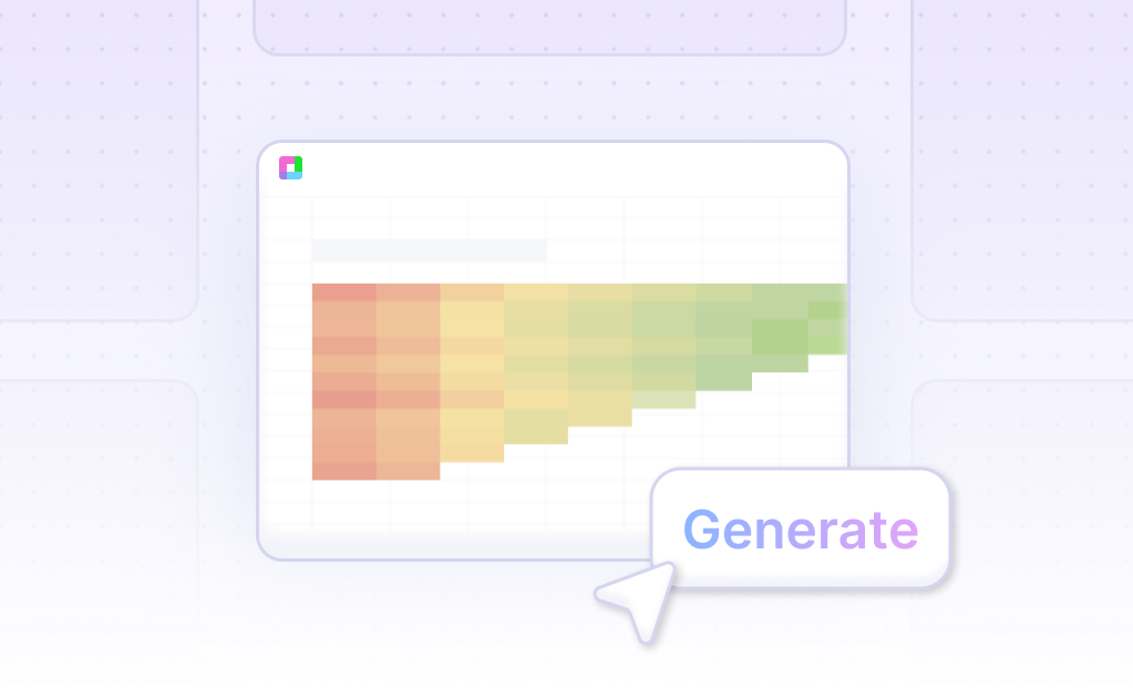
- After selecting the data, instruct the AI assistant to generate the Pyramid 100% Stacked Column Chart. The tool will process the data and create the chart automatically. This method is faster and more efficient than manually creating the chart in Excel or Google Sheets.
- Lastly, refine the chart using the AI assistant. Specify any changes to the formatting, labels, or other elements to enhance clarity and presentation. Iterating on the chart ensures it meets your specific needs and standards.
How to Generate a Pyramid 100% Stacked Column Chart in Excel or Google Sheets
Creating a Pyramid 100% Stacked Column Chart can be achieved effectively in both Excel and Google Sheets. This tutorial provides step-by-step instructions to help you visualize data in this format.
Generating a Pyramid 100% Stacked Column Chart in Excel
To generate a pyramid shape using a horizontal stacked bar in Excel, start by inserting a table to specify the width of each layer. Ensure that the height of each layer is uniform to maintain consistency. Note that the resulting pyramid shape will be stepped rather than smooth. Use the Stacked Bar chart option to create the non-3D pyramid effect.
Generating a Pyramid 100% Stacked Column Chart in Google Sheets
In Google Sheets, a stacked bar chart can be modified to resemble a pyramid chart. Adjust the visualization settings to achieve this appearance. Ensure that the data is organized in a way that each segment's height reflects the measure in the Values zone.
Steps to Create a Pyramid 100% Stacked Column Chart
Follow these steps to create the chart. First, build the stacked column chart by preparing your data with two member hierarchies. Select 'Stacked 100 Column Chart' as the chart type. One hierarchy will be on the x-axis, and the other will drive the chart color. The segment height is determined by the measure in the Values zone, presenting each column's data in relation to a 100% total.
Visualizing Data with a Pyramid 100% Stacked Column Chart
The Stacked 100 Column Chart displays series values as percentages of the total. Each column segment represents a proportion of the column total. This type of chart requires two hierarchies: one for the x-axis and one for the color of the segments. Each column measures from 0-100%, effectively showing accumulated values proportionately.
Use Cases for Pyramid 100% Stacked Column Charts
Comparative Market Analysis |
Visualizing data with a Pyramid 100% Stacked Column Chart allows businesses to compare market share across different sectors efficiently. This chart type emphasizes the relative percentage each sector contributes, helping stakeholders quickly identify dominant players and emerging trends in the market. |
Project Milestone Progress |
Project managers can utilize Pyramid 100% Stacked Column Charts to display the completion percentage of various project milestones. This visualization technique offers a clear, proportional view of how different tasks and phases contribute to overall project completion, ensuring timely decision-making and resource allocation. |
Sales Performance Across Regions |
A Pyramid 100% Stacked Column Chart can help visualize sales performance across different geographical regions. By presenting the proportional sales contributions of each region, this chart aids in identifying high-performing and underperforming areas, guiding strategic sales and marketing efforts. |
Financial Statement Breakdown |
Financial analysts can use Pyramid 100% Stacked Column Charts to display the composition of expenses, revenues, and profits in financial statements. This visualization breaks down financial elements into proportional segments, facilitating a clear understanding of financial health and operational efficiency. |
Employee Skill Distribution |
Human resources departments can benefit from Pyramid 100% Stacked Column Charts to represent the skill distribution among employees. This type of chart highlights the proportional representation of various skills within the workforce, assisting in identifying potential gaps and guiding training initiatives. |
Customer Demographics |
Marketing teams can use Pyramid 100% Stacked Column Charts to visualize customer demographic data. By displaying the percentage distribution of age, gender, income levels, and other demographic factors, this chart type provides a clear overview of the customer base, aiding in targeted marketing strategies. |
Product Portfolio Analysis |
Product managers can leverage Pyramid 100% Stacked Column Charts to analyze the composition of product portfolios. The chart offers a visual representation of the relative contributions of different products to the total portfolio, supporting decisions on resource allocation and product development focus areas. |
Frequently Asked Questions
What is a Stacked 100 Column Chart?
A Stacked 100 Column Chart displays accumulated series values relative to 100% totals, with each column segment representing a proportion of the column's total.
What do the columns in a stacked 100 column chart measure?
Each column in a stacked 100 column chart measures from 0 to 100%, with each segment representing a proportion of the column's total.
How do you build a stacked 100 column chart?
To build a stacked 100 column chart, follow the same steps required to build a stacked column chart and select Stacked 100 Column Chart at Step 2. This chart requires two member hierarchies, one on the x-axis and the other to drive the chart color.
What are the requirements for creating a stacked 100 column chart?
The stacked 100 column chart requires two member hierarchies: one on the x-axis and one to drive the chart color.
How can the data in a stacked 100 column chart be interpreted?
The stacked 100 column chart displays accumulated series values relative to 100% totals. Each column measures from 0 to 100%, and each segment within a column represents a proportion of the column's total.
Summary and Next Steps
In this guide, we've covered the essentials of what a Pyramid 100% Stacked Column Chart is and how to create one using both modern AI tools and traditional spreadsheet programs. We explored the use of Sourcetable, an AI-enhanced spreadsheet tool, to simplify and enhance the chart creation process. Additionally, we demonstrated how to achieve similar results using conventional spreadsheet software like Excel and Google Sheets.
Whether you're a novice or looking to streamline your data visualization tasks, Sourcetable's AI assistant can significantly reduce the complexity involved. By automating parts of the process, it allows users to focus more on analysis and less on setup.
Ready to experience the ease of AI-driven data analysis? Sign up for Sourcetable today and generate your first Pyramid 100% Stacked Column Chart effortlessly.
Recommended Guides
Connect your most-used data sources and tools to Sourcetable for seamless analysis.
Frequently Asked Questions
If your question is not covered here, you can contact our team.
Contact Us


