Generate a 100% Stacked Line with Markers Chart with AI
Create custom 100% Stacked Line with Markers Charts with Sourcetable AI. Generate data from scratch or upload your own to get started.
Introduction
Creating a 100% Stacked Line with Markers Chart can provide valuable insights into the relative changes of multiple data categories over time. Whether you are employing AI tools like Sourcetable or sticking to traditional spreadsheet programs such as Excel or Google Sheets, the process can be straightforward.
Sourcetable simplifies this task significantly by integrating an AI spreadsheet assistant. This assistant is designed to help users quickly generate any kind of spreadsheet content, including complex charts and graphs. For those less familiar with spreadsheets, Sourcetable's approachable interface transforms beginners into power users effortlessly.
To experience the ease of creating a 100% Stacked Line with Markers Chart with the help of AI, sign up for Sourcetable. Alternatively, continue reading for detailed guidance on generating this chart with or without AI assistance.
See how easy it is to generate 100% Stacked Line with Markers Chart with Sourcetable

Understanding the 100% Stacked Line with Markers Chart
A 100% Stacked Line with Markers Chart is a specialized visualization tool used to depict the percentage contributions of various categories over time.
Visual Representation of Percentages
This chart type plots percentage contributions on the y-axis, while the x-axis typically represents time. The total value is always 100%, making it easy to interpret each category's contribution to the whole.
Benefits
100% Stacked Line with Markers Charts are useful for comparing percentages of responses to Likert scales or when dealing with data involving only two segments. These charts visually convey "parts of a whole" quickly and allow for faster visual processing than reading. Audiences can understand the information without needing to read labels or the title.
Applications
These charts are highly effective for illustrating trends in time series data. They are perfect for situations where understanding the proportion of each category’s contribution is more critical than knowing absolute values.
Interpreting Data
The y-axis starts at 0% and ends at 100%. The stacking of lines with markers facilitates an easy comparison of percentage contributions across different time periods. Each line's position indicates the percentage represented accurately.
Creation
To create a 100% Stacked Line with Markers Chart, use "stacked columns & lines" visuals and calculate the 100% in a measure.
When to Use a 100% Stacked Line with Markers Chart
Ideal Scenarios for Use
A 100% Stacked Line with Markers Chart is perfect for visualizing data over time when you need to emphasize the percentage contribution of individual categories to the whole. This type of chart is most effective when you have multiple data series and want to analyze their trends and proportions relative to the total amount. Use it to show changes in component percentages over a period.
Advantages
One key advantage of a 100% Stacked Line with Markers Chart is its ability to clearly depict trends in the relative contributions of different categories over time. The markers help identify specific data points, making it easier for viewers to follow changes. This type of chart is especially useful in highlighting shifts in market share, performance metrics, or survey results where understanding the proportion is crucial.
Disadvantages
However, this chart type has limitations. It does not display absolute values, which can obscure the understanding of actual data magnitudes. In scenarios where absolute growth or decline is critical, using a 100% Stacked Line with Markers Chart may lead to misinterpretation. Additionally, if there are too many categories, the chart can become cluttered, making it difficult to read and analyze.
Comparison with Other Chart Types
Compared to a simple line chart, a 100% Stacked Line with Markers Chart provides additional context by showing relative proportions, but it sacrifices clarity on total values. Unlike a bar chart, it can illustrate data trends over time but may be less effective at showcasing detailed category sizes. A stacked bar chart can also display part-to-whole relationships but is often better for static data points rather than trends over time.
How to Generate a 100% Stacked Line with Markers Chart with Sourcetable
- Sourcetable, an AI spreadsheet, makes it easy to create a 100% Stacked Line with Markers Chart. You can generate this chart manually, similar to Excel or Google Sheets, as shown in the next section. However, using Sourcetable AI is the simplest method.
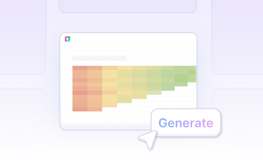
- First, create sample data using Sourcetable's AI assistant or upload a CSV file. Next, select the range of data that you want to turn into a 100% Stacked Line with Markers Chart. Then, ask the AI assistant to generate the chart.
- Finally, use the AI assistant to refine or iterate on the 100% Stacked Line with Markers Chart. Specify changes to formatting, labels, and other elements to perfect your chart. This method ensures a quick and efficient creation process.
- Using Sourcetable AI for chart generation saves time and enhances productivity. Follow these steps to easily create a 100% Stacked Line with Markers Chart. Sourcetable's intuitive interface and powerful AI capabilities streamline your data visualization tasks.
How to Generate a 100% Stacked Line with Markers Chart in Excel or Google Sheets
Creating a 100% Stacked Line with Markers Chart in Excel
To create a 100% stacked line chart in Excel, first, select your data set. Go to the "Insert" tab and click the "Insert chart" icon. Choose "Stacked column chart" from the "Chart" type section in the "Setup" tab. Adjust the data range, X-axis, and Series ranges if needed.
Next, convert the stacked column chart into a stacked line chart. Click on the chart, and navigate to the “Design” tab, then select “Change Chart Type.” Choose a "Stacked Line" chart. To display values as percentages, go to "Visual > Fields > Values > Display value as > Percentage of Total." This will ensure each line's total is 100% per period.
Creating a 100% Stacked Line with Markers Chart in Google Sheets
In Google Sheets, start by selecting your data set. Click "Insert" and then "Chart." In the "Chart editor," choose "Combo chart." Adjust the data range, X-axis, and Series ranges if needed. In the "Setup" tab of the chart editor, ensure you're displaying each data series with a different marker type such as columns, lines, or area lines.
To show data as a percentage of the whole, set the series to display values as percentages. Use a marker type that best represents your data, ensuring the total is visually clear. Include additional lines with markers if necessary to emphasize specific data points.
Optimizing for Clarity and Presentation
Both Excel and Google Sheets offer flexible options for creating 100% stacked line charts with markers. By selecting appropriate chart types and carefully adjusting data ranges and display options, you can effectively visualize your data. Always ensure that the chart clearly communicates the percentage values of each category for better analysis and decision-making.
Use Cases for 100% Stacked Line with Markers Chart
Comparing Market Shares Over Time |
A 100% Stacked Line with Markers Chart is ideal for comparing the market shares of different companies over time. By showing each company's share as a percentage of the total market, it helps identify trends and shifts in market dominance clearly. |
Tracking Sales Performance |
Visualize sales performance of different products over multiple periods. This chart type helps in identifying which products are gaining or losing traction, all relative to the total sales volume. |
Monitoring Website Traffic Sources |
Analyze the relative contribution of different traffic sources to a website over time. This helps in understanding which channels are becoming more effective or less effective, aiding in targeted marketing efforts. |
Evaluating Resource Allocation |
Track allocation of resources like budget, time, or manpower across various projects. This chart shows how the distribution changes, helping in strategic planning and optimization. |
Assessing Social Media Engagement |
Use the chart to compare engagement metrics such as likes, shares, and comments across multiple social media platforms. This helps identify which platforms perform best relative to each other over time. |
Visualizing Academic Performance |
Chart the performance of different students or classes in various subjects over time. This visualization helps in identifying strengths and weaknesses across different academic areas. |
Financial Data Analysis |
Monitor the relative performance of various investment portfolios. The chart helps in understanding the shifts in portfolio composition and relative risk over time. |
Frequently Asked Questions
What is a 100% Stacked Line with Markers Chart?
A 100% Stacked Line with Markers Chart is a type of line chart that plots percentages on the y-axis and time on the x-axis, focusing on the proportion of contribution made by each category.
When should I use a 100% Stacked Line Chart?
You should use a 100% Stacked Line Chart when you need to compare percentages of responses, highlight part-to-whole contributions, or visualize time series data with multiple dimensions.
How do I interpret a 100% Stacked Line with Markers Chart?
Interpretation involves looking at the percentage each line section represents at any point along the time axis. The absolute values are lost, but the chart shows the proportionate contribution clearly.
What are the benefits of using a 100% Stacked Line with Markers Chart?
Benefits include quick understanding of data without reading labels or titles, precise interpretation of percentages, and effective visualization of part-to-whole relationships and trends over time.
When should I avoid using a 100% Stacked Line Chart?
Avoid using a 100% Stacked Line Chart if your focus is on absolute values rather than percentage contributions, or if the precise magnitude of each category is important.
Conclusion
In this guide, we've explored the nuances of creating a 100% Stacked Line with Markers Chart. We discussed using Sourcetable's AI capabilities for efficient chart generation and compared it with traditional methods using Excel and Google Sheets. This provided a clear understanding of both AI-enhanced and conventional approaches to spreadsheet management.
Sourcetable simplifies complex tasks with its AI spreadsheet assistant, transforming anyone into a spreadsheet expert. Whether you're making templates, charts, or graphs, Sourcetable's intuitive AI assistant facilitates a seamless creation process.
Ready to take your data visualization to the next level? Sign up for Sourcetable today and generate your first 100% Stacked Line with Markers Chart effortlessly.
Recommended Guides
Connect your most-used data sources and tools to Sourcetable for seamless analysis.
Frequently Asked Questions
If your question is not covered here, you can contact our team.
Contact Us


