Generate a Funnel Chart with AI
Create custom Funnel Charts with Sourcetable AI. Generate data from scratch or upload your own to get started.
Introduction
Creating a funnel chart is a powerful way to visualize the stages in a sales or marketing process. Traditional spreadsheet programs like Excel or Google Sheets can achieve this, requiring manual setup and data arrangement. However, these methods often involve a steep learning curve.
Sourcetable simplifies this process through its AI-powered spreadsheet capabilities. As an AI spreadsheet, Sourcetable can assist users in quickly generating funnel charts by leveraging its built-in AI spreadsheet assistant. This tool can automatically create charts and graphs, including funnel charts, making it accessible to users without advanced spreadsheet knowledge.
To start creating your funnel chart effortlessly with cutting-edge AI assistance, sign up for Sourcetable and generate your first funnel chart today or continue reading for more information.
See how easy it is to generate Funnel Chart with Sourcetable

What is a Funnel Chart?
A funnel chart is a specialized chart type that demonstrates the flow of users through a business or sales process. Named for its shape, the chart starts from a broad head and ends in a narrow neck, effectively visualizing how the number of users decreases at each stage of the process.
Uses in Data Visualization
Funnel charts are most often used in business or sales contexts to track how a starting set of visitors or users drops out of a process or flow. They help visualize the breakdown of a whole into progressive parts and are appropriate when there are at least three stages to plot.
Benefits of Funnel Charts
Funnel charts help visualize results and facilitate data interpretation. They can represent many indicators and are versatile enough to be used in multiple contexts. Funnel charts allow for the wide viewing of variable behavior across stages of a process and show processes over time, thus identifying bottlenecks.
Creating a Funnel Chart
To create a funnel chart, set up the data with one column for the stages in the process and one for the values. Select the data, insert the funnel chart using the Insert menu, and use the Design and Format tabs to customize it.
Example Funnel Charts
Examples include a funnel chart of an email campaign and a funnel chart showing stages as a list of users in a table.
When to Use a Funnel Chart
Funnel Chart Overview
A Funnel Chart is ideal for visualizing stages in a linear process, especially when tracking the conversion rates through these stages. It effectively highlights areas where drop-offs occur.
Benefits of Funnel Charts
Funnel Charts provide a clear visual representation of data flow through various phases, simplifying the identification of bottlenecks. They are excellent for sales processes, lead conversion analysis, and user journey tracking.
Drawbacks of Funnel Charts
While Funnel Charts excel in showing progression and decline through stages, they may oversimplify data. They lack depth in comparative analysis among different stages.
Comparison with Bar Charts
Bar Charts offer more detailed comparisons across different categories and stages but can be less intuitive in visualizing a step-by-step process.
Comparison with Line Charts
Line Charts excel in illustrating trends over time. However, they are less effective in demonstrating discrete stages of a process with significant drop-offs.
Comparison with Pie Charts
Pie Charts are good for showing parts of a whole but do not effectively depict sequential steps or conversion rates in a process, unlike Funnel Charts.
Best Use Cases
Use Funnel Charts for sales pipeline analysis, lead-to-customer conversion tracking, and any process that involves stepwise filtering with significant drop-offs between stages.
How to Generate a Funnel Chart with Sourcetable
- Sourcetable, an AI spreadsheet, simplifies the creation of Funnel Charts. Creating a Funnel Chart with Sourcetable AI is the easiest method available.
- First, generate sample data using Sourcetable's AI assistant, or upload a CSV file. This ensures you have the necessary data for your Funnel Chart.
- Next, select the range of data you want to visualize. Highlight the cells that contain the data you want to turn into a Funnel Chart.
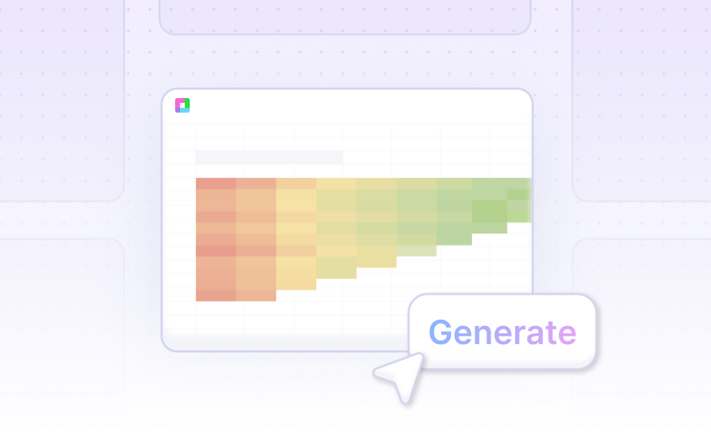
- Then, ask the AI assistant to generate the Funnel Chart. This step automates the Chart creation process, saving you time and effort.
- Finally, refine or iterate on the Funnel Chart using the AI assistant. You can specify changes to formatting, labels, and other elements to suit your needs.
How to Generate a Funnel Chart in Excel or Google Sheets
Creating a Funnel Chart in Excel
This feature is available in Excel for Windows if you have Office 2019, Office 2021, or a Microsoft 365 subscription. Begin by setting up your data with one column for the stages and one for the values. Then, select your data.
Click on the Insert tab, then choose Insert Waterfall, Funnel, Stock, Surface or Radar Chart. Select Funnel. The funnel chart will appear on the worksheet. Use the Design and Format tabs to customize its appearance.
Steps to Create a Funnel Chart in Google Sheets
Create a funnel chart by using a stacked bar chart. First, add a helper column to center the bars. Select your data and insert a stacked bar chart.
Remove the helper column to shape the funnel chart. Modify the fill color of the bars using the Series option under the Customize tab. Ensure to add data labels to display counts of each process and enhance presentation by removing major gridlines and horizontal axis labels.
Use Cases Unlocked by Visualizing Data Using a Funnel Chart
Sales Pipeline Analysis |
A Funnel Chart is ideal for monitoring and analyzing sales pipelines. It visually represents each stage of the sales process, from lead generation to deal closure, helping identify drop-off points and areas for improvement. |
Marketing Campaign Performance |
Marketing teams can leverage Funnel Charts to measure the effectiveness of campaigns by tracking customer journey stages, from initial engagement to conversion. This aids in optimizing marketing strategies and improving ROI. |
Customer Retention Tracking |
Funnel Charts assist in visualizing customer retention rates by showcasing the transition of users through different lifecycle stages. Companies can identify trends and strategize to enhance customer loyalty and retention. |
Conversion Rate Optimization |
Web analysts use Funnel Charts to pinpoint where potential customers drop off within an online purchasing process. This insight is crucial for optimizing website design and increasing conversion rates. |
Project Management |
Project managers can utilize Funnel Charts to visualize task completion rates at various project stages. This enables better resource allocation and identification of bottlenecks, ensuring timely project completion. |
User Onboarding Analysis |
Funnel Charts are useful for tracking user onboarding processes, highlighting completion rates of onboarding steps. This helps in enhancing the user experience and increasing the number of active users. |
Frequently Asked Questions
What is a funnel chart?
A funnel chart visualizes the flow of users through a business or sales process, showing how a starting set of visitors or users drops out at each stage.
When should you use a funnel chart?
Use a funnel chart in business or sales contexts to provide a high-level view of how quantities change through each phase of a process or to identify where potential customers drop off.
What statistics should you highlight in a funnel chart?
Highlight conversion rates at each stage, significant customer drop-offs, comparison of different cohorts or time periods, and the effectiveness of changes made to a process.
What are common issues in creating funnel charts?
Common issues include difficulty in understanding due to the chart's specialized use case and unique shape, and sometimes a bar chart or stacked bar chart may represent the data more effectively.
What are best practices for using a funnel chart?
Label each stage with corresponding measurements, ensure stages are spaced evenly, and consider using a bar-style funnel chart to make data interpretation easier.
Conclusion
This guide explored the creation of Funnel Charts, delving into methods using both AI-powered tools like Sourcetable and traditional spreadsheet programs such as Excel and Google Sheets. We discussed the simplicity and effectiveness of using Sourcetable's AI spreadsheet assistant for swiftly generating these charts, contrasting it with the manual processes involved in traditional spreadsheet software.
To effortlessly create your first Funnel Chart with cutting-edge technology, consider signing up for Sourcetable. Sign up here and start enhancing your data visualization skills today.
Recommended Guides
Connect your most-used data sources and tools to Sourcetable for seamless analysis.
Frequently Asked Questions
If your question is not covered here, you can contact our team.
Contact Us


