Generate a Pie Chart with AI
Create custom Pie Charts with Sourcetable AI. Generate data from scratch or upload your own to get started.
Introduction
Creating a pie chart can be a straightforward task, whether you are using AI-driven tools like Sourcetable or traditional spreadsheet programs such as Excel or Google Sheets. Sourcetable simplifies and enhances the process by offering an AI spreadsheet assistant. This tool aids users in quickly generating everything from simple templates to complex charts and graphs, including pie charts.
Sourcetable is particularly valuable for those looking to become spreadsheet power users without extensive training. The AI assistant within Sourcetable empowers users by automating tasks and providing intuitive guidance through spreadsheet functions.
If you're interested in quickly generating accurate and visually appealing pie charts, consider signing up at Sourcetable to generate your first Pie Chart. Alternatively, keep reading to learn more about creating pie charts using traditional spreadsheet tools.
See how easy it is to generate Pie Chart with Sourcetable

What is a Pie Chart?
A pie chart is a type of chart used to show how a total amount is divided between levels of a categorical variable. It is a circle divided into radial slices, with each slice representing a categorical value. The size of each slice indicates the proportion of the whole that each category level takes.
Structure and Purpose
In a pie chart, each radial slice corresponds to a single category level. The primary purpose is to visually represent the distribution of categories or values within a whole, making it easy to compare each group's contribution.
Usage
Pie charts are widely used to express metrics, illustrate percentage representation, and emphasize the proportionality of categories within a whole. They are ideal when focusing on dominant categories and the overall composition of a dataset.
Advantages
Pie charts provide a simple and easy-to-understand picture, allowing for immediate analysis and quick comprehension of information. They are effective in communicating data comparisons at a glance.
When to Use a Pie Chart
Pros of Using Pie Charts
Pie charts effectively display the composition of a whole by illustrating proportional parts of a dataset. They're best for showing simple proportions and percentage distributions, making them easy for audiences to understand.
Cons of Using Pie Charts
Pie charts can become cluttered and hard to read with too many categories. It's difficult to compare similar-sized segments. For detailed data comparison, other charts may be more effective.
Comparisons with Other Graphs
Bar charts are preferable for comparing multiple categories or showing changes over time. Unlike pie charts, bar charts handle large datasets efficiently and make it easier to distinguish between similar values.
Line graphs excel in showing trends and changes across time, offering clear visualization of data progression. They're superior to pie charts for time-series data.
Scatter plots display relationships between two variables, providing insight into data correlation. Pie charts lack the capability to represent such relationships effectively.
Conclusion
Use pie charts for simple compositions and when visual clarity on proportional data is needed. For more complex data comparisons, bar charts, line graphs, or scatter plots offer better alternatives.
How to Generate a Pie Chart with Sourcetable
- Sourcetable, an AI spreadsheet, makes creating Pie Charts effortless. The quickest way to generate a Pie Chart is by using Sourcetable’s AI assistant.
- First, create sample data using Sourcetable's AI assistant or upload a CSV file. This ensures you have the data ready to visualize.
- Next, select the range of data you want to turn into a Pie Chart. It's crucial to choose the correct data range for accurate visualization.
- After selecting the data, ask the AI assistant to generate the Pie Chart. This step saves time compared to manual chart creation.
- Finally, use the AI assistant to refine or iterate on the Pie Chart. Specify changes to formatting, labels, or other elements to perfect your chart.
- The ease and speed of using Sourcetable AI make it the preferred method for generating Pie Charts. For manual chart creation, follow the steps in the next section.
How to Generate a Pie Chart in Excel and Google Sheets
Creating a Pie Chart in Excel
To create a pie chart in Excel, start by selecting your data series. For example, to chart the 2017 data series, select the range A1:D2.
Next, go to the Insert tab and click on the Pie symbol within the Charts group. Then, click "Pie" to insert your chart.
If you'd like to create a second pie chart, select the range A1:D1. Hold down the CTRL key and select the range A3:D3. Follow the same steps to insert the chart.
For customization, click the legend at the bottom and press Delete. To add data labels, click the + button on the right side of the chart and check the Data Labels box. Customize further by clicking the paintbrush icon to change color schemes or right-clicking the pie chart to format data labels by checking Category Name, unchecking Value, and checking Percentage. You can center the labels and modify the font size and color through the Font options.
Creating a Pie Chart in Google Sheets
In Google Sheets, open a spreadsheet and format your data. Enter a label or category in the first column and positive numeric data in the second column. Each row will represent a slice of the pie.
Optionally, add a label name in the first row for clarity. Ensure that every data point is positive since pie charts represent parts of a whole.
After entering your data, use the chart tools in Google Sheets to generate the pie chart.
Best Practices for Pie Charts
Pie charts are ideal for showing how individual amounts contribute to a total. Examples include quarterly versus annual sales figures. They work best with a single data series and when data values are above zero.
For readability, limit to no more than seven categories. For visual clarity in smaller values, consider other types like 3-D pie charts, pie of pie, or bar of pie charts.
Use Cases Unlocked by Visualizing Data Using a Pie Chart
Market Share Analysis |
Pie charts offer a clear snapshot of different companies' market shares within an industry. By representing each company's proportion visually, stakeholders can quickly assess the competitive landscape and identify dominant players, assisting in strategic planning and investment decisions. |
Budget Allocation |
Visualizing budget allocation using a pie chart helps organizations understand how resources are distributed across various departments. This can aid in ensuring balanced investment and highlight areas where adjustments might be necessary to optimize financial efficiency. |
Survey Results |
When visualizing survey results, pie charts effectively represent the distribution of responses across different options. This can quickly convey the preferences of a sample population, aiding in decision-making and understanding public opinion on specific issues. |
Product Sales Distribution |
Pie charts can be used to illustrate the proportion of total sales attributed to different products. This helps in identifying best-selling items and those that may require reevaluation or discontinuation, facilitating more informed inventory and marketing strategies. |
Website Traffic Sources |
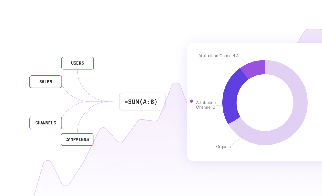
Analyzing website traffic sources through pie charts enables a straightforward comparison of different channels like organic search, direct traffic, or social media. This visual representation assists in identifying the most effective platforms and optimizing marketing efforts accordingly. |
Employee Roles Distribution |
In human resources, pie charts can be used to depict the distribution of employee roles within a company. Understanding the composition of staff helps in workforce planning, identifying skills gaps, and ensuring balanced team structures. |
Customer Segmentation |
Pie charts enable businesses to visualize customer segmentation data effectively. By displaying the proportion of each segment, companies can tailor their marketing strategies and personalization efforts to target specific customer groups more effectively. |
Expense Breakdown |
Representing expenses with a pie chart gives a clear overview of how funds are spent across different categories. This aids in financial review processes, helping to identify areas with excessive spending and opportunities for cost-saving. |
Frequently Asked Questions
What are pie charts best used for?
Pie charts are best used to show how a total amount is divided between levels of a categorical variable and to demonstrate each group's contribution to the whole.
What are some best practices when using pie charts?
Best practices for pie charts include adding annotations, considering the order of slices, limiting the number of pie slices, and avoiding distorting effects.
Why are pie charts often considered bad for data analysis?
Pie charts are often considered bad for data analysis because they are difficult to read, do not accurately represent quantities, and humans struggle to estimate quantities based on angles. Additionally, matching labels and slices can be challenging, and they have trouble showing small percentages.
How is the central angle calculated for each sector in a pie chart?
The central angle for each sector in a pie chart is calculated using the formula (Given Data/Total of all the data) * 360 degrees.
What are some alternatives to pie charts for part-to-whole comparisons?
Stacked bar charts are a good alternative to pie charts for showing part-to-whole comparisons.
Conclusion
Throughout this guide, we've explored the fundamentals of Pie Charts, including their creation using both AI-enhanced tools like Sourcetable and traditional spreadsheet software like Excel and Google Sheets. Utilizing Sourcetable's AI spreadsheet assistant simplifies the process, empowering users to efficiently generate visual data representations.
To harness the power of AI in creating detailed and accurate Pie Charts effortlessly, consider the advantages of using Sourcetable. Start by signing up at Sourcetable to create your first Pie Chart with ease.
Recommended Guides
Connect your most-used data sources and tools to Sourcetable for seamless analysis.
Frequently Asked Questions
If your question is not covered here, you can contact our team.
Contact Us


