Generate a Bar of Pie Chart with AI
Create custom Bar of Pie Charts with Sourcetable AI. Generate data from scratch or upload your own to get started.
Introduction
Creating a Bar of Pie Chart efficiently illustrates complex data, where it allows you to emphasize crucial subsets within your dataset. This chart can be generated using modern AI tools like Sourcetable or via traditional spreadsheet programs such as Excel and Google Sheets. Both methods provide unique advantages depending on the user's expertise and requirements.
Sourcetable introduces an AI spreadsheet that simplifies the transformation of raw data into insightful charts. Featuring an AI-powered assistant, Sourcetable empowers users to navigate spreadsheet functionalities effortlessly, creating anything from basic templates to advanced charts and graphs. This tool is exceptionally beneficial for users aiming to leverage AI for enhanced data interpretation and visualization.
For traditional spreadsheet users, programs like Excel and Google Sheets remain accessible for creating Bar of Pie Charts. These programs require manual setup but are ideal for those who prefer hands-on control over every aspect of chart generation.
To discover how easy and intuitive it is to generate your first Bar of Pie Chart with AI, sign up at Sourcetable today or continue reading for more detailed information on both AI-driven and manual methods. Sign up here.
See how easy it is to generate Bar of Pie Chart with Sourcetable

What is a Bar of Pie Chart?
Definition
Bar charts and pie charts are both common chart types with overlapping uses. Bar charts depict numeric values plotted against distinct categories on a two-axis plot, with one bar for each category. The length of each bar corresponds to the numeric value associated with it. Bar charts can be vertical or horizontal.
Purpose
Bar charts are ideal for comparing group-to-group data. They can be used with a broader range of data types than pie charts and are better in scenarios where the data doesn't sum up to a meaningful whole.
Usage
Pie charts show how a total amount is divided among distinct categories. Each category is represented by a slice of the pie, and the size of each slice corresponds to the category's proportion of the total. They are best when comparing parts of a whole and not suitable for time-series data.
Advantages of Bar Charts
Bar charts are simple and easy to understand, making it easier to spot trends and patterns in data sets. They summarize large data sets visually.
Disadvantages of Bar Charts
Bar charts often need additional details and explanations, and people can misunderstand or misinterpret them. They don't reveal the key causes and effects.
Advantages of Pie Charts
Pie charts provide a simple and clear way to understand how a total amount is split among several categories. They display data with percentages and give a clear idea of the relative proportion for each variable.
Disadvantages of Pie Charts
Pie charts should not be used for comparing multiple sets of data. They become crowded with more than six categories and aren't useful for representing time-series data.
Creating a Bar of Pie Chart
To create a bar of pie chart, enter your data into Excel, highlight the relevant cell range, click the Insert tab, choose the Pie icon, and then select Bar of Pie. This chart type is useful for grouping smaller slices of a pie chart into a more readable format.
Examples
An example of a bar of pie chart is one created by grouping all the slices in a pie that account for less than a certain percentage of the total. This grouped data is then represented in the bar chart.
When to Use a Bar of Pie Chart
A Bar of Pie Chart, an extension of the standard pie chart, effectively breaks down small or less significant segments, offering a clearer representation of the data. This is particularly useful when dealing with complex data sets that include minor categories that collectively contribute to the overall total but are too small to view individually in a pie chart.
Advantages of a Bar of Pie Chart
The main advantage of a Bar of Pie Chart is its ability to declutter a pie chart by grouping smaller slices into a single bar, which is then further divided. This makes it easier for viewers to understand the distribution of these minor categories without overwhelming them with cluttered visuals.
Comparisons with Other Charts
Compared to a regular pie chart, the Bar of Pie Chart provides a much clearer visibility for smaller categories. While regular pie charts can make these seem insignificant, the Bar of Pie Chart gives them their own space for better readability.
Disadvantages of a Bar of Pie Chart
One downside of the Bar of Pie Chart is that it can become too complex if overused, making it harder for viewers to interpret the data quickly. Additionally, it might not be the best choice for data sets with only a few categories, where a simple pie chart might suffice.
In contrast, bar charts offer straightforward comparisons between categories and are usually easier to understand at a glance. However, they do not connect categories to a whole as effectively as pie charts do.
Line charts, while excellent at showing trends over time, cannot effectively display proportional data like a pie chart can. Therefore, the choice between these chart types depends largely on the specific details of the data being visualized and the context in which it is being presented.
How to Generate a Bar of Pie Chart with Sourcetable
- Generating a Bar of Pie Chart in Sourcetable is straightforward and efficient. Sourcetable, an AI spreadsheet, simplifies the process with its AI assistant.
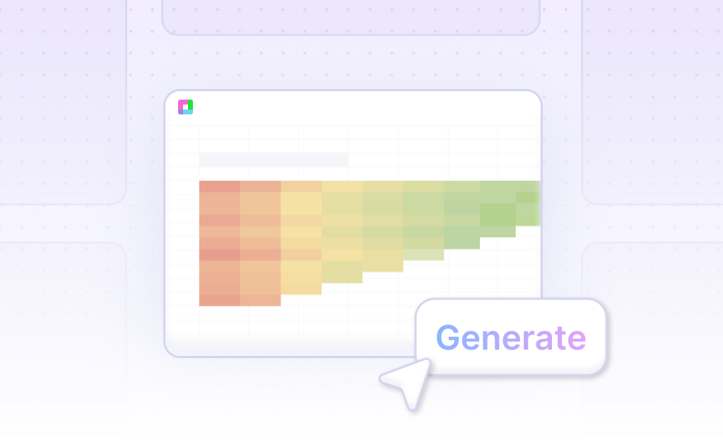
- First, create sample data using Sourcetable's AI assistant, or upload your CSV file. This flexibility allows you to start with any dataset. Next, select the range of data you want to visualize. This selection sets the foundation for your Bar of Pie Chart.
- After selecting your data, request the Bar of Pie Chart with the AI assistant. This instant visualization saves time and effort. To enhance the chart, refine or iterate using the AI assistant. Specify changes to formatting, labels, or other chart elements for a polished look.
- In the next section, we detail manual generation of a Bar of Pie Chart, akin to processes in Excel or Google Sheets.
How to Generate a Bar of Pie Chart in Excel and Google Sheets
Creating a Bar of Pie Chart in Excel
To create a Bar of Pie Chart in Excel, enter your data into Excel. Next, highlight the cell range A1:B11. Then, click the Insert tab, followed by the Pie icon. From the dropdown, select 'Bar of Pie'. Excel will automatically generate the chart. Customize the chart as desired by double-clicking any element to adjust the number of slices in the pie displayed in the bar chart or to group slices by percentage.
Generating a Bar of Pie Chart in Google Sheets
In Google Sheets, start by highlighting the cells containing the data to visualize. Click the 'Chart' icon in the Google Sheets toolbar. In the chart editor, customize the chart type to 'Bar of Pie'. Ensure your data is properly formatted, with the first column for labels or categories and the second for positive numeric data, each representing a slice of the pie.
Use Cases Unlocked by Visualizing Data Using a Bar of Pie Chart
Identifying Sales Distribution |
A bar of pie chart helps businesses identify sales distribution effectively. By breaking down sales data visually, businesses can easily spot which products contribute the most revenue. This aids in strategic decision-making and inventory management. |
Comparing Market Segments |
Visualizing data with a bar of pie chart allows for easy comparison of market segments. Companies can analyze customer demographics, purchase behaviors, and preferences, gaining insights that inform targeted marketing strategies. |
Tracking Resource Allocation |
Organizations can use a bar of pie chart to track resource allocation across various departments or projects. This visualization helps in identifying areas that consume the most resources and optimizing the allocation for better efficiency. |
Monitor Operational Performance |
Bar of pie charts are useful in monitoring operational performance metrics. By visualizing key performance indicators (KPIs), businesses can quickly assess their operational efficiency and make informed adjustments to processes. |
Analyzing Financial Data |
Financial analysts use bar of pie charts to break down financial data into more digestible parts. This visualization technique simplifies complex financial information, making it easier to identify trends, outliers, and areas of concern. |
Evaluating Project Progress |
Project managers leverage bar of pie charts to evaluate project progress. By visualizing different aspects of the project timeline and resource usage, managers can ensure projects stay on track and make necessary adjustments promptly. |
Customer Feedback Analysis |
A bar of pie chart can be used to analyze customer feedback and satisfaction levels. It provides a clear view of customer sentiments and highlights specific areas where improvements are needed, aiding in enhancing customer experience. |
Competitive Analysis |
Companies use bar of pie charts for competitive analysis to visualize market share and competitor performance. This data helps businesses understand their position in the market and develop strategies to improve competitiveness and market penetration. |
Frequently Asked Questions
What is a bar chart also known as?
A bar chart is also called a bar graph or column chart.
What type of data do bar charts plot?
A bar chart plots numeric values for levels of a categorical feature as bars.
How should bars be plotted in a bar chart?
Bars should be plotted on a zero-valued common baseline to allow for easy and accurate comparison of values.
What is the key advantage of using bar charts over pie charts?
Bar charts can be used for both part-to-whole and group-to-group comparisons, making them generally the better choice for visualizing data.
When should pie charts be avoided?
Pie charts should be avoided when the number of slices is large or when the individual parts do not sum to a meaningful whole.
Conclusion
In this guide, we've detailed the steps to create a Bar of Pie Chart, using both AI-driven tools like Sourcetable and traditional spreadsheet programs such as Excel or Google Sheets. We first explored what a Bar of Pie Chart is, then showed how Sourcetable’s AI can streamline and enhance the chart creation process. For those preferring conventional methods, we also covered steps using non-AI spreadsheets.
To easily generate a Bar of Pie Chart with cutting-edge AI assistance, consider using Sourcetable. Its AI spreadsheet assistant simplifies data visualization, enabling you to become a spreadsheet power user effortlessly.
Ready to use AI to create impressive charts? Sign up for Sourcetable to generate your first Bar of Pie Chart.
Recommended Guides
Connect your most-used data sources and tools to Sourcetable for seamless analysis.
Frequently Asked Questions
If your question is not covered here, you can contact our team.
Contact Us


