Generate a Doughnut Chart with AI
Create custom Doughnut Charts with Sourcetable AI. Generate data from scratch or upload your own to get started.
Introduction
Creating a Doughnut Chart can provide insightful visual representation of your data, whether you are using AI tools like Sourcetable or traditional spreadsheet programs such as Excel and Google Sheets. Sourcetable simplifies this process with its AI spreadsheet capabilities, facilitating powerful user experiences even for beginners. The platform's AI spreadsheet assistant is designed to aid users in generating various forms of data visualizations including charts and graphs.
This guide will walk you through the steps of generating a Doughnut Chart using both methods: AI-enhanced via Sourcetable and manually using conventional spreadsheet tools. Learn how to harness the power of Sourcetable's AI features or apply foundational techniques in Excel or Google Sheets to achieve your data visualization needs.
To start creating your first AI-powered Doughnut Chart, sign up at Sourcetable or continue reading for detailed instructions on both methods.
See how easy it is to generate Doughnut Chart with Sourcetable

What is a Doughnut Chart?
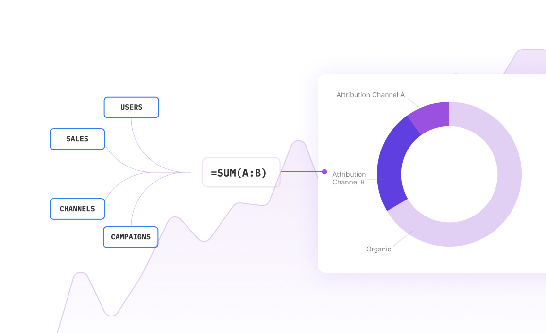
A doughnut chart shows the relationship of parts to a whole. It can contain more than one data series, with each series adding a ring to the chart. The first data series is displayed in the center.
While effective for displaying parts of a whole, doughnut charts can be difficult to read due to their circular nature. The difficulty increases with multiple data series, affecting the accurate representation of data sizes.
Despite these challenges, doughnut charts are ideal for comparing a small number of categories. They are efficient in conserving space and highlighting a single variable, making data visualization simpler.
For SEO optimization, use keywords naturally and focus on long-tail keywords to better target your audience. Avoid keyword stuffing to maintain readability and effectiveness.
When to Use a Doughnut Chart
Overview of Doughnut Charts
Doughnut charts are useful for showing proportions within a dataset. Suitable for comparing parts of a whole, they provide a clear visual representation similar to pie charts but with a central hole. This design enhances readability and allows for additional data labeling.
Pros of Using Doughnut Charts
Doughnut charts excel in visual appeal and efficiency. They condense information into a compact, easy-to-read format. The central space can display extra data or labels, providing flexibility in presenting detailed insights. This makes them ideal for dashboards and reports.
Cons of Using Doughnut Charts
Despite their advantages, doughnut charts can become cluttered with too many segments. Overuse of colors or labels can confuse viewers. They are not suitable for large datasets or for showing trends over time. Their simplicity can also limit detailed data comparisons.
Doughnut Charts vs. Pie Charts
Both doughnut and pie charts display proportions well. However, doughnut charts offer more space for annotations. The central hole can be used creatively for additional information, making them more versatile in some scenarios.
Doughnut Charts vs. Bar Charts
While doughnut charts are great for depicting parts of a whole, bar charts are superior for comparing values across categories. Bar charts handle large datasets and trends over time more effectively. They also offer a straightforward way to compare different groups.
Doughnut Charts vs. Line Charts
Line charts excel in showing data trends over time, which doughnut charts cannot do. Line charts connect individual data points, making them ideal for time-series analysis. Conversely, doughnut charts are limited to static data without temporal dimensions.
How to Generate a Doughnut Chart with Sourcetable
- Generating a Doughnut Chart with Sourcetable's AI spreadsheet is straightforward and efficient. The easiest method involves using Sourcetable's AI assistant. First, create sample data using the AI assistant or upload a CSV file.
- Next, select the range of data you wish to visualize. Once selected, ask the AI assistant to generate the Doughnut Chart. The AI will swiftly create a precise chart based on your data.
- To refine the Doughnut Chart, use the AI assistant to adjust formatting and labels. This iterative process ensures your chart meets your specific needs. Creating a Doughnut Chart manually, as shown in the next section, is also an option similar to Excel or Google Sheets.
How to Generate a Doughnut Chart in Excel and Google Sheets
Creating a Doughnut Chart in Excel
Open Excel and input your data into the worksheet. Select the data range you want to visualize as a doughnut chart. Navigate to the Insert tab, and in the Charts group, click Other Charts. Under Doughnut, select Doughnut. Click the plot area to display the Chart Tools.
On the Design tab, choose your preferred layout in the Chart Layouts group and select a style in the Chart Styles group. To resize the chart, click it and adjust the Shape Height and Shape Width in the Size group on the Format tab. To alter the size of the doughnut hole, click a data series, then select Format Selection on the Format tab, and adjust the doughnut hole size slider.
Creating a Doughnut Chart in Google Sheets
Open Google Sheets and select the data range you want to visualize. Click Insert in the main menu, and then Chart. In the Chart editor sidebar, click the drop-down box below Chart Type and select Donut Chart. Customize the chart by adding a title, changing fonts, or adjusting sizes as needed.
Benefits of Doughnut Charts
Doughnut charts are effective for visualizing compositions of a whole and comparing sizes. They can display more data in the center compared to pie charts, which are often misinterpreted. For alternative visualizations, consider using stacked bar charts or stacked area charts.
Use Cases for Visualizing Data with a Doughnut Chart
Market Share Analysis |
A Doughnut Chart is essential for visualizing market share data, helping businesses understand their position against competitors. This type of chart highlights the proportion each competitor holds in the market, providing quick insights into market dynamics. |
Budget Allocation |
Visualizing budget allocation with a Doughnut Chart offers clear insights into how funds are distributed across different departments or projects. This facilitates informed decision-making and ensures transparency in financial planning. |
Sales Distribution |
Doughnut Charts can effectively display sales distribution across products or regions. This visualization helps identify top-performing products or regions, enabling businesses to strategize effectively to maximize revenue. |
Revenue Segmentation |
Revenue segmentation visualized via a Doughnut Chart helps businesses easily understand income sources. By breaking down revenue into segments, companies can identify which areas are most lucrative and target growth opportunities strategically. |
Customer Demographics |
Using a Doughnut Chart to represent customer demographics provides a clear picture of the distribution of different customer segments. This information is crucial for tailoring marketing efforts and improving customer engagement. |
Expense Breakdown |
A Doughnut Chart is ideal for visualizing expense breakdowns, offering immediate insight into where money is being spent. This assists in identifying cost-saving opportunities and optimizing budgetary allocations. |
Website Traffic Sources |
Visualizing website traffic sources with a Doughnut Chart helps digital marketers understand which channels are driving the most visitors. This aids in optimizing marketing strategies and improving ROI on digital campaigns. |
Frequently Asked Questions
How do you create a simple donut chart?
To create a simple donut chart, you can use tools like wpdatatables or any charting library that supports donut chart creation. They display categorical data and are ideal for showcasing key performance indicators and part-to-whole relationships.
How do you create a donut chart with multiple rings?
You can create a donut chart with multiple rings by layering the chart to show more than one data series. This is useful for dashboard reporting and can provide an in-depth comparison of different data sets while maintaining a clear, concise visualization.
How do you animate a donut chart on load?
To animate a donut chart on load, utilize the animation features available in your charting library. This can make the data visualization more engaging and help draw attention to important data points.
How do you change the color of the stroke for a donut chart?
Changing the color of the stroke for a donut chart can be achieved through customization options in your charting tool. Usually, this involves setting the desired stroke color in the chart's configuration settings.
How do you create a donut chart with rounded edges and text centered?
Creating a donut chart with rounded edges and centered text involves customizing the chart’s style settings. Adjust the edge styling to round the corners of the segments and ensure text is positioned in the center of the donut.
Conclusion
Throughout this guide, we have explored the Doughnut Chart, showing its applications and visual appeal. We discussed how to leverage Sourcetable's AI capabilities to efficiently create Doughnut Charts, emphasizing the ease with which Sourcetable’s AI spreadsheet assistant can help users manage data visualization tasks. We also covered methods for generating these charts using traditional spreadsheet tools like Excel and Google Sheets, providing a foundational approach for those preferring conventional methods.
To streamline your chart-making process and unlock the potential of advanced spreadsheet management, consider using Sourcetable. Sign up here to generate your first Doughnut Chart with the aid of an intelligent AI assistant.
Recommended Guides
Connect your most-used data sources and tools to Sourcetable for seamless analysis.
Frequently Asked Questions
If your question is not covered here, you can contact our team.
Contact Us


