Generate a Cone Stacked Bar Chart with AI
Create custom Cone Stacked Bar Charts with Sourcetable AI. Generate data from scratch or upload your own to get started.
Introduction
Creating visually engaging charts is essential for data analysis and presentation. A Cone Stacked Bar Chart is a specific type that displays data in tiers, allowing for a clear comparison between different categories over time or conditions. While you can construct these charts in Excel or Google Sheets, this involves a series of complex steps that can be time-consuming and prone to errors.
Sourcetable introduces a streamlined solution through its AI-enabled spreadsheet platform. By leveraging the AI spreadsheet assistant, users can easily generate Cone Stacked Bar Charts without in-depth knowledge of traditional spreadsheet software. This tool assists you in crafting any spreadsheet feature, from simple templates to advanced charts, enhancing efficiency and accuracy.
To experience firsthand how Sourcetable can transform your data visualization tasks, sign up today to generate your first Cone Stacked Bar Chart. Alternatively, continue reading to learn more about utilizing traditional spreadsheet programs for this task.
See how easy it is to generate Cone Stacked Bar Chart with Sourcetable

What is a Cone Stacked Bar Chart?
A Cone Stacked Bar Chart is an enhanced bar chart used to compare numeric values across two categorical variables, with a conical shape for visual representation. Each bar is subdivided into stacked segments, where each segment indicates a level of the second categorical variable. This visualization method does not add additional data but alters the visual presentation.
How Cone Stacked Bar Charts Work
Each bar in a Cone Stacked Bar Chart is divided into sub-bars stacked end to end. These sub-bars collectively represent the total length of the primary bar, similar to standard bar charts. The stacked structure helps to show the contribution of each segment to the total value clearly.
Benefits of Cone Stacked Bar Charts
Cone Stacked Bar Charts are visually appealing and easily catch the audience's attention. They allow for straightforward comparisons between categories and their subdivisions, aiding in easy interpretation and improving decision-making processes.
When to Use a Cone Stacked Bar Chart
Advantages of Cone Stacked Bar Charts
The cone stacked bar chart is ideal for comparing parts of a whole across multiple categories. Its 3D cone shape adds a visual appeal, making it useful for presentations where aesthetics matter. Each section within the bar represents a subgroup, allowing for clear visibility of each segment's contribution to the total.
Disadvantages of Cone Stacked Bar Charts
Despite its visual appeal, the cone shape can sometimes distort data perception, particularly when precise comparison between subgroups is necessary. The 3D effect may cause difficulty in accurately judging data values, which could mislead the viewer.
Comparison with Other Charts
Unlike simple bar charts, cone stacked bar charts provide additional context by showing subgroup distributions within a category. However, simple bar charts are more straightforward and easier to interpret when exact values are crucial. Pie charts offer a different form of whole-to-part comparison, but they lack the ability to display data across multiple categories, making cone stacked bar charts more versatile for certain datasets.
Generating a Cone Stacked Bar Chart with Sourcetable
- To generate a Cone Stacked Bar Chart with Sourcetable, follow these simple steps. Sourcetable, an AI spreadsheet, makes it effortless. You can manually create the chart like in Excel or Google Sheets, but Sourcetable AI simplifies the process.
- First, create sample data using Sourcetable's AI assistant or upload a CSV file. Locate the range of data you want to include in the Cone Stacked Bar Chart. Highlight the selected data.
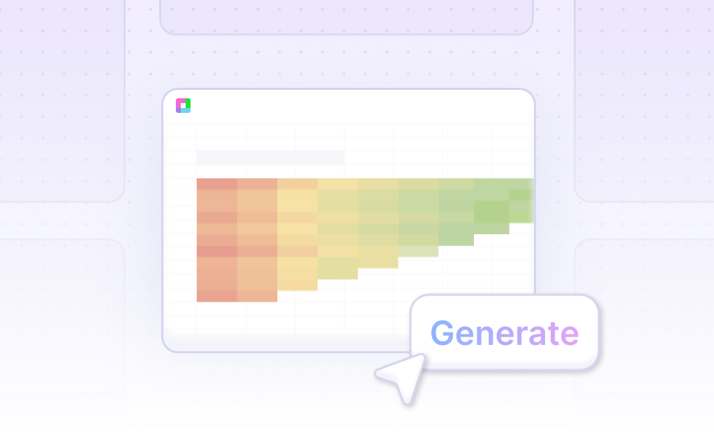
- Next, ask the AI assistant to generate the Cone Stacked Bar Chart. The AI will quickly create the chart based on your data. You can further refine or iterate on the chart by specifying changes to formatting, labels, and other elements.
How to Generate a Cone Stacked Bar Chart in Excel or Google Sheets
Generating a Cone Stacked Bar Chart in Excel
Cone charts are no longer available under column charts in Excel. However, you can replicate them by selecting a 3D column chart and formatting the data series as a cone. To create a cone stacked bar chart, follow these steps:
1. Create a stacked bar chart using the 100% stacked column chart type.
2. Select the cone chart type during the customization.
3. Choose a cylinder 2D or 3D variation based on preference.
4. Apply additional formatting such as titles, text formatting, or legend placement as needed.
Generating a Cone Stacked Bar Chart in Google Sheets
Google Sheets supports the creation of stacked column charts that can display multiple data sets for a single column. To generate a stacked column chart and customize it as a cone stacked bar chart, follow these steps:
1. Open Google Sheets and enter the data you want to visualize.
2. Highlight the cells containing the data.
3. Click the 'Chart' icon in the Google Sheets toolbar to create a stacked column chart.
4. Customize the chart as desired to approximate a cone stacked bar chart format.
Both Excel and Google Sheets provide effective ways to visualize data with cone stacked bar charts, each offering unique tools for customization and data comparison.
Use Cases for Visualizing Data with a Cone Stacked Bar Chart
Comparing Sales Performance |
Visualize and compare sales performance across different product categories. The Cone Stacked Bar Chart provides a clear and concise view of sales data, making it easy to identify top-performing products and underperformers at a glance. |
Tracking Budget Allocation |
Monitor budget allocations across various departments. With a Cone Stacked Bar Chart, stakeholders can quickly see how funds are distributed, ensuring financial resources are optimized and aligned with organizational priorities. |
Analyzing Employee Performance |
Assess employee performance metrics over time. This chart type effectively displays multiple performance indicators, enabling HR managers to identify trends, recognize high achievers, and address performance gaps promptly. |
Visualizing Market Share |
Show market share distribution among competitors. The Cone Stacked Bar Chart makes it easy to see how market dominance shifts over time, helping businesses strategize and stay ahead in competitive markets. |
Evaluating Project Progress |
Track the progress of various projects within an organization. By stacking different phases of project completion, the Cone Stacked Bar Chart provides a clear overview of overall project status and helps in pinpointing areas that require attention. |
Monitoring Customer Segments |
Analyze customer segmentation data. This visualization helps businesses understand the composition of their customer base, facilitating targeted marketing efforts and enhancing customer relationship management. |
Financial Statement Analysis |
Break down financial statements into component parts. The Cone Stacked Bar Chart allows for a detailed comparison of revenue, expenses, and net profit over multiple periods, aiding in financial analysis and planning. |
Frequently Asked Questions
What is a stacked bar chart?
A stacked bar chart is an extension of a standard bar chart that uses two categorical variables to display numeric values. Each bar is divided into sub-bars, representing the levels of a secondary categorical variable.
When should you use a stacked bar chart?
Use a stacked bar chart when comparing numeric values between levels of a categorical variable and when assessing the relative contribution of each primary bar to the total of the secondary categorical variable.
What are the best practices for using a stacked bar chart?
Best practices include using a zero baseline, maintaining the same order for categorical variables within each primary bar, and ensuring the chart aligns with your visualization goals.
What is a percentage stacked bar chart?
A percentage stacked bar chart scales each primary bar to the same height, with each sub-bar showing its percentage contribution to the whole. This allows for better analysis of the relative distributions of secondary groups.
What are some common misuses of a stacked bar chart?
Common misuses include using pie charts for comparing two or more primary groups and not maintaining a zero baseline. These misuses can distort data interpretation and reduce clarity.
Generating a Cone Stacked Bar Chart
This guide explored the Cone Stacked Bar Chart, detailing its creation through both AI-powered and traditional methods. Sourcetable, an AI-enabled spreadsheet software, simplifies the process extensively, allowing users to leverage its AI assistant for quick and efficient chart generation. For those preferring conventional tools, steps to create this chart in spreadsheet programs like Excel or Google Sheets were also covered.
To harness the full potential of AI in spreadsheet management and effortlessly generate your first Cone Stacked Bar Chart, sign up for Sourcetable at https://app.sourcetable.com/signup.
Recommended Guides
Connect your most-used data sources and tools to Sourcetable for seamless analysis.
Frequently Asked Questions
If your question is not covered here, you can contact our team.
Contact Us


