Generate a Cone 100% Stacked Column Chart with AI
Create custom Cone 100% Stacked Column Charts with Sourcetable AI. Generate data from scratch or upload your own to get started.
Introduction
Creating a Cone 100% Stacked Column Chart can be a complex task, whether you are using AI tools like Sourcetable or traditional spreadsheet programs such as Excel or Google Sheets. Sourcetable simplifies this process with its AI capabilities, transforming any user into a spreadsheet expert. The AI assistant in Sourcetable helps users effortlessly generate various charts and graphs, including the sophisticated Cone 100% Stacked Column Chart.
For users preferring traditional methods, Excel and Google Sheets offer manual yet detailed control over chart customization, suitable for those who enjoy hands-on data manipulation. This webpage provides step-by-step guides to use both AI-enhanced and conventional techniques for creating these charts.
Ready to create your first Cone 100% Stacked Column Chart with ease? Sign up for Sourcetable to get started, or continue reading for detailed instructions on both AI-enhanced and traditional methods.
See how easy it is to generate Cone 100% Stacked Column Chart with Sourcetable

What is a Cone 100% Stacked Column Chart?
A Cone 100% Stacked Column Chart is a specific type of Excel chart that visualizes data by showing the relative percentage of multiple data series in stacked columns. Each stacked column equals 100%, effectively illustrating part-to-whole relationships. This chart is particularly useful in displaying the proportions of different data series over time.
Key Features
The 100% stacked column chart type in Excel allows for a clear comparison of the relative sizes of each series within the whole. The total value of each column is always 100%, making it easy to understand the proportion each segment contributes to the entire column.
Applications
This chart type is ideal for comparing attainment rates and visualizing goals over time. It is also useful for showing the percentages of responses to Likert scales, making it suitable for survey data analysis. When presenting data hierarchically, the Cone 100% Stacked Column Chart offers a clear and intuitive representation.
Benefits
A key benefit of using a Cone 100% Stacked Column Chart is its ability to convey part-to-whole relationships swiftly and clearly. Unlike line graphs, which may require more effort to interpret, these charts make the "part-to-whole" nature of the data immediately obvious, thus allowing for faster visual processing.
Cone 100% Stacked Column Charts are also advantageous for comparing trends over time. They highlight the contribution of each part to the whole, facilitating trend comparisons that other chart types may not present as clearly. They enable viewers to quickly understand both the individual segments and the overall structure of the data.
Creating a Cone 100% Stacked Column Chart
To create a 3D Cone 100% Stacked Column Chart, use the excelize.Col3DConePercentStacked chart type. Set the data for the values field, and the chart will generate a visual representation of part-to-whole relationships within your dataset.
When to Use a Cone 100% Stacked Column Chart
Overview
A Cone 100% Stacked Column Chart is ideal when you need to compare the proportional contributions of different categories to a whole over time. This type of chart clearly represents each category's percentage within a single column, making it easy to see how each part relates to the whole.
Pros
The Cone 100% Stacked Column Chart provides a distinct visual appeal with its 3D cones, enhancing engagement and comprehension. It effectively displays relative percentages of multiple data series within individual categories. This chart is particularly advantageous when you want to emphasize the part-to-whole relationship in your dataset.
Cons
While visually striking, Cone 100% Stacked Column Charts may sacrifice precision for aesthetics. The 3D perspective can sometimes distort the perception of data, making it challenging to interpret exact values. Additionally, this chart type may not be suitable for datasets requiring high accuracy and clarity.
Comparison with Other Charts
Compared to standard bar charts, Cone 100% Stacked Column Charts offer a more visually engaging experience but may reduce data accuracy. Unlike line charts, cone charts are not ideal for illustrating trends over time. Compared to pie charts, cone charts can handle more complex data but may become cluttered with too many data series.
Generating a Cone 100% Stacked Column Chart with Sourcetable
- Sourcetable offers the easiest way to generate a Cone 100% Stacked Column Chart. First, create sample data using Sourcetable's AI assistant or upload a CSV file.
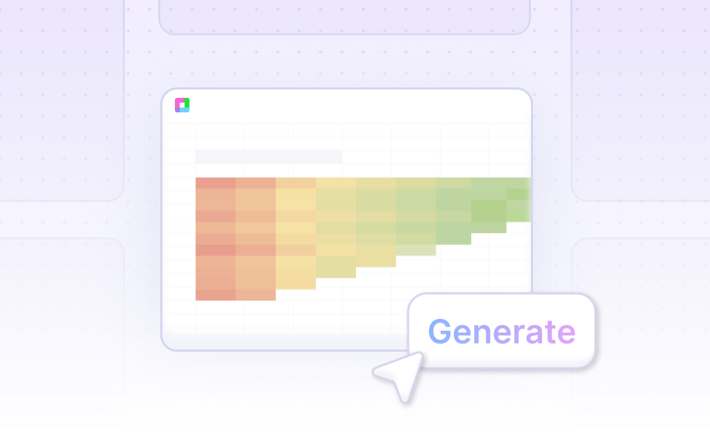
- Select the range of data you want to visualize. Then, ask the AI assistant to generate the Cone 100% Stacked Column Chart. This method is faster and more accurate than manual generation in Excel or Google Sheets.
- Refine or iterate on the chart by specifying any changes to formatting, labels, and other details through Sourcetable's AI assistant. This optimization ensures your Cone 100% Stacked Column Chart meets your exact needs.
How to Generate a Cone 100% Stacked Column Chart in Excel and Google Sheets
Creating a Cone 100% Stacked Column Chart in Excel
Stacked column charts in Excel are excellent for comparing sub-segments of results and identifying which sub-segment contributes the most to the overall sum. To create a 100% stacked column chart, highlight the data you want to visualize.
Next, click on the "Chart" button, then choose the 100% stacked column chart type. Excel offers both 2D and 3D variations. Select the variation that best suits your presentation needs. This chart type will display each section as a percentage of the whole rather than in absolute values, making it easy to compare parts of the total to the total.
Generating a Cone 100% Stacked Column Chart in Google Sheets
Google Sheets allows you to create stacked column charts similar to Excel. Use the "Column" chart type, which is ideal for data with categories and subcategories. Highlight your data, select the chart type, and choose the 100% stacked column chart.
To enhance your chart, you can add a second axis if comparing two datasets. While it is currently not possible to stack multiple columns in a single row, you can format your data to stack two columns on top of each other. If additional stacking features are needed, consider requesting them from Google.
Steps for Creating a Cone 100% Stacked Column Chart
To create a Cone 100% Stacked Column Chart in either Excel or Google Sheets, follow these steps:
Open your Excel or Google Sheets application.
Open your Excel or Google Sheets application.
Highlight the data you want to include in your chart.
Highlight the data you want to include in your chart.
Click on the "Chart" button to open chart options.
Click on the "Chart" button to open chart options.
Select the 100% stacked column chart type.
Select the 100% stacked column chart type.
Choose between 2D and 3D variations if using Excel.
Choose between 2D and 3D variations if using Excel.
By following these steps, you can create a visually compelling Cone 100% Stacked Column Chart that highlights the contributions of each sub-segment as a percentage of the total.
Use Cases for Visualizing Data with a Cone 100% Stacked Column Chart
Comparing Sales Performance Across Regions |
A Cone 100% Stacked Column Chart is ideal for comparing sales performance across different regions. By maintaining the same height for all columns, it highlights the proportionate sales contribution of each region, offering immediate visual insights into regional sales distribution. |
Analyzing Customer Demographics |
Businesses can use a Cone 100% Stacked Column Chart to analyze customer demographics. This chart type helps illustrate the composition of various demographic segments within the customer base, making it easier to identify dominant demographic groups. |
Evaluating Product Portfolio Performance |
Product managers can evaluate the performance of a product portfolio with a Cone 100% Stacked Column Chart. By stacking the data, the chart enables a clear comparison of the sales proportions of each product, aiding in identifying top and underperformers. |
Tracking Marketing Campaign Effectiveness |
Marketing teams can track the effectiveness of various campaigns using a Cone 100% Stacked Column Chart. This type of visualization helps compare the contribution of different campaigns to overall marketing goals, revealing the most successful strategies. |
Assessing Budget Allocation |
A Cone 100% Stacked Column Chart is useful for assessing budget allocation across departments. It shows the proportion of the total budget assigned to each department, allowing for an easy evaluation of how resources are distributed. |
Monitoring Employee Performance Metrics |
Human resources can monitor employee performance metrics with this chart type. It provides a clear visualization of the contribution of different teams or employees to performance targets, aiding in performance evaluation and recognition processes. |
Visualizing Survey Results |
Survey data visualization is more effective with a Cone 100% Stacked Column Chart. It displays the relative frequencies of different response categories, making it simple to understand the distribution of survey responses at a glance. |
Examining Energy Consumption Patterns |
Environmental analysts can examine energy consumption patterns across various sources with a Cone 100% Stacked Column Chart. It highlights the proportional use of different energy types, facilitating the analysis of energy consumption trends and sustainability efforts. |
Frequently Asked Questions
How can I show each task type as a percentage of total time?
You need to use DAX to calculate this.
How do I create a 100% stacked column chart?
Choose the right data, limit categories, maintain a consistent order, use color wisely, label clearly, avoid overcomplicating, and provide context.
What types of charts can be used to show the distribution of data across multiple categories?
100% stacked column charts are good for comparative analysis and showing trends over time. They are useful for comparing sums of multiple parts across different categories or responses to Likert scales.
What are some common issues with Cone 100% Stacked Column Charts?
It is possible for the data to be missing.
What are the visual benefits of using a 100% stacked column chart?
They clearly show parts of a whole and how they change over time. They are effective for comparing individual segments and visually conveying the relationship of parts to a whole quickly.
Conclusion
In our discussion, we explored the Cone 100% Stacked Column Chart, detailing its structure and uses. We covered the steps to create this chart using the AI capabilities of Sourcetable and the traditional methods in Excel and Google Sheets. The AI assistant in Sourcetable simplifies the process, enabling users to generate charts with ease.
For those looking to leverage the power of AI for efficient and accurate data visualization in spreadsheets, signing up for Sourcetable is a constructive step forward. Begin your journey in data visualization by creating a Cone 100% Stacked Column Chart with ease.
Start now by signing up at Sourcetable.
Recommended Guides
Connect your most-used data sources and tools to Sourcetable for seamless analysis.
Frequently Asked Questions
If your question is not covered here, you can contact our team.
Contact Us


