Generate a Cone 3-D Column Chart with AI
Create custom Cone 3-D Column Charts with Sourcetable AI. Generate data from scratch or upload your own to get started.
Introduction
Creating a Cone 3-D Column Chart can enhance visual data presentations, offering a clear, impactful way to display trends and comparisons. Sourcetable, an AI-enhanced spreadsheet program, simplifies this process, providing tools and assistance to users of any skill level. Users can harness the power of an AI assistant to generate these charts efficiently, without the steep learning curve often associated with traditional spreadsheet software like Excel or Google Sheets.
This guide covers both AI-driven and traditional methods for creating Cone 3-D Column Charts, ensuring you have the knowledge to use whichever tool suits your needs. Whether you prefer the advanced capabilities of Sourcetable or the familiarity of conventional spreadsheet programs, you'll find step-by-step instructions here.
To get started with Sourcetable and harness the power of its AI capabilities for your first Cone 3-D Column Chart, sign up now or keep reading for more information. Sign up here.
See how easy it is to generate Cone 3-D Column Chart with Sourcetable

What is a Cone 3-D Column Chart?
Cone 3-D Column Charts are visually engaging charts that use conical shaped items to represent data. Unlike traditional column or bar charts, these charts employ the cone's unique shape for a more visually appealing data presentation.
These charts do not add any additional data, thereby maintaining the integrity of the data set while potentially offering a clearer visual representation. The cone shape itself may contribute to better appearance and readability.
Benefits of Cone 3-D Column Charts
Cone 3-D Column Charts are easier to read compared to other types of charts. They allow for adjustments in the 3-D format, making it simpler to interpret the displayed information. Transparency can be applied to make all data points visible, enhancing clarity.
How to Create a Cone 3-D Column Chart
To create a Cone 3-D Column Chart, start by selecting 3D columns. Then, format the data series as a cone. This straightforward process helps in crafting a visually effective 3-D cone representation of data.
Uses in Data Visualization
Cone 3-D Column Charts are primarily used for visual data representation. Although they do not add extra data elements, they may improve the visual appeal and comprehension of data, making them a popular choice for many data visualization needs.
Examples of Cone 3-D Column Charts
Examples of Cone 3-D Column Charts include stacked cone charts and 3D cone charts. These variations cater to different data visualization requirements and enhance the overall presentation quality.
When to Use a Cone 3-D Column Chart
Overview
A Cone 3-D Column Chart is ideal for visualizing data categories and highlighting magnitude differences. It is best used in scenarios where immediate visual comparison between data points is crucial. Its three-dimensional aspect can make data more engaging and visually appealing.
Pros of Cone 3-D Column Charts
Cone 3-D Column Charts provide an aesthetically pleasing way to present data. They allow for quick visual interpretation of data trends and comparisons. The 3-D effect can make the data more engaging, especially in presentations.
Cons of Cone 3-D Column Charts
The 3-D aspect can sometimes distort data perception. Accurate interpretation might be difficult if the chart is overused or not well-designed. It may require more space than traditional 2-D charts, potentially complicating data comprehension.
Comparisons with Other Charts
Compared to 2-D bar charts, Cone 3-D Column Charts offer better visual appeal but may sacrifice clarity. Unlike pie charts, which show part-to-whole relationships, Cone 3-D Column Charts excel in depicting data trends. Line charts provide better visualization of data over time but lack the categorical emphasis of Cone 3-D columns.
Conclusion
Use Cone 3-D Column Charts to impressively display categorical data and emphasize differences. Be cautious of potential distortions and ensure the design does not compromise clarity. They are best for presentations requiring visual impact and quick data interpretation.
How to Generate a Cone 3-D Column Chart with Sourcetable
- Creating a Cone 3-D Column Chart with Sourcetable is streamlined and efficient. Sourcetable, an AI-powered spreadsheet, simplifies the process compared to traditional methods used in Excel or Google Sheets.
- To start, you can either create sample data using Sourcetable's AI assistant or upload your own CSV. Once you have your data, select the range of data you want for your Cone 3-D Column Chart. This ensures accurate representation and visualization of your data.
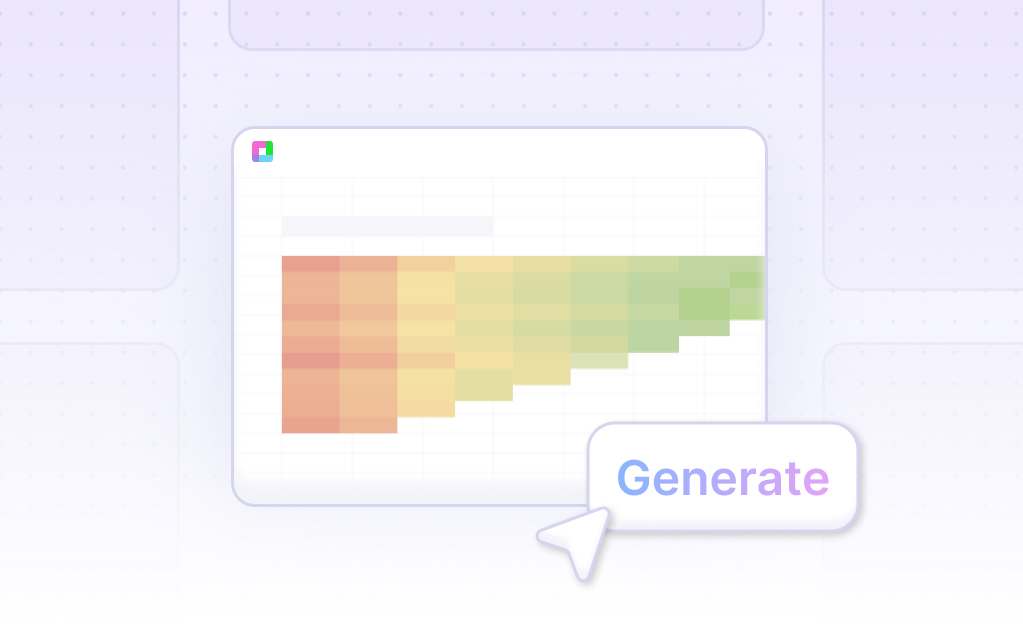
- Next, instruct Sourcetable's AI assistant to generate the Cone 3-D Column Chart. The AI processes your request and produces the chart swiftly. This removes the manual steps typically needed in other spreadsheet software.
- Finally, use the AI assistant to refine and iterate on your Cone 3-D Column Chart. You can specify changes to chart formatting, labels, and other elements to match your exact requirements. This ensures your chart is both aesthetically pleasing and informative.
How to Generate a Cone 3-D Column Chart in Excel or Google Sheets
Generating a Cone 3-D Column Chart in Excel
To create a Cone 3-D Column Chart in Excel, start by selecting the cells that contain the data you want to use for your chart. Then, navigate to the Insert tab and click on Charts. Choose the 3D Column Chart type from the available options. After the chart is created, right-click on the data series and format it as a cone.
Generating a 3-D Column Chart in Google Sheets
In Google Sheets, use the Chart Editor to create a 3-D Column Chart. First, select the data range for your chart. Open the Chart Editor and choose the appropriate chart type. Ensure you tick the checkbox to make the chart 3D. Other settings and changes can be applied the same way as with a standard 2D chart.
Use Cases Unlocked by Visualizing Data Using a Cone 3-D Column Chart
Sales Performance |
A Cone 3-D Column Chart effectively displays sales performance across different regions or products. The 3-D effect makes it easier to compare different categories at a glance. This visualization helps in identifying top-performing areas which can be leveraged for strategic decision-making. |
Marketing Campaign Results |
Visualizing marketing campaign results with a Cone 3-D Column Chart provides a clear representation of each campaign's effectiveness over time. By comparing multiple campaigns, businesses can quickly spot trends and improve future marketing strategies. |
Financial Analysis |
A Cone 3-D Column Chart is ideal for financial analysis, such as comparing quarterly revenues or tracking expenses. The 3-dimensional aspect offers a more engaging representation, making complex financial data easier to understand and analyze. |
Product Comparisons |
Comparing multiple product lines becomes straightforward with a Cone 3-D Column Chart. Managers can quickly assess which products perform better in various metrics, such as sales volume or customer satisfaction, aiding in product development and inventory management. |
Customer Demographics |
Using a Cone 3-D Column Chart to visualize customer demographics data aids in better understanding market segments. This can help companies tailor their products and services to meet the preferences of different demographic groups, enhancing customer satisfaction and retention. |
Website Traffic Analysis |
A Cone 3-D Column Chart can efficiently display website traffic data, such as visitor numbers over time or by source. This visualization helps identify trends in user behavior, enabling improvements in website design and content strategy. |
Employee Performance Metrics |
Visualizing employee performance metrics with a Cone 3-D Column Chart allows for an easy comparison of productivity and achievements across different teams or departments. This supports better performance reviews and identifies areas requiring additional support or training. |
Frequently Asked Questions
How can I create a Cone 3-D Column Chart in Excel 365?
To create a Cone 3-D Column Chart, select a 3-D column chart and then format the data series as a cone.
Can I customize the 3-D format, rotation, and scaling of a Cone 3-D Column Chart?
Yes, the 3-D format, rotation, and scaling can be changed to make the chart easier to read.
What is the benefit of using transparency in a Cone 3-D Column Chart?
Using transparency makes all data markers visible, especially when larger data markers obscure smaller ones.
Conclusion
Throughout this guide, we've explored the innovative process of creating a Cone 3-D Column Chart. We discussed the fundamentals of this chart type, how to leverage the AI capabilities of Sourcetable to streamline the creation process, and alternative methods using traditional spreadsheet tools like Excel and Google Sheets.
Sourcetable simplifies complex tasks with its AI-powered spreadsheet assistant, enabling users of any skill level to efficiently create detailed charts and graphs. Whether you are a beginner or an experienced spreadsheet user, Sourcetable enhances your ability to visualize data dynamically.
To experience the efficiency and simplicity of designing charts with advanced AI support, sign up for Sourcetable today and create your first Cone 3-D Column Chart. Get started now at https://app.sourcetable.com/signup.
Recommended Guides
Connect your most-used data sources and tools to Sourcetable for seamless analysis.
Frequently Asked Questions
If your question is not covered here, you can contact our team.
Contact Us


