Generate a Combo Chart with AI
Create custom Combo Charts with Sourcetable AI. Generate data from scratch or upload your own to get started.
Introduction
Creating a Combo Chart efficiently demonstrates the relationship between two sets of data, which can be a pivotal visual in data analysis. Users can generate these charts either through AI-driven tools like Sourcetable or using traditional spreadsheet applications such as Excel and Google Sheets. Each method offers unique advantages tailored to different user needs.
Sourcetable introduces an AI-powered approach, simplifying complex data manipulations with its AI spreadsheet assistant. This feature enables users, regardless of their technical know-how, to easily create detailed charts and graphs. It is particularly beneficial for those looking to enhance their productivity in spreadsheet management.
To explore the capabilities of AI in spreadsheet management, sign up for Sourcetable and generate your first Combo Chart. If you prefer traditional methods, continue reading for a detailed guide on creating Combo Charts using Excel or Google Sheets.
See how easy it is to generate Combo Chart with Sourcetable

What is a Combo Chart?
A Combo Chart is a versatile visualization tool that combines the features of bar charts and line charts. This unique chart type displays data using a combination of bars and/or lines, where each bar or line represents a specific category.
Combo Charts are particularly effective for comparing values across different categories. They are designed to provide a comprehensive view of complex data sets, making it easier to highlight relationships and patterns within the data.
Features of a Combo Chart
The ability to use both bars and lines in a single chart makes Combo Charts very flexible. This allows for complex relationships and patterns to be communicated effectively. Each element in the chart can represent a different metric or category, providing a clear visual distinction between the compared values.
Benefits of Using Combo Charts
Combo Charts provide an in-depth understanding of data by showcasing multiple metrics over time or across different categories. This visualization technique is ideal for analyzing and communicating intricate data relationships, making it a powerful tool for data analysis.
When to Use a Combo Chart
Use Cases
A Combo Chart is ideal for visualizing two different types of data in one chart. Use this type of chart to compare data sets with different units or scales. It is especially useful for showing the trend over time for one set of data and the relationship to another set of data.
Pros of Combo Charts
Combo Charts combine line and bar charts, making it easy to compare trends and values simultaneously. They enhance clarity by providing a multi-dimensional view of the data. This type of chart is also flexible, allowing the use of different chart types to better represent different data sets.
Cons of Combo Charts
The complexity of Combo Charts can sometimes overwhelm viewers. They may be difficult to read if too much data is included. Proper labeling and clear legends are essential to avoid confusion.
Comparison with Other Charts
Compared to single-type charts like line or bar charts, Combo Charts offer a more comprehensive view. Line charts effectively show trends over time, while bar charts illustrate quantities. Combo Charts bring both strengths together. However, if simplicity and ease of understanding are more critical, single-type charts might be preferred.
How to Generate a Combo Chart with Sourcetable
- Generating a Combo Chart with Sourcetable, an AI spreadsheet, is simple and efficient. You can do this manually like in Excel or Google Sheets, which we outline in the next section. However, using Sourcetable's AI assistant streamlines the process.
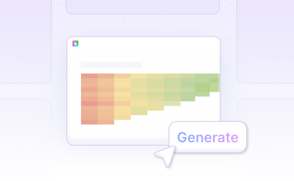
- To begin, create sample data using Sourcetable's AI assistant or upload a CSV. This initial step ensures you have the necessary data to work with. Next, select the range of data you want to turn into a Combo Chart. Accurate data selection is crucial for generating meaningful insights.
- Then, ask the AI assistant to generate the Combo Chart. This step leverages Sourcetable's capabilities to quickly produce a visually appealing chart. Finally, use the AI assistant to refine or iterate on the Combo Chart. Specify changes to formatting, labels, and other elements to enhance the clarity and presentation of your data.
- Using Sourcetable for creating a Combo Chart is the easiest method. It combines AI efficiency with the flexibility of traditional spreadsheet tools, providing an optimal user experience. Follow these steps to create professional and insightful Combo Charts effortlessly.
How to Generate a Combo Chart in Excel or Google Sheets
Creating a Combo Chart in Excel
To create a Combo Chart in Excel, start by selecting the cells you want to chart. Next, click the INSERT tab on the ribbon. Then, click the Combo button and choose your preferred option to create the chart. For further customization, you can move and resize the chart, add a title, and optionally include a secondary axis and axis titles.
Generating a Combo Chart in Google Sheets
Begin by setting up your data with your primary data series in the left column and the secondary data on the right. Select the data you want to include in your chart, then go to the Insert tab and click Chart. If Google Sheets does not suggest a combo chart, navigate to the Setup tab in the Chart Editor and select Combo Chart from the Chart Type drop-down menu. Customize your chart using additional settings in the Setup tab.
Combo Chart Features and Comparisons
Combo Charts in Google Sheets and Excel use different marker types to display data series. Both platforms support line, column, and area marker types. Combo charts are best used to show relationships between data sets measured differently, such as projected versus actual sales or temperatures with precipitation amounts.
Use Cases Unlocked by Visualizing Data with a Combo Chart
Analyzing Sales Performance |
Visualizing data with a Combo Chart allows businesses to track and compare sales performance over time. It combines bar and line charts to show sales volume alongside revenue trends, offering comprehensive insights. |
Budget vs. Actual Spending |
A Combo Chart is perfect for comparing budgeted expenses against actual spending. By using bars for budgets and lines for actuals, financial discrepancies can be quickly identified and addressed. |
Market Trend Analysis |
Market analysts can use Combo Charts to scrutinize market trends by displaying both historical data and forecasting metrics. This dual-visualization helps in making informed decisions based on past and predicted market behaviors. |
Product Performance Comparison |
Compare the performance of multiple products over the same period with Combo Charts. Bars can represent sales figures while a line chart shows customer satisfaction ratings, offering a multidimensional view. |
Website Traffic Insights |
Track website traffic by visualizing page views alongside bounce rates. The Combo Chart’s mixed visual elements make it easier to analyze how different aspects of web performance correlate. |
Project Progress Monitoring |
Monitor project progress by displaying planned milestones against actual achievements. Combo Charts can show task completions (bars) and project timelines (lines), ensuring project managers stay on track. |
Resource Utilization |
Organizations can use Combo Charts to optimize resource allocation by comparing planned vs. actual resource usage. This ensures efficient use of resources and helps in reducing wastage. |
Frequently Asked Questions
What is a combo chart?
A combo chart displays data in multiple forms within a single view by combining two or more chart types in one.
Why use a combo chart?
Combo charts are useful for emphasizing different types of data and can promote efficiency in data analysis by condensing large sets of data into one chart, making data easier to understand.
When should I use a secondary axis in a combo chart?
Use a secondary axis in a combo chart when you want to display different value ranges together, allowing for better visualization of data with varying scales.
What are some best practices for creating combo charts?
Best practices for creating combo charts include using dual-axis charts selectively, choosing proper colors, customizing data labels, and using annotations to highlight important areas.
Which chart types can be combined to create a combo chart?
You can combine 2-D charts such as 2-D Line, 2-D Column, Scatter, and Bubble charts to create a combo chart.
Conclusion
In this guide, we explored the intricacies of the Combo Chart, a versatile visualization tool that combines different chart types into one. We discussed how to effortlessly generate Combo Charts using Sourcetable's AI-enhanced features, as well as traditional methods with spreadsheet programs like Excel and Google Sheets. Sourcetable simplifies the creation process with its AI spreadsheet assistant, empowering users to craft customized visual representations effortlessly.
By tapping into AI capabilities with Sourcetable, creating informative and appealing Combo Charts becomes straightforward, even for those new to spreadsheets. Whether you choose AI-powered tools or traditional methods, the ability to visualize complex data clearly is within reach.
Ready to dive into the world of advanced data visualization with minimal effort? Sign up for Sourcetable today and create your first Combo Chart with ease!
Recommended Guides
Connect your most-used data sources and tools to Sourcetable for seamless analysis.
Frequently Asked Questions
If your question is not covered here, you can contact our team.
Contact Us


