Generate a Bar Sparkline with AI
Create custom Bar Sparklines with Sourcetable AI. Generate data from scratch or upload your own to get started.
Introduction
Creating a Bar Sparkline can significantly enhance data visualization in your reports or presentations. Traditionally, this has been done using spreadsheet programs like Microsoft Excel or Google Sheets, which require manual setup and customization.
Sourcetable introduces an innovative AI-powered approach, simplifying the process of creating Bar Sparklines and other advanced spreadsheet functionalities. As an AI spreadsheet, Sourcetable empowers users of all skill levels to quickly generate detailed charts, graphs, and even use pre-built templates with the assistance of its AI assistant.
To experience the ease of generating a Bar Sparkline with AI, sign up for Sourcetable today or continue reading for more detailed information. Start your journey towards becoming a spreadsheet power user by clicking here.
See how easy it is to generate Bar Sparkline with Sourcetable

What is a Bar Sparkline?
A bar sparkline is a tiny chart within a worksheet cell that provides a visual representation of data. Unlike traditional charts, sparklines are small and simple, making them ideal for displaying data trends compactly.
Visual Representation of Data
Bar sparklines are used to show trends in a series of values. They highlight seasonal increases or decreases, economic cycles, and maximum and minimum values effectively.
Customization Options
Use the "charttype" option to set the sparkline type to "bar." Customize bar sparklines with the "color1" and "color2" options to differentiate between values. The "max" option specifies the maximum value along the horizontal axis.
Applications in Data Visualization
Adding bar sparklines to line and column charts improves readability and interpretation. Bar sparklines provide a concise way to display trends and augment other chart types.
Examples
For instance, "=sparkline(A36,'charttype','bar';'max',100)" creates a basic bar chart, while more complex formulas can create stacked or reversed bar sparklines with customized colors.
When to Use a Bar Sparkline
Overview
A Bar Sparkline is ideal for visualizing data trends over time in a compact space. Use it for quick, at-a-glance comparisons within datasets. It is perfect for dashboards and reports where space is limited.
Pros of Bar Sparklines
Bar Sparklines provide a clear visual representation of trends and performance over time. They save space, making them suitable for dense reports or dashboards. Their simplicity allows for easy comparison and quick insights.
Cons of Bar Sparklines
While effective for small datasets, Bar Sparklines may lose clarity with larger, more complex datasets. They can also oversimplify data, potentially leading to misinterpretation.
Comparison with Other Graphs
Unlike detailed bar charts, Bar Sparklines are best for high-level trend analysis rather than in-depth analysis. Pie charts can show part-to-whole relationships better but are less effective for showing trends over time. Line charts offer more detail for continuous data but may take up more space.
How to Generate a Bar Sparkline with Sourcetable
- Sourcetable, an AI spreadsheet, simplifies generating Bar Sparklines. Start by creating sample data using Sourcetable's AI assistant or by uploading a CSV file. This flexibility allows quick data setup suitable for various projects.
- Next, select the range of data intended for the Bar Sparkline. This step specifies the exact subset of data for visualization. An accurate selection ensures precise sparklines.
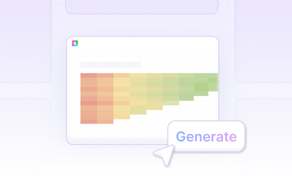
- After selecting your data, ask the AI assistant to generate the Bar Sparkline. The Sourcetable AI then produces a clear, concise Bar Sparkline representation of your data.
- Refine your Bar Sparkline using the AI assistant by specifying desired changes in formatting, labels, or other properties. This iterative process helps customize the Bar Sparkline to meet your specific needs.
How to Generate a Bar Sparkline in Excel and Google Sheets
Creating a Bar Sparkline in Excel
Sparklines in Excel are small charts that fit inside individual cells of a sheet, helping to show trends in a series of values. To create a bar sparkline, start by selecting the data range to analyze. Next, go to the Insert tab and click Sparklines. Then, select the bar sparkline type. Sparklines are most effective when placed close to the data they represent.
Creating a Bar Sparkline in Google Sheets
In Google Sheets, the SPARKLINE function can generate a bar sparkline within a single cell. Use the syntax =SPARKLINE(data, [options]), where "data" is the range of cells to visualize. To create a bar sparkline, set the "charttype" option to "bar". Customize colors with "color1" and "color2" to differentiate between values. Ensure your data range includes more than two cells in a column or row.
Customizing Bar Sparklines
Both Excel and Google Sheets offer options to fine-tune your bar sparklines. In Google Sheets, adjust column size by expanding the column width. Use color options to make your sparklines visually attractive and easy to interpret.
Use Cases Unlocked by Visualizing Data Using a Bar Sparkline
1. Sales Performance Tracking |
Visualizing sales figures with a bar sparkline enables businesses to quickly compare sales performance across various time periods. This helps identify trends, seasonality, and potential growth opportunities. |
2. Website Traffic Analysis |
Website owners can use bar sparklines to visualize monthly or weekly website traffic. This allows for swift identification of peak traffic periods, leading to informed decisions about marketing strategies and content optimization. |
3. Social Media Engagement |
Bar sparklines can help track social media engagement metrics such as likes, shares, and comments over time. This facilitates the assessment of content performance and guides future content planning. |
4. Financial Performance Monitoring |
Companies can use bar sparklines to visualize key financial metrics such as revenue, expenses, and profits. This supports quick financial health assessments and aids in strategic financial planning. |
5. Inventory Management |
Inventory levels can be monitored using bar sparklines to visualize stock counts over time. This helps in efficient inventory management, ensuring stock availability and minimizing holding costs. |
6. Employee Productivity Tracking |
Businesses can visualize employee performance metrics with bar sparklines to monitor productivity levels over defined periods. This assists in identifying high-performing employees and areas that need improvement. |
7. Customer Satisfaction Measurement |
Customer satisfaction scores can be tracked using bar sparklines to visualize changes over time. This allows businesses to monitor the impact of changes in services or products on customer satisfaction. |
8. Marketing Campaign Effectiveness |
Marketing professionals can use bar sparklines to track the performance of marketing campaigns over time. This helps in analyzing campaign effectiveness and making data-driven marketing decisions. |
Frequently Asked Questions
How can I make a bar sparkline in Google Sheets?
You can make a bar sparkline using the SPARKLINE formula with the option 'charttype' set to 'bar'.
What are the color customization options for bar sparklines?
Bar sparklines can use the 'color1' and 'color2' options to customize colors, allowing differentiation between values.
Where should I position a sparkline for greatest impact?
Position a sparkline near its data, preferably in a blank cell at the end of a row of data.
What are the advantages and disadvantages of using bar sparklines?
An advantage of bar sparklines is that they highlight one thing in a larger context. However, they do not provide enough information and can be ineffective without proper context.
What is required to create a bar sparkline?
Bar sparklines require a max value for the horizontal axis to correctly scale and represent the data visually.
Conclusion
In this guide, we explored the concept of Bar Sparklines, detailing how they can be generated using AI-driven tools like Sourcetable or through traditional spreadsheet programs such as Excel and Google Sheets. We furnished insights on utilizing Sourcetable’s AI assistant, which simplifies the process of creating complex charts, including Bar Sparklines.
For those who prefer conventional methods, we also discussed step-by-step procedures to create Bar Sparklines in spreadsheets without AI. Whether you choose the innovative AI approach of Sourcetable or the standard spreadsheet method, you can efficiently create Bar Sparklines tailored to your data visualization needs.
To immediately leverage the power of AI in creating your first Bar Sparkline, sign up for Sourcetable here.
Recommended Guides
Connect your most-used data sources and tools to Sourcetable for seamless analysis.
Frequently Asked Questions
If your question is not covered here, you can contact our team.
Contact Us


