Generate a Sparkline with AI
Create custom Sparklines with Sourcetable AI. Generate data from scratch or upload your own to get started.
Introduction
Generating Sparklines, the tiny, word-sized graphs that illustrate trends in a dataset, can be a powerful way to visualize data. Users can create Sparklines either with the aid of AI-driven tools like Sourcetable or using traditional spreadsheet programs such as Excel and Google Sheets. Sourcetable simplifies the process by providing an AI spreadsheet assistant that aids users in crafting these graphs effortlessly.
The AI assistant in Sourcetable not only helps create Sparklines but also supports the generation of other chart types, templates, and complex data manipulations without the steep learning curve typically associated with advanced spreadsheet functions. This feature democratizes access to sophisticated data analysis tools, making it feasible for anyone to become a spreadsheet power user.
If you're interested in leveraging AI to create high-quality Sparklines quickly, sign up for Sourcetable and generate your first graph today or continue reading for further details on traditional methods.
See how easy it is to generate Sparkline with Sourcetable

What is a Sparkline?
A sparkline is a very small line chart typically embedded within a worksheet cell. It provides a visual representation of data trends. Sparklines are drawn without axes or coordinates, presenting the general shape of variations in some measurement.
Sparklines are particularly useful for showing trends over time, highlighting seasonal increases or decreases, and illustrating economic cycles. They also effectively highlight maximum and minimum values within a data series.
Types of Sparklines
There are various types of sparkline charts, each suited to different visualization needs. Common types include Horizontal Bar Charts, Line Charts, Win/Loss Charts, and Column Charts.
Horizontal Bar Charts display variations as horizontal bars, while Line Charts use lines to illustrate trends. Win/Loss Charts show gains and losses, and Column Charts represent data with vertical bars.
Creating Sparklines
To create a sparkline, select a blank cell near your data, then choose the Sparkline type from the Insert menu. After selecting the data cells, confirm to generate the Sparkline. You can create multiple sparklines by dragging the handle to add one for each data row.
When to Use a Sparkline
When to Use Sparklines
Sparklines are ideal for displaying trends or variations in a small amount of space. They provide a quick, at-a-glance representation of data over time or categories. Use sparklines for dashboards, reports, or inline data comparisons where space is limited.
Pros of Using Sparklines
Sparklines offer a minimalist design, making them perfect for environments with space constraints. They help highlight trends and patterns without overwhelming the viewer with details. Sparklines quickly convey essential information, facilitating easy and fast decision-making.
Cons of Using Sparklines
The primary limitation of sparklines is their lack of detailed information. They may not effectively communicate precise data points or complex relationships. Sparklines may also oversimplify trends, potentially leading to misinterpretations.
Comparison with Other Charts
Compared to line charts, sparklines are more space-efficient but provide less detailed information. While bar charts can effectively illustrate numerical comparisons and magnitudes, they require more space than sparklines. Scatter plots, on the other hand, offer detailed insights into relationships between variables but are unsuitable for small spaces. Thus, sparklines serve as a complementary tool rather than a replacement for these more detailed charts.
How to Generate a Sparkline with Sourcetable
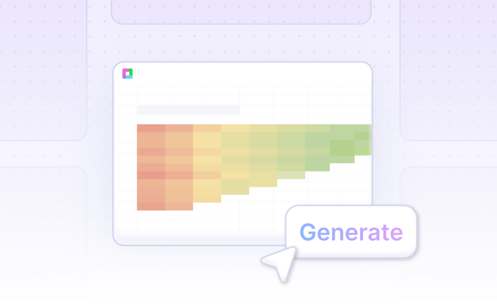
- Sourcetable, an AI-powered spreadsheet, simplifies the creation of Sparklines. First, create sample data using Sourcetable's AI assistant or upload a CSV. This ensures your data is ready for visualization.
- Next, select the range of data you want to transform into a Sparkline. With the desired data highlighted, instruct the AI assistant to generate the Sparkline. This step leverages Sourcetable's intuitive AI to create the initial visualization.
- Further refine your Sparkline by asking the AI assistant to adjust formatting, labels, or other elements. This iterative process allows precision customization, ensuring the Sparkline fits your exact needs. Utilizing Sourcetable AI for Sparklines combines ease of use with powerful customization.
How to Generate Sparklines in Excel and Google Sheets
Creating Sparklines in Excel
A sparkline is a tiny chart within a worksheet cell that provides a visual representation of data trends. Use sparklines in Excel to show trends in a series of values, highlight seasonal increases or decreases, and pinpoint maximum and minimum values.
To add a sparkline, select a blank cell at the end of a row of data. Navigate to the Insert tab, choose the desired sparkline type (such as Line or Column), select the cells in the row you wish to visualize, and click OK. To add sparklines for more rows, drag the handle from the initial sparkline cell.
Creating Sparklines in Google Sheets
In Google Sheets, use the SPARKLINE function to create sparklines. The syntax is SPARKLINE(data, [options]). The data argument is mandatory and specifies the range or array containing the data to plot. The options argument is optional and allows further customization.
To generate a sparkline, select the cell where you want it to appear. Enter the formula with your specified data range: =SPARKLINE(data, [options]). Define various options to customize your chart, such as setting the color, chart type, and how to handle empty cells.
Examples of Sparkline Customizations
Google Sheets offers extensive customization for sparklines through the SPARKLINE function. For example, =sparkline(A36,"charttype","bar";"max",100) creates a basic bar chart. The formula =sparkline(E42,"charttype","bar";"color1","teal";"rtl",true;"max",max(C$36:C$44)) reverses the bar direction with the rtl argument.
Other useful customizations include stacking multiple columns (=sparkline(E49:F49,"charttype","bar";"color1","EB4967";"color2","73A4D3")) and creating line charts with custom colors and widths (=sparkline(B3:G3,"charttype","line";"color","indigo";"ymin",0;"linewidth",2)).
Additional options help you set colors based on data conditions, such as using an if formula to set line color based on series values: =sparkline(C7:H7,"color",if(H7>C7,"green","red");"ymax",100;"linewidth",2). Customize win/loss charts and column charts with specific colors for high and low values to enhance data visualization.
Use Cases for Visualizing Data with Sparklines
Trend Analysis |
Sparklines provide a simple way to analyze trends over time. By showing data trends in a compact and clear format, they help identify positive or negative patterns. This visualization can be beneficial for monitoring sales performance, tracking stock market trends, or observing changes in web traffic over time. |
Performance Monitoring |
Using sparklines for performance monitoring allows quick assessment of key performance indicators (KPIs). Managers and team leads can use these visualizations to track metrics such as customer satisfaction, productivity, and revenue growth. This real-time visualization aids in making data-driven decisions promptly. |
Financial Reporting |
Sparklines are useful in financial reporting to present a quick overview of financial metrics. These tiny charts can be embedded in reports to display revenue, expenses, and profit trends. Investors and stakeholders can easily interpret financial health and performance over time using sparklines. |
Project Management |
In project management, sparklines help visualize project progress and task completion rates. By embedding sparklines in project dashboards, teams can quickly assess which tasks are on track and which are falling behind. This enables more effective resource allocation and project planning. |
Website Analytics |
Webmasters can use sparklines to monitor website analytics efficiently. By visualizing metrics such as page visits, bounce rates, and user engagement, sparklines provide a quick snapshot of website performance. This helps in optimizing content and improving user experience. |
Quality Control |
In manufacturing and production, sparklines are instrumental in tracking quality control metrics. Visualizing defect rates, production yields, and other quality parameters helps in identifying irregularities and implementing corrective actions swiftly. |
Health Monitoring |
Sparklines offer a compact way to track health metrics, such as heart rate, glucose levels, and exercise activity. Health professionals and individuals can use these visualizations to monitor health trends and make informed decisions about lifestyle and medical interventions. |
Frequently Asked Questions
What is a sparkline and where is it used?
A sparkline is a miniature chart in a single worksheet cell that provides a visual representation of data. It is used to show trends, seasonal increases or decreases, and economic cycles, and to highlight maximum and minimum values.
What types of charts can be created using sparklines?
The default chart type for a sparkline is a line chart. Other types include bar charts, column charts, and win/loss charts.
How do sparklines differ from regular charts in terms of flexibility and ease of creation?
Sparklines are quicker to make than regular charts, but using a regular line chart and shrinking it offers more flexibility and formatting choices. Additionally, sparklines are limited when it comes to displaying dual series data.
What customization options are available for sparkline visualizations?
Sparkline visualizations can be customized with options such as chart type, color, and axis settings.
When should different types of sparklines be used?
Line charts should be used with single or dual series data. Bar charts are best for comparing every cell in a column or with single series data. Win/loss charts are suitable for binary data like wins and losses. Column charts are appropriate for comparing series of values, including negative values.
Conclusion
In this guide, we've explored the intricate yet straightforward process of creating Sparklines using Sourcetable's AI capabilities and traditional spreadsheets like Excel and Google Sheets. Whether automated through AI or manually crafted in conventional spreadsheets, Sparklines offer a compact, informative visual representation of your data.
Using Sourcetable, users gain an adaptive edge with an AI-driven assistant that simplifies the process of generating these mini-charts, empowering anyone to become a spreadsheet expert swiftly. On the other hand, traditional spreadsheet programs provide foundational control for those preferring hands-on customization.
To harness the full potential of modern data visualization with ease, consider signing up for Sourcetable and generate your first Sparkline efficiently. Begin your seamless spreadsheet journey by visiting Sourcetable Sign Up.
Recommended Guides
Connect your most-used data sources and tools to Sourcetable for seamless analysis.
Frequently Asked Questions
If your question is not covered here, you can contact our team.
Contact Us


