Generate a Cylinder 100% Stacked Bar Chart with AI
Create custom Cylinder 100% Stacked Bar Charts with Sourcetable AI. Generate data from scratch or upload your own to get started.
Introduction
Learning to generate a Cylinder 100% Stacked Bar Chart can enhance data presentation, offering a clear visual comparison of parts to a whole across different categories. Both AI-enhanced tools like Sourcetable and traditional spreadsheet programs such as Excel and Google Sheets can accomplish this task. However, the former facilitates a more streamlined, user-friendly experience.
Sourcetable, an AI spreadsheet platform, revolutionizes how users interact with data manipulations and visualizations. It features an AI spreadsheet assistant that simplifies creating complex charts, graphs, and spreadsheet operations, making it accessible for users at any skill level.
To easily create your first Cylinder 100% Stacked Bar Chart with minimal effort, consider signing up for Sourcetable. Alternatively, continue reading for a methodical guide on generating these charts using traditional spreadsheet software. Begin your journey at https://app.sourcetable.com/signup.
See how easy it is to generate Cylinder 100% Stacked Bar Chart with Sourcetable

What is a Cylinder 100% Stacked Bar Chart?
A Cylinder 100% Stacked Bar Chart is a type of graph used to visually represent data. It uses cylinder-shaped bars to show the percentage contribution of each part to the whole. Each bar in the chart always adds up to 100%.
Definition and Usage
This chart displays the parts of a whole using stacked bars. It is particularly effective for showing parts of a whole over time. The 100% stacked bar always maintains a total length representing 100%, making it easy to compare segments across different bars.
Benefits
Cylinder 100% Stacked Bar Charts are easy to understand and allow for quick visual interpretation of percentage values. They visually indicate the part-to-whole nature of the data without additional text, making them superior to line graphs in some aspects.
When to Use
These charts are best used when comparing attainment rates, Likert scale responses, or the sum of multiple parts across multiple bars. They are also useful in limited circumstances where the focus is on the extremes of the data or hierarchical data.
Creating a Cylinder 100% Stacked Bar Chart
To create this chart, highlight the data, click on the chart option, choose the 100% stacked bar chart type, select the cylinder option, and then decide whether to use 2D or 3D.
Interpreting the Data
While 100% stacked bar charts are effective for visualizing parts of a whole, line charts may offer clearer trend representation over time. The choice between the two depends on whether the emphasis is on showing parts of a whole or comparing trends across categories.
When to Use a Cylinder 100% Stacked Bar Chart
Ideal Scenarios
A Cylinder 100% Stacked Bar Chart is perfect for comparing the relative percentage of multiple data series in a graphical format. This chart type excels when you need to visualize the proportional contribution of individual sub-groups to the whole, across different categories.
Pros and Cons
Pros: Cylinder 100% Stacked Bar Charts present data in an easy-to-read visual format, allowing for clear comparison across multiple series. They are visually appealing and help in understanding market share, budget allocations, and survey results.
Cons: This chart can become crowded and hard to read with too many categories or series. It may also mislead if the emphasis is on absolute values rather than percentages. User comprehension can suffer with a cluttered or overly complex dataset.
Comparison to Other Charts
Compared to traditional Bar Charts, Cylinder 100% Stacked Bar Charts offer a more engaging visual style but may sacrifice clarity when dealing with complex data. Pie Charts display percentage contributions but lack the ability to compare multiple categories effectively. Line Charts excel in showing trends over time but fail to represent percentage compositions as clearly.
In summary, while Cylinder 100% Stacked Bar Charts are excellent for displaying percentage distributions among categories, they should be used when the dataset is not overly complex to avoid compromising readability.
How to Generate a Cylinder 100% Stacked Bar Chart with Sourcetable
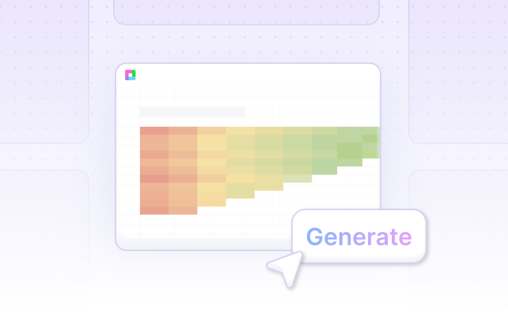
- Using Sourcetable AI, you can generate a Cylinder 100% Stacked Bar Chart quickly and easily. Start by creating sample data with Sourcetable's AI assistant or upload a CSV file.
- Next, select the range of data you want to represent in the Cylinder 100% Stacked Bar Chart. This step is crucial for accurate visualization.
- Then, ask the AI assistant to generate the Cylinder 100% Stacked Bar Chart. Sourcetable's AI will process the data and create the chart automatically.
- You can refine or iterate on the Cylinder 100% Stacked Bar Chart using the AI assistant. Specify any changes to formatting, labels, or other details to perfect your chart.
How to Generate a Cylinder 100% Stacked Bar Chart in Excel and Google Sheets
Creating a Cylinder 100% Stacked Bar Chart in Excel
To create a cylinder 100% stacked bar chart in Excel, follow these steps. First, enter your data into Excel. Highlight the range of cells containing the data. Next, click the Insert tab. In the Charts group, select the 100% Stacked Bar icon. Customize the chart as desired by adjusting colors, labels, and axis titles.
Creating a Cylinder 100% Stacked Bar Chart in Google Sheets
To make a cylinder 100% stacked bar chart in Google Sheets, format your data like a bar chart. Ensure you have at least 2 data series. The data series can represent categories like sales per month, with months in the first column and sales regions in the other columns. Select your data, click Insert, then Chart. In Chart editor, choose the 100% Stacked Bar Chart option. Customize your chart to fit your needs, including adjusting colors and labels.
Using 100% Stacked Bar Charts
100% stacked bar charts are great for showing the relationship of individual items to the whole without focusing on cumulative totals. Use these charts to visualize how different categories contribute to the total, making it clear and easy to understand.
Use Cases Unlocked by Visualizing Data Using a Cylinder 100% Stacked Bar Chart
Market Share Analysis |
Visualizing market share data with a Cylinder 100% Stacked Bar Chart allows businesses to see the proportional representation of different companies within an industry. This helps identify market leaders and competitors. |
Financial Performance Comparison |
A Cylinder 100% Stacked Bar Chart is ideal for comparing financial performance across multiple divisions or product lines, illustrating the relative contributions to overall revenue or profit. |
Survey Results Breakdown |
This chart type effectively displays survey results, showing the distribution of various responses within each question category. It aids in understanding participants' preferences and opinions. |
Resource Allocation |
Organizations can utilize this chart to visualize resource allocation across different projects or departments, showcasing the relative effort or investment in each area. |
Sales Distribution |
Displaying sales data with a Cylinder 100% Stacked Bar Chart highlights the proportion of total sales attributed to various regions or sales teams, facilitating performance analysis and strategic planning. |
Frequently Asked Questions
What is a 100% stacked bar chart?
A 100% stacked bar chart is a type of chart that shows the parts of a whole by stacking bars of different segments all adding up to 100%. Each bar is divided into sub-bars representing different categories.
When should I use a 100% stacked bar chart?
Use a 100% stacked bar chart to show parts of a whole when the cumulative total is not important, and you need to emphasize the proportions of contributing categories.
What are the advantages of using a 100% stacked bar chart?
A 100% stacked bar chart clearly shows how each part contributes to the whole and allows for easy trend comparisons. It works well for displaying the percentage of responses to Likert scales and for comparing attainment rates.
What are some common mistakes people make when using a 100% stacked bar chart?
Common mistakes include using too many categories, failing to maintain a consistent order of segments across all columns, and not using contrasting colors or colorblind-friendly palettes. Adding too many data points or complex patterns can also reduce readability.
How do I interpret a 100% stacked bar chart?
To interpret a 100% stacked bar chart, look at the proportional length of each segment within a bar to understand the part-to-whole relationship among the categories. Each bar represents 100% of the data, with segments indicating the contribution of each category.
Conclusion
In summary, this guide explored the Cylinder 100% Stacked Bar Chart, revealing its unique visual representation capabilities. We discussed generating this chart with the aid of AI in Sourcetable, as well as creating it manually in traditional spreadsheet software like Excel and Google Sheets. Each method offers distinct advantages, whether seeking efficiency through AI or adhering to conventional techniques.
For those keen to explore the effortless and advanced approach to chart-making, Sourcetable provides a remarkable solution. Its AI-powered spreadsheet assistant simplifies the process, turning even novice users into spreadsheet experts swiftly. Experience the convenience of creating dynamic charts without extensive spreadsheet knowledge.
Embark on your journey to mastering spreadsheets with ease. Sign up for Sourcetable to generate your first Cylinder 100% Stacked Bar Chart effortlessly.
Recommended Guides
Connect your most-used data sources and tools to Sourcetable for seamless analysis.
Frequently Asked Questions
If your question is not covered here, you can contact our team.
Contact Us


