Spreadsheet Assistant
Your AI sidekick for mastering spreadsheets
Sourcetable's AI Assistant turns you into a spreadsheet power user. Get instant help with formulas, analysis, data cleanup, and more - right in your workbooks. Boost your productivity, work more efficiently, and create anything with spreadsheets.
Try for Free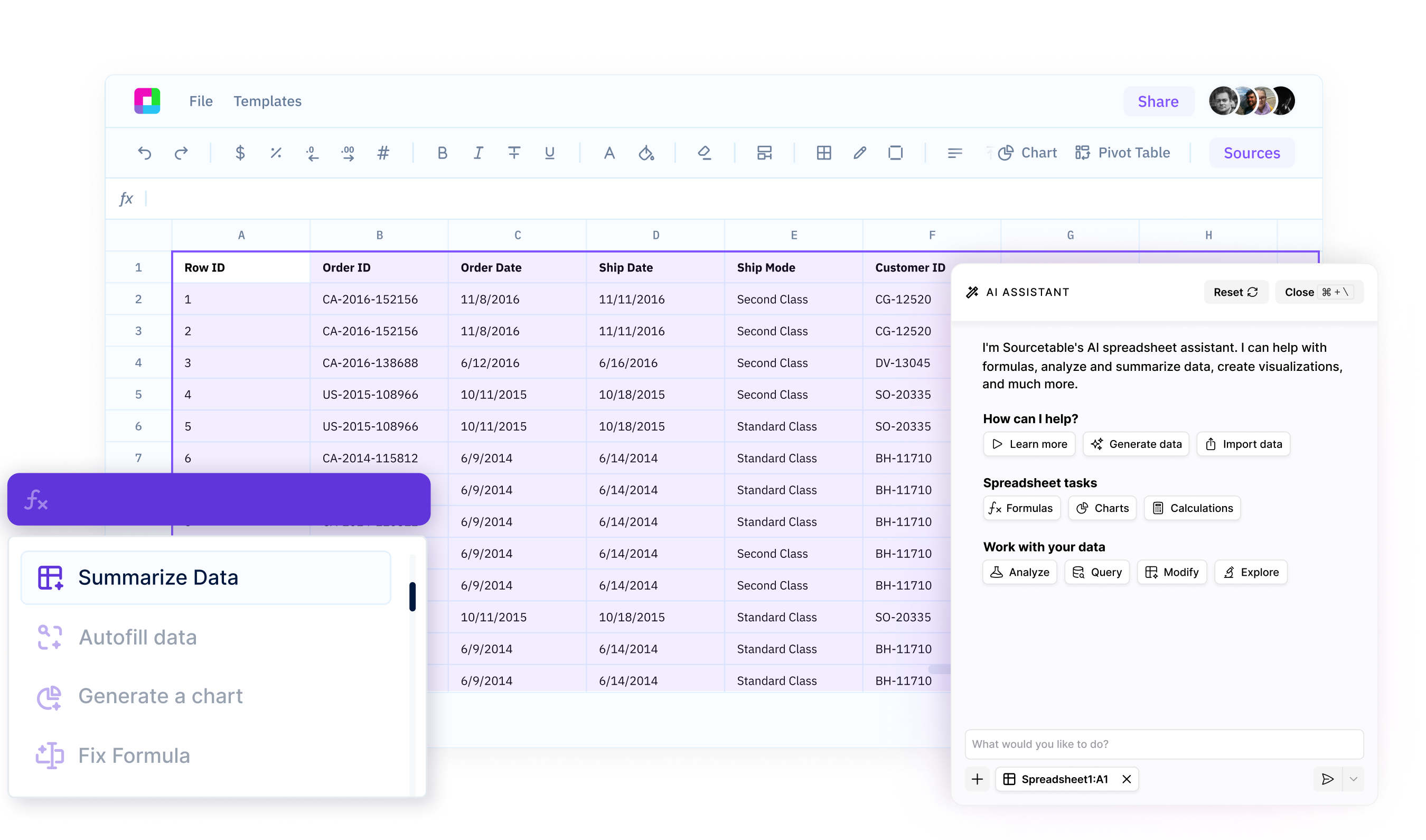
Get instant help with any task
Whether you need help writing a complex formula, analyzing a dataset, building a template, or more - just ask your AI Assistant. Get expert guidance in seconds, right in your spreadsheet.
Boost your efficiency
Stop wasting time Googling spreadsheet functions or making spreadsheets on your own. Your AI Spreadsheet Assistant helps you work smarter and faster, so you can get more done in less time.
Unlock your data
Your AI assistant doesn't just answer simple questions - it also analyzes your data, uncovers insights, and suggests the best ways to work with your spreadsheets. Create charts, templates, and more.
Your AI Expert for Every Spreadsheet Task
Get instant help with formulas, data cleaning, charts, and analysis. Just describe what you need and your AI assistant guides you through it - no more Googling or trial and error.
Meet your ultimate spreadsheet companion
Formula & Function Assistance
Struggling to figure out how to write a formula? Just ask your AI Assistant. It provides instant help and recommendations for writing any formula, helping you work more efficiently.
Try for free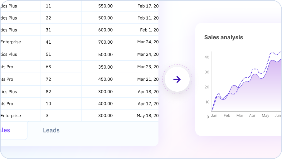
Data Analysis & Insights
Your AI Spreadsheet can analyze your data to uncover trends, patterns, and key insights. Ask questions about your data in plain English and get instant analysis and suggestions for further exploration.
Try for free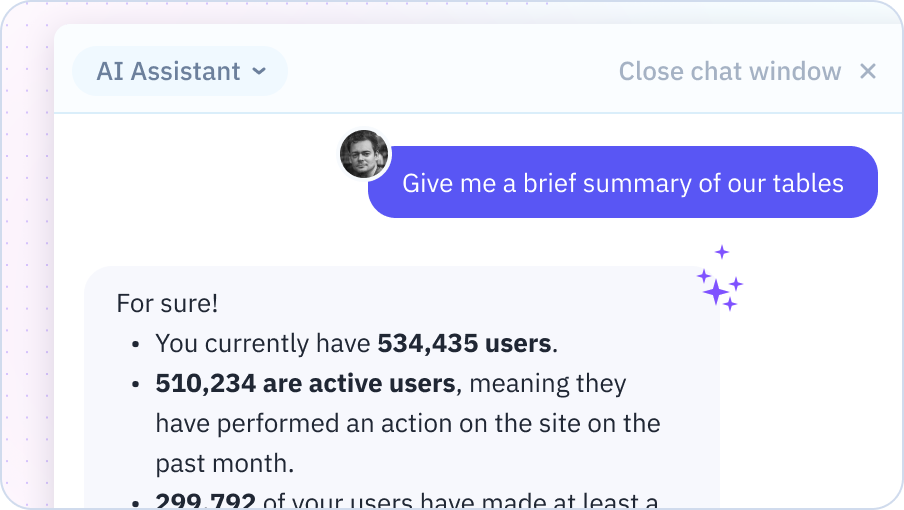
Data Transformation & Cleanup
Cleaning and transforming data is a breeze with your AI Assistant. Describe what you need - removing duplicates, standardizing formats, splitting columns, etc. - and your AI will provide step-by-step guidance to get it done fast.
Try for free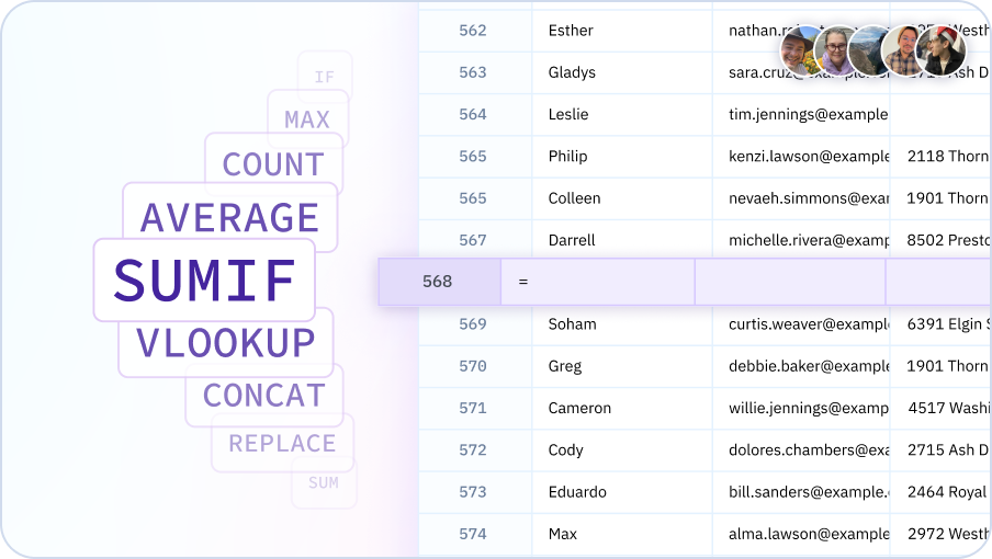
Get your spreadsheet work done faster with AI
Build financial models, analyze and summarize data, instantly generate charts and reports.

Why choose Sourcetable's AI Spreadsheet Assistant?
Expert help, instantly
Get the spreadsheet guidance of an expert, on-demand. No more scouring forums or help docs - just ask your Assistant for instant help.
Right where you work
No switching between apps or learning new tools. Access the power of AI assistance seamlessly, right in your familiar spreadsheet interface.
Answer complex questions
Beyond just helping with formulas or one-off tasks, your Assistant provides proactive data insights and strategic spreadsheet guidance.
Tailored to your needs
Your AI Assistant helps you build any spreadsheet from scratch. From formatting to pivot tables, Sourcetable has you covered.
Team Purple
See what people say about Sourcetable

Chris Aubuchon
@ChrisAubuchon
Spreadsheets are still the best interface for so many real world projects, it's time for @SourcetableApp to give them a reboot

Micah Alpern
@malpern
Love seeing innovation in this space after so many decades with very little.


Frequently Asked Questions
What can I ask the AI Spreadsheet Assistant to do?
Sourcetable's AI Spreadsheet Assistant can help with formulas, data cleaning, formatting, creating charts, performing calculations, finding patterns, generating insights, and answering questions about your data. Think of it as having an expert spreadsheet user available 24/7 to help with any spreadsheet task.
Can the AI Spreadsheet Assistant work with my existing spreadsheets?
Yes, you can upload existing Excel or Google Sheets files and Sourcetable's AI will understand your data structure, formulas, and formatting. It can help you modify, extend, or analyze your existing spreadsheets without starting from scratch.
How does the AI understand context in my spreadsheet?
Sourcetable's AI analyzes your column headers, data types, existing formulas, and relationships between sheets to understand your spreadsheet's purpose. This context allows it to provide relevant suggestions and accurate assistance without you having to explain every detail.
Can the AI Spreadsheet Assistant handle multiple sheets?
Yes, Sourcetable's AI works across multiple sheets within a workbook. You can ask it to combine data from different sheets, create cross-sheet references, or perform analysis that spans your entire workbook.
What's the difference between this and Excel's built-in AI features?
Sourcetable's AI Spreadsheet Assistant is more advanced than Excel's built-in features. It can understand complex natural language requests, write sophisticated formulas, perform advanced analysis, generate insights, and work with data from multiple sources - all through conversational interaction rather than menu navigation.
Can I use this alongside Excel or Google Sheets?
Yes, Sourcetable is fully compatible with Excel and Google Sheets. You can import files from either platform, work with them using AI assistance, and export back to .xlsx or Google Sheets format. Many users use Sourcetable for AI-powered analysis and then export to their preferred platform.