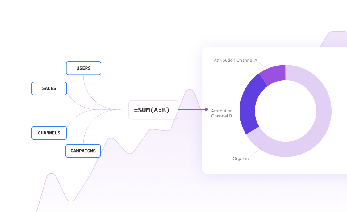
Picture this: You're in a meeting, and someone asks about last week's conversion rates. Instead of scrambling through static reports or waiting for IT to pull numbers, you simply glance at your live dashboard and deliver precise, up-to-the-minute insights. That's the power of real-time analytics dashboard analysis.
Real-time dashboards aren't just fancy visualizations—they're your command center for making split-second decisions that can make or break business outcomes. Whether you're tracking website performance, monitoring sales metrics, or analyzing user behavior, having live data at your fingertips transforms how you work.
Why Real-Time Dashboard Analysis Matters
Discover the key benefits
Instant Decision Making
React to trends as they happen, not hours or days later. Spot opportunities and address issues before they impact your bottom line.
Live Data Visualization
Transform complex datasets into clear, actionable charts and graphs that update automatically as new data flows in.
Proactive Problem Solving
Set up intelligent alerts that notify you when metrics deviate from expected ranges, enabling immediate intervention.
Stakeholder Transparency
Share live dashboards with team members and executives, ensuring everyone works with the same current information.
Performance Optimization
Continuously monitor and optimize campaigns, processes, and strategies based on real-time performance data.
Competitive Advantage
Stay ahead of competitors by responding to market changes and customer behavior shifts in real-time.
Real-World Dashboard Analysis Examples
E-commerce Performance Dashboard
An online retailer tracks conversion rates, cart abandonment, and revenue per visitor in real-time. When they notice a sudden spike in cart abandonment during checkout, they immediately investigate and discover a payment gateway issue. Quick action saves thousands in lost sales within the first hour.
Key Metrics Tracked: Conversion rate, average order value, traffic sources, payment completion rates, inventory levels
Marketing Campaign Monitor
A digital marketing team runs multiple ad campaigns across platforms. Their real-time dashboard shows cost-per-click, impression rates, and lead quality scores. When one campaign's CPC suddenly increases by 40%, they pause it immediately and reallocate budget to better-performing ads.
Key Metrics Tracked: CPC, CTR, conversion rates, lead quality scores, budget utilization, ROAS
Customer Support Analytics
A SaaS company monitors support ticket volume, response times, and customer satisfaction scores. When ticket volume spikes unexpectedly, the dashboard alerts managers who can immediately deploy additional support staff or identify system issues causing user problems.
Key Metrics Tracked: Ticket volume, average response time, resolution time, satisfaction scores, agent productivity
Financial Performance Tracker
A financial services firm tracks daily revenue, expense ratios, and client acquisition costs. Real-time monitoring helps them spot trends that could affect quarterly results, enabling proactive adjustments to sales strategies and cost management.
Key Metrics Tracked: Daily revenue, expense ratios, client acquisition cost, lifetime value, churn rate, profit margins
Building Effective Real-Time Dashboards
Discover the key benefits
Data Source Integration
Connect your database, APIs, and third-party tools to create a unified data pipeline. Sourcetable automatically syncs data from multiple sources, ensuring your dashboard always reflects the latest information.
Metric Selection & KPI Definition
Choose the most impactful metrics for your specific use case. Focus on actionable KPIs that directly influence business decisions rather than vanity metrics that look impressive but don't drive action.
Visualization Design
Create clear, intuitive charts and graphs that make trends immediately obvious. Use color coding, threshold indicators, and progressive disclosure to highlight what matters most.
Alert Configuration
Set up intelligent notifications for when metrics cross critical thresholds. Configure alerts for both positive opportunities and potential problems to stay ahead of the curve.
Performance Optimization
Ensure your dashboard loads quickly and updates smoothly. Optimize data queries, implement caching strategies, and design for mobile access so insights are available anywhere.
Common Real-Time Dashboard Applications
Discover the key benefits
Sales Performance Monitoring
Track daily sales targets, pipeline velocity, and conversion rates across different channels and regions. Identify top performers and struggling areas to optimize resource allocation.
Website & App Analytics
Monitor user behavior, page load times, bounce rates, and conversion funnels. Quickly identify and fix issues that could impact user experience and business outcomes.
Operational Efficiency Tracking
Measure production metrics, quality scores, downtime, and resource utilization. Optimize processes and prevent costly disruptions through real-time monitoring.
Financial Risk Management
Track market positions, risk exposure, and portfolio performance. Enable rapid response to market volatility and regulatory compliance requirements.
Customer Experience Monitoring
Analyze support interactions, satisfaction scores, and product usage patterns. Proactively address customer issues before they escalate to churn.
Inventory & Supply Chain
Monitor stock levels, supplier performance, and logistics efficiency. Prevent stockouts and optimize inventory turnover through real-time visibility.
Dashboard Design Best Practices
Keep It Simple and Focused
The best dashboards tell a story at a glance. Avoid cramming too many metrics onto one screen. Instead, create a hierarchy where the most critical KPIs are prominently displayed, with supporting details available through drill-down functionality.
Use Contextual Color Coding
Implement consistent color schemes where green indicates good performance, yellow suggests caution, and red signals problems requiring immediate attention. This visual language helps users quickly assess status without reading every number.
Provide Historical Context
Real-time numbers mean little without context. Include trend lines, period-over-period comparisons, and benchmark indicators so users can understand whether current performance is normal, improving, or declining.
Optimize for Mobile Access
Ensure your dashboard works perfectly on smartphones and tablets. Decision-makers need access to critical metrics even when they're away from their desk, traveling, or working remotely.
Test Data Update Frequency
Not all metrics need second-by-second updates. Balance freshness with system performance by updating critical metrics frequently while refreshing less time-sensitive data at appropriate intervals.
Frequently Asked Questions
How often should real-time dashboards update?
Update frequency depends on your business needs and data sensitivity. Critical metrics like website uptime might update every few seconds, while financial reports might refresh every 15-30 minutes. The key is balancing data freshness with system performance and user needs.
What's the difference between real-time and near real-time dashboards?
Real-time dashboards update instantaneously as data changes, while near real-time dashboards refresh every few minutes to hours. Near real-time is often sufficient for most business applications and reduces system load while still providing timely insights.
How do I choose which metrics to include in my dashboard?
Focus on actionable metrics that directly influence business decisions. Ask yourself: 'If this metric changes, what action would I take?' Include leading indicators that predict future performance, not just lagging indicators that show what already happened.
Can I create dashboards without technical expertise?
Yes! Modern tools like Sourcetable make dashboard creation accessible to non-technical users. With drag-and-drop interfaces, pre-built templates, and AI assistance, you can create professional dashboards without coding or complex technical setup.
How do I ensure my dashboard data is accurate?
Implement data validation rules, set up automated quality checks, and regularly audit your data sources. Use consistent definitions across all systems and establish clear data governance processes to maintain accuracy and reliability.
What should I do when my dashboard shows an alert?
Have predefined response procedures for different alert types. Create escalation protocols, document troubleshooting steps, and ensure team members know their roles when alerts trigger. The key is turning alerts into immediate, effective action.
How can I share dashboards with my team securely?
Use role-based access controls to ensure team members see only relevant data. Implement secure sharing options like password-protected links, user authentication, and data filtering based on user permissions. Never compromise security for convenience.
What's the ROI of implementing real-time dashboards?
ROI varies by use case, but common benefits include faster problem resolution, improved decision-making speed, reduced manual reporting time, and prevention of costly issues through early detection. Many organizations see positive ROI within 3-6 months of implementation.
Frequently Asked Questions
If your question is not covered here, you can contact our team.
Contact Us


