Picture this: A new affordable housing policy launches with fanfare, but six months later, you're drowning in spreadsheets trying to figure out if it's actually working. Sound familiar? You're tracking dozens of metrics across multiple departments, wrestling with inconsistent data formats, and facing pressure to prove ROI to elected officials who want clear answers, not complex pivot tables.
Public policy impact analysis doesn't have to be a bureaucratic nightmare. With the right tools and approach, you can transform mountains of policy data into clear, compelling stories that drive better decisions and stronger community outcomes.
Why Policy Impact Analysis Matters
Understanding the real-world effects of policy implementation helps governments make smarter decisions and serve citizens better.
Evidence-Based Decision Making
Replace gut feelings with hard data. Track policy outcomes across multiple metrics to understand what's working and what needs adjustment.
Resource Optimization
Identify which programs deliver the best return on investment. Redirect funding from underperforming initiatives to proven successes.
Stakeholder Transparency
Build public trust with clear, accessible reports that show how policies are affecting real people in measurable ways.
Rapid Response Capability
Spot problems early and adjust course before small issues become major policy failures. Real-time monitoring saves time and taxpayer money.
Policy Impact Analysis in Action
See how different government agencies use data analysis to measure and improve policy effectiveness.
Housing Policy Effectiveness
A metropolitan housing authority tracked first-time homebuyer program success by analyzing mortgage approval rates, default rates, and neighborhood revitalization metrics. They discovered that properties in certain zip codes had 40% higher success rates, leading to targeted program expansion that doubled effective placements.
Education Initiative Impact
A school district analyzed their new early literacy program by combining test scores, attendance data, and parent engagement metrics. The analysis revealed that schools with dedicated reading specialists saw 25% greater improvement, informing budget allocation for the following year.
Public Health Program Assessment
A health department evaluated their diabetes prevention program by tracking participant health outcomes, program completion rates, and healthcare cost savings. They found that community-based workshops had 60% better retention than clinic-based programs, reshaping their outreach strategy.
Transportation Policy Analysis
A city transportation department assessed their new bike lane network by analyzing traffic patterns, accident rates, and air quality measurements. The data showed a 30% reduction in cyclist accidents and measurable air quality improvements, supporting expansion funding requests.
Economic Development Tracking
An economic development agency measured their small business support program by tracking job creation, business survival rates, and local economic indicators. Analysis showed that businesses receiving mentorship had 45% higher survival rates, leading to program restructuring.
Environmental Policy Monitoring
An environmental protection agency evaluated new water conservation policies by analyzing usage data, compliance rates, and environmental impact metrics. They discovered that incentive-based programs achieved 80% better compliance than penalty-based approaches.
Your Policy Analysis Workflow
A systematic approach to measuring policy impact that delivers actionable insights for better governance.
Define Success Metrics
Start by identifying what success looks like for your policy. Are you measuring adoption rates, behavioral changes, or outcome improvements? Clear metrics make everything else easier.
Gather Multi-Source Data
Collect data from various departments and external sources. Don't rely on single data streams—the most valuable insights often come from connecting seemingly unrelated datasets.
Establish Baseline Measurements
Document conditions before policy implementation. Without baseline data, you can't prove your policy caused observed changes rather than external factors.
Monitor Implementation Progress
Track rollout phases and identify implementation barriers early. Many policies fail not because they're bad ideas, but because execution hits unexpected roadblocks.
Analyze Outcome Patterns
Look for trends, correlations, and unexpected results. The goal isn't just to prove success—it's to understand why certain approaches work better than others.
Generate Actionable Reports
Translate complex analysis into clear recommendations. Decision-makers need specific, actionable insights, not just data dumps.
Essential Policy Impact Metrics to Track
The difference between successful and failed policy analysis often comes down to tracking the right metrics. Here are the key indicators that matter most for different policy types:
Implementation Metrics
Outcome Metrics
Process Metrics
Overcoming Common Policy Analysis Challenges
Every government analyst knows the frustration of trying to measure policy impact with insufficient tools and scattered data. Here's how to tackle the most common roadblocks:
Data Integration Nightmares
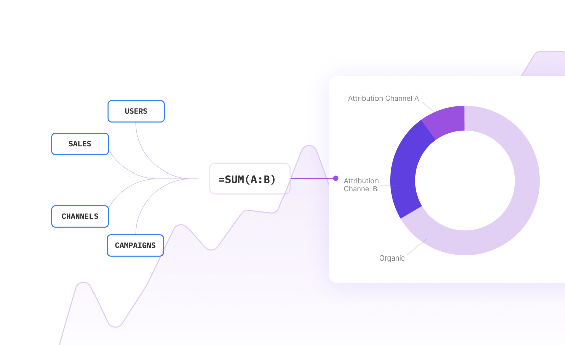
You need data from multiple departments, each using different systems and formats. One department tracks everything in Excel, another uses a proprietary database, and a third still relies on paper forms. The solution isn't trying to standardize everything—it's finding tools that can work with messy, real-world data and connect the dots automatically.
Attribution Problems
How do you prove your policy caused the improvements you're seeing? Maybe crime rates dropped after your community policing initiative, but the economy also improved and a new shopping center opened. Use comparison groups, time-series analysis, and control for external factors to build a stronger causal case.
Political Pressure for Quick Results
Elected officials want to see results before the next election cycle, but meaningful policy impact often takes years to materialize. Focus on leading indicators and interim milestones that demonstrate progress toward longer-term goals. Track both implementation success and early outcome signals.
Limited Resources
Your analysis team is probably understaffed and overworked. Automate routine data collection and processing wherever possible. Use AI-powered tools to handle the heavy lifting so your team can focus on interpretation and strategic thinking rather than data wrangling.
Frequently Asked Questions
How long should we wait before evaluating policy impact?
It depends on your policy type and objectives. For process improvements, you might see results in 3-6 months. For behavioral changes, expect 6-12 months. For systemic changes like education or economic development, plan for 2-3 years of monitoring. Start measuring immediately but set realistic expectations for when meaningful trends will emerge.
What's the difference between outputs, outcomes, and impacts?
Outputs are what you directly produce (number of people served, programs delivered). Outcomes are the immediate effects on participants (skills gained, behaviors changed). Impacts are the broader, long-term changes in communities or systems. All three matter, but impacts are often what policymakers care about most.
How do we handle missing or incomplete data?
Don't let perfect be the enemy of good. Use the data you have while working to improve collection processes. Be transparent about data limitations in your reports. Consider proxy measures when direct measurement isn't possible. Sometimes a rough answer to the right question is more valuable than a precise answer to the wrong question.
Should we measure everything or focus on key indicators?
Focus on key indicators that directly relate to your policy objectives. Too many metrics create analysis paralysis and dilute your message. Aim for 5-10 core metrics that tell a complete story. You can always track additional data points for deeper analysis, but lead with the metrics that matter most to decision-makers.
How do we communicate negative results to leadership?
Frame negative results as learning opportunities and course corrections rather than failures. Present options for improvement along with the analysis. Show what you've learned about what doesn't work, and how this knowledge prevents future mistakes. Remember: catching problems early through good analysis saves money and improves outcomes.
What tools do we need for effective policy impact analysis?
You need tools that can handle diverse data sources, perform statistical analysis, and create clear visualizations. Look for platforms that integrate with your existing systems, support collaboration across departments, and can generate reports that non-technical stakeholders can understand. The key is finding tools that match your team's skills and workflow.
Frequently Asked Questions
If your question is not covered here, you can contact our team.
Contact Us


