Statistical Graphics That Tell Your Data's Story
Picture this: You're staring at a spreadsheet with thousands of data points, trying to spot patterns that could change your entire research direction. The numbers swim before your eyes like alphabet soup, and you know there's a story hidden in there somewhere – you just can't see it yet.
This is where advanced statistical graphics become your secret weapon. With Sourcetable's AI-powered visualization tools, you can transform that overwhelming dataset into crystal-clear insights that practically leap off the screen. Whether you're working with regression analysis or exploring time series patterns, the right graphic can turn confusion into clarity in seconds.
Why Advanced Statistical Graphics Matter
Transform your analytical workflow with powerful visualization capabilities
Instant Pattern Recognition
Spot trends, outliers, and relationships in seconds that would take hours to identify in raw data tables
AI-Powered Chart Selection
Let intelligent algorithms recommend the perfect visualization type based on your data characteristics and analysis goals
Professional Presentation Ready
Generate publication-quality graphics with customizable themes, annotations, and statistical overlays
Interactive Exploration
Drill down into data points, adjust parameters in real-time, and explore multiple scenarios dynamically
Statistical Integrity
Built-in validation ensures your graphics accurately represent underlying statistical relationships and assumptions
Seamless Integration
Works natively with Excel, CSV, and all major data formats – no complex imports or conversions needed
Statistical Graphics in Action
Let's walk through some real-world scenarios where advanced statistical graphics make all the difference:
The Marketing Attribution Mystery
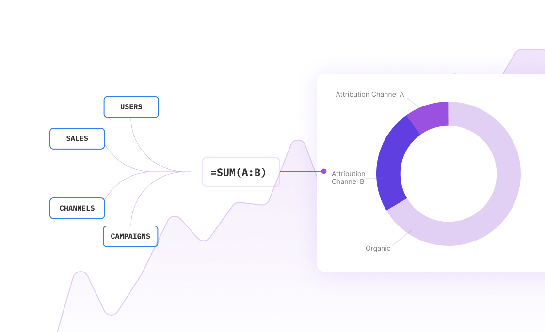
A digital marketing team was drowning in campaign data from six different channels. Traditional bar charts showed which channels drove the most traffic, but they couldn't see the interaction effects between channels. Using advanced statistical graphics, they created a parallel coordinates plot that revealed something surprising: their 'lowest performing' channel was actually the crucial first touchpoint that made all other channels more effective.
The result? A 40% improvement in attribution modeling accuracy and a complete reshuffling of their budget allocation strategy.
The Quality Control Breakthrough
A manufacturing company was experiencing random quality issues that seemed to follow no pattern. Standard control charts showed the process was 'in control,' but products kept failing final inspection. By implementing advanced statistical process control graphics with multivariate overlays, they discovered that the issue wasn't in any single variable – it was in the subtle interactions between temperature, humidity, and machine speed.
The visualization revealed a 'sweet spot' combination that reduced defects by 65% and saved the company over $200,000 in the first quarter alone.
The Survey Data Revelation
A research team had collected responses from 10,000 participants across 50 questions. Traditional frequency tables and basic charts were overwhelming and revealed little insight. Using advanced clustering visualizations and correspondence analysis plots, they uncovered three distinct respondent personas that weren't visible in the raw data.
These insights transformed their entire research approach and led to targeted interventions that improved program effectiveness by 80%.
Creating Advanced Statistical Graphics
A streamlined process that transforms complex analysis into intuitive visualization
Try for freeAdvanced Graphics for Every Statistical Challenge
Discover the key benefits
Multivariate Analysis Visualization
Create sophisticated plots for principal component analysis, factor analysis, and cluster analysis. Visualize high-dimensional data relationships with interactive 3D plots and dimensionality reduction techniques.
Time Series and Forecasting Graphics
Build dynamic time series plots with seasonal decomposition, trend analysis, and forecast confidence intervals. Include multiple series comparisons and anomaly detection overlays.
Experimental Design Visualization
Generate interaction plots, main effects diagrams, and response surface plots for designed experiments. Visualize ANOVA results with forest plots and effect size graphics.
Survival Analysis Graphics
Create Kaplan-Meier curves, hazard ratio plots, and cumulative incidence graphics. Include risk tables and confidence intervals for comprehensive survival analysis presentation.
Bayesian Analysis Visualization
Display posterior distributions, credible intervals, and MCMC diagnostics with specialized Bayesian graphics. Create prior-posterior comparison plots and parameter evolution traces.
Quality Control Charts
Generate advanced control charts including CUSUM, EWMA, and multivariate control charts. Add capability analysis graphics and process performance visualizations.
Beyond Basic Charts: Advanced Statistical Graphics Techniques
While bar charts and scatter plots serve their purpose, advanced statistical graphics unlock insights that basic visualizations simply can't reveal. Here's how to leverage sophisticated techniques for maximum analytical impact:
Multidimensional Scaling and Correspondence Analysis
When dealing with complex categorical data or similarity matrices, traditional charts fall short. Multidimensional scaling (MDS) plots reveal hidden structure in your data by representing similarities as distances in 2D or 3D space. Similarly, correspondence analysis transforms contingency tables into intuitive spatial representations where proximity indicates association.
These techniques are particularly powerful for market research, survey analysis, and any situation where you need to understand relationships between multiple categorical variables simultaneously.
Violin Plots and Distribution Comparisons
Box plots tell you about quartiles, but violin plots reveal the full story of your data distribution. By combining box plot information with kernel density estimation, violin plots show you exactly where your data clusters, how skewed it is, and whether you have multiple modes.
This is crucial for understanding whether your statistical assumptions hold true and for identifying data quality issues that could compromise your analysis.
Network and Graph Visualizations
For correlation matrices, dependency structures, or any relational data, network graphs provide intuitive understanding that traditional matrices cannot match. Node-link diagrams, adjacency matrices, and chord diagrams each reveal different aspects of your data relationships.
These visualizations are particularly valuable in social network analysis, financial risk modeling, and understanding complex system interactions.
Frequently Asked Questions
What makes statistical graphics 'advanced' compared to basic charts?
Advanced statistical graphics go beyond simple data display to reveal complex relationships, patterns, and structures in your data. They incorporate statistical theory, handle multidimensional data, show uncertainty and variability, and are designed specifically for statistical inference rather than just data presentation.
Do I need programming skills to create advanced statistical graphics?
No! Sourcetable's AI-powered interface makes advanced statistical graphics accessible through intuitive point-and-click tools. The system handles the complex statistical computations and chart generation automatically, while still giving you full control over customization and parameters.
How do I choose the right type of statistical graphic for my data?
Sourcetable's AI analyzes your data characteristics and analysis goals to recommend the most appropriate visualization types. The system considers factors like data types, sample size, distribution characteristics, and statistical assumptions to guide you toward the most effective graphics.
Can I export graphics for publication in academic journals?
Yes! Sourcetable generates publication-quality graphics that meet academic standards. You can export in multiple formats (PNG, PDF, SVG) with customizable resolution, color schemes, and formatting to match journal requirements. All graphics include proper statistical annotations and can be easily modified for different publication styles.
How does Sourcetable ensure statistical accuracy in graphics?
Sourcetable includes built-in statistical validation that checks for common issues like assumption violations, inappropriate scaling, misleading representations, and sample size adequacy. The system alerts you to potential problems and suggests corrections to ensure your graphics accurately represent your data and analysis.
Can I create interactive statistical graphics for presentations?
Absolutely! Sourcetable supports interactive graphics that allow viewers to explore data points, adjust parameters, and drill down into details. These are perfect for presentations, dashboards, and collaborative analysis sessions where stakeholders need to engage with the data directly.


