Picture this: you're staring at spreadsheets with thousands of rows of sales data, customer metrics, and performance indicators. The numbers blur together like hieroglyphics on a Monday morning. Your executive team needs insights yesterday, and they want them presented in a way that doesn't require a statistics degree to understand.
Sound familiar? Welcome to the world of advanced data visualization dashboard analysis – where raw data transforms into compelling visual stories that drive business decisions. But here's the twist: with AI-powered tools like Sourcetable's intelligent assistant, creating sophisticated dashboards no longer requires a team of data scientists or weeks of development time.
What Makes Dashboard Analysis 'Advanced'?
Advanced dashboard analysis goes beyond basic bar charts and pie graphs. It's the difference between showing what happened and revealing why it happened – and more importantly, what's likely to happen next.
Think of it like the difference between a weather report and a meteorologist's forecast. A basic dashboard shows you it rained yesterday (historical data). An advanced visualization dashboard reveals the atmospheric patterns, predicts tomorrow's weather, and suggests whether you should pack an umbrella for next week's business trip.
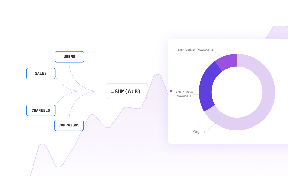
Advanced dashboards incorporate statistical analysis, predictive modeling, and interactive elements that let users drill down into the data story. They combine multiple data sources, apply complex calculations, and present insights through carefully chosen visualization types that match the cognitive load of the intended audience.
Essential Components of Advanced Dashboard Analysis
The building blocks that separate amateur dashboards from professional-grade business intelligence tools
Multi-dimensional Data Integration
Seamlessly combine data from CRM systems, financial databases, marketing platforms, and operational tools into unified visualizations that reveal cross-functional insights
Interactive Drill-down Capabilities
Enable users to click through summary views to detailed breakdowns, filtering and segmenting data dynamically to explore different hypotheses and scenarios
Real-time Data Streaming
Display live metrics that update automatically, allowing teams to monitor performance, detect anomalies, and respond to changing conditions immediately
Predictive Analytics Integration
Incorporate forecasting models, trend analysis, and predictive algorithms that help stakeholders anticipate future outcomes and plan proactively
Context-aware Annotations
Automatically highlight significant changes, outliers, and trends with intelligent commentary that explains what the data means in business terms
Mobile-responsive Design
Ensure dashboards remain functional and visually appealing across devices, from desktop monitors to tablet presentations to smartphone quick-checks
Design Principles That Actually Work
Here's something most dashboard tutorials won't tell you: the prettiest dashboard isn't always the most effective. I've seen beautifully designed dashboards that looked like modern art but left executives more confused than when they started. The secret isn't in the aesthetics – it's in the psychology.
The 5-Second Rule
Your dashboard should answer the user's primary question within five seconds of loading. If someone has to hunt for the key metric or squint at tiny labels, you've lost them. This means prioritizing the most critical information in the top-left quadrant (where eyes naturally go first) and using size, color, and position strategically.
Cognitive Load Management
Human brains can only process so much information simultaneously. Advanced dashboard design respects this limitation by grouping related metrics, using white space effectively, and implementing progressive disclosure – showing summary data first, with the ability to drill down for details.
Consider a sales performance dashboard: instead of showing every product line's metrics simultaneously, start with top-level revenue trends and category performance. Users can then click to explore specific product details when needed. This approach prevents information overload while maintaining analytical depth.
Real-World Dashboard Analysis Examples
See how advanced visualization transforms different business scenarios
Executive Performance Overview
A C-suite dashboard combining financial KPIs, operational metrics, and market indicators with automated variance analysis. Shows revenue trends, profit margins, employee productivity, and competitive positioning in a single view with AI-generated insights highlighting significant changes and recommending focus areas.
Marketing Campaign Attribution
Multi-touch attribution analysis tracking customer journeys across channels, correlating marketing spend with revenue outcomes. Interactive funnel visualizations show conversion rates at each stage, with predictive models forecasting campaign ROI and suggesting budget reallocation strategies.
Supply Chain Risk Assessment
Real-time logistics dashboard monitoring supplier performance, inventory levels, and delivery schedules. Heat maps identify potential bottlenecks, while predictive algorithms flag supply chain risks before they impact operations. Includes scenario planning tools for disruption response.
Customer Health Scoring
Comprehensive customer analytics combining usage patterns, support interactions, and engagement metrics into dynamic health scores. Predictive churn modeling identifies at-risk accounts, while segmentation analysis reveals expansion opportunities and personalization strategies.
Financial Risk Monitoring
Advanced financial dashboard tracking credit exposure, market volatility, and regulatory compliance metrics. Monte Carlo simulations model potential losses under different scenarios, while automated alerts flag threshold breaches and regulatory reporting deadlines.
Product Development Metrics
Agile development dashboard combining sprint progress, code quality metrics, and user feedback analysis. Burndown charts track delivery timelines, while sentiment analysis of user reviews guides feature prioritization and quality improvement initiatives.
Step-by-Step Implementation Process
A proven methodology for creating advanced visualization dashboards that deliver results
Stakeholder Discovery & Requirements Gathering
Conduct structured interviews with end users to understand their decision-making processes, information needs, and current pain points. Document specific use cases, success metrics, and technical constraints to ensure the dashboard aligns with business objectives.
Data Architecture & Source Integration
Map data sources, establish connection protocols, and design ETL processes for reliable data flow. Implement data quality checks, establish refresh schedules, and create backup procedures to ensure dashboard reliability and accuracy.
Information Architecture & User Experience Design
Create wireframes and user flow diagrams that prioritize information hierarchy and optimize cognitive load. Design navigation patterns, establish visual consistency guidelines, and plan responsive layouts for different devices and use cases.
Visualization Development & Testing
Build interactive visualizations using appropriate chart types for each data story. Implement drill-down capabilities, filtering options, and export functionality. Conduct usability testing with actual end users to refine the interface and ensure intuitive operation.
Performance Optimization & Deployment
Optimize query performance, implement caching strategies, and establish monitoring protocols for system health. Deploy to production environment with proper access controls, backup procedures, and version control for ongoing maintenance.
Training & Adoption Support
Develop user documentation, conduct training sessions, and establish support channels for ongoing questions. Monitor usage patterns, gather feedback, and plan iterative improvements based on real-world usage and changing business needs.
Common Pitfalls (And How to Avoid Them)
Even experienced analysts make predictable mistakes when building advanced dashboards. Here are the big ones I see repeatedly – and more importantly, how to sidestep them entirely.
The 'Everything Dashboard' Trap
Someone decides to build the dashboard – one comprehensive view that serves everyone from interns to executives. This never works. A CFO needs different information than a marketing manager, presented differently, with different levels of detail. Instead, create focused dashboards for specific roles and use cases, with shared data sources ensuring consistency.
Metric Overload Syndrome
If everything is important, nothing is important. I've seen dashboards with 47 different metrics crammed into a single screen. Users spend more time figuring out what to look at than actually analyzing the data. Limit each dashboard view to 5-7 key metrics maximum, with the ability to drill down for additional details.
The Static Data Problem
Advanced dashboards need fresh data to remain relevant. Building a beautiful dashboard that updates weekly (or worse, manually) defeats the purpose. Invest in automated data pipelines and real-time connections. Your data integration strategy should be planned before you choose colors and fonts.
Ignoring the Mobile Reality
Executives check dashboards on their phones during flights, in Ubers, between meetings. If your dashboard only works on a 27-inch monitor, you've eliminated 60% of potential usage scenarios. Design mobile-first, then scale up for desktop viewing.
How AI Transforms Dashboard Analysis
Traditional dashboard building requires weeks of development, SQL expertise, and constant maintenance. AI changes this equation entirely. Instead of coding complex queries and manually creating visualizations, you can describe what you want to see and have intelligent systems build it for you.
With Sourcetable's AI assistant, creating advanced dashboards becomes conversational. Ask questions like "Show me customer acquisition cost trends by channel with seasonal adjustments" or "Create an executive summary of our Q3 performance with benchmark comparisons." The AI understands context, suggests appropriate visualization types, and even explains anomalies it discovers in your data.
Automated Insight Generation
The most powerful AI dashboard features don't just display data – they explain it. Smart annotations automatically appear when metrics cross thresholds, trends reverse, or unusual patterns emerge. Instead of staring at a chart wondering why sales dropped 15% last Tuesday, the system explains the correlation with that marketing campaign pause or seasonal adjustment.
Predictive Dashboard Elements
Advanced AI integration enables forward-looking dashboard components. Revenue forecasting models update automatically as new data arrives. Customer churn predictions highlight at-risk accounts before they cancel. Inventory optimization suggestions appear when supply chain disruptions are detected. The dashboard evolves from a rear-view mirror into a strategic navigation system.
Frequently Asked Questions
How long does it typically take to build an advanced dashboard?
With traditional tools, advanced dashboards can take 4-8 weeks for development, testing, and deployment. AI-powered platforms like Sourcetable reduce this to days or even hours by automating data connections, suggesting optimal visualizations, and generating insights automatically. The actual timeline depends on data complexity and stakeholder requirements.
What's the difference between basic reporting and advanced dashboard analysis?
Basic reporting shows historical data in static formats – what happened last month or quarter. Advanced dashboard analysis provides interactive, real-time insights with predictive elements and drill-down capabilities. It combines multiple data sources, applies statistical analysis, and enables users to explore hypotheses dynamically rather than just viewing predetermined reports.
Do I need technical skills to create sophisticated dashboards?
Traditional dashboard development requires SQL knowledge, understanding of data modeling, and visualization expertise. However, AI-powered tools have dramatically lowered the technical barrier. With conversational interfaces and automated data processing, business users can create advanced dashboards by describing their requirements in plain English rather than writing code.
How do I ensure my dashboard remains accurate and up-to-date?
Implement automated data validation checks, establish clear data governance policies, and set up monitoring alerts for data quality issues. Use automated refresh schedules rather than manual updates, and create backup data sources for critical metrics. Regular audits and user feedback help identify accuracy issues before they impact business decisions.
What's the ROI of investing in advanced dashboard analysis?
Organizations typically see 3-5x ROI within the first year through improved decision speed, reduced manual reporting time, and better strategic alignment. Advanced dashboards eliminate hours of manual data compilation, reduce meeting preparation time, and enable faster response to market changes. The productivity gains compound as teams make more data-driven decisions.
How do I handle data security and access controls?
Implement role-based access controls that show different data views based on user permissions. Use secure data connections with encryption in transit and at rest. Establish audit trails for data access and modifications. Consider row-level security for sensitive financial or customer data, ensuring users only see information relevant to their responsibilities.
Can advanced dashboards integrate with existing business systems?
Modern dashboard platforms offer extensive integration capabilities with CRM systems, ERP software, marketing platforms, and financial tools. API connections, pre-built connectors, and automated data synchronization ensure seamless integration without disrupting existing workflows. Cloud-based solutions typically offer the most flexible integration options.
How do I measure dashboard success and user adoption?
Track usage metrics like daily active users, session duration, and feature utilization. Monitor business impact through decision speed improvements, reduced email requests for data, and faster time-to-insight. Conduct regular user surveys to assess satisfaction and identify improvement opportunities. Successful dashboards show increasing usage over time as users discover value.
Frequently Asked Questions
If your question is not covered here, you can contact our team.
Contact Us


